Cannes Lions
Auditorial
R/GA, London / GOOGLE / 2022
Awards:

Overview
Entries
Credits
OVERVIEW
Background
Over 300 million people have a vision impairment. [IOVS]
Yet 97% of the top million websites have accessibility issues [WebAim], making it difficult for people who can’t rely on their sight to access and enjoy online content.
There is a spectrum of forms of sight loss that span restricted vision, light sensitivity, motion sensitivity, colour affected vision, blurred vision to total blindness.
Those with significant sight loss are often reliant on assistive devices to navigate the web - but the user experience is poor; laborious, inhuman, confusing.
We set about reimagining it.
Idea
The internet as we know it was designed predominantly by sighted designers, so is inherently biassed toward sighted users.
More than 97% of the top million websites have accessibility issues, making it difficult for 300 million blind and low vision readers to enjoy online content.
United by the belief that the internet could serve people with visual disabilities better, Google, The Guardian and The Royal National Institute of Blind People got together to create.
The result is Auditorial —a customisable storytelling website that adapts to suit the sensory needs of each unique reader.
Strategy
The strategic approach was to first and foremost launch a lighthouse creative project with a mainstream publisher (The Guardian) to demonstrate a new, multi-modal way of thinking about building websites, and storytelling specifically.
Once we had that proof of concept, we set about seeding the learnings among the creative industries, by producing the ultimate inclusive digital craft guide — https://auditorial.withgoogle.com/accessibility-notebook — which was also reproduced as a design lecture, and touring it at conferences and festivals, in interviews, in platform integrations, mail outs, social media, articles and with the press.
Execution
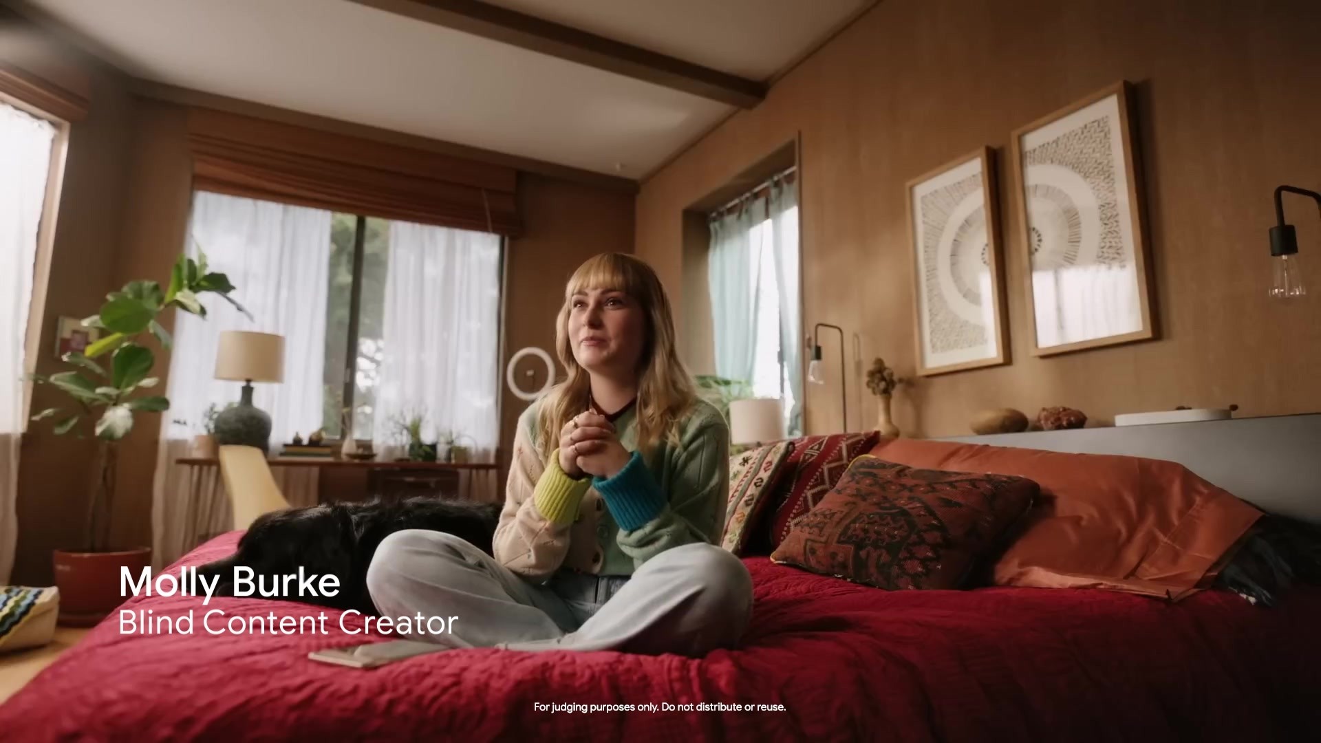
This project addressed the bias of design, by placing blind and low vision users at the core of a design team. The result is a system of adaptive features that can make a piece of online storytelling accessible and enjoyable no matter what kind of visual ability you have.
There are various forms and degrees of sight loss, from colour affected vision to light sensitivity, motion sensitivity, restricted vision to total blindness.
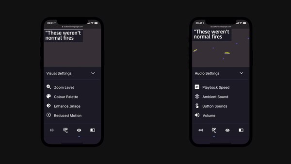
With Auditorial, readers can experience the storytelling in whichever sensory mode suits them — reading, listening or watching, and customising visuals and audio along the way.
So for example, if you have a light sensitivity you can flip the whole website into dark mode.
If you have motion sensitivity, you can turn motion graphics into keyframes.
If you’re blind and have sensitive hearing, you can remove ambient sound effects and focus on the narrator.
All in all there are 22 adaptive features that enable users to experience the same story over 100 different ways.
In addition to these adaptive controls, we implemented a new kind of screen reader introduction to help blind users understand what to expect from a website, developed a new narrative approach to alt-tagging to make imagery more additive for blind readers, and produced our audio story with 'wholistic audio' that explains itself fully without any need to see supporting visuals.
Details of all the techniques we developed can all be found in the ‘Accessibility Notebook’ which captures all the learnings from our research and development in the ultimate craft guide for people seeking to create their own inclusive website - https://auditorial.withgoogle.com/accessibility-notebook
The project has already reached over 100K readers and makers, and inclusive design lectures from Google and the RNIB are still touring the creative community today.
Outcome
The project, while still in its infancy, has reached over 100K readers and makers, and inclusive design lectures from Google and the RNIB are still touring the creative community today.
96% of user-testers with sight loss said Auditorial offers a vastly improved experience:
“This will be a game-changer for visually impaired people.”
“It unlocks a whole different area of the internet that we were shut off from, for so long”
"This was easier to access than anything on a traditional news website or app."
"I got so much more information than reading through a regular news article, where usually I can't tell what the content is the way the writer intended"
"I hope developers use this project as a benchmark"
"This was so much nicer than having to listen to my screen reader ramble through it."
"I wish I could have these controls on every website across the web"
Similar Campaigns
12 items
