Eurobest
A musical corporate font
SCHOLZ & FRIENDS, Berlin / BERLINER PHILHARMONIKER / 2017

Overview
Entries
Credits
OVERVIEW
Background
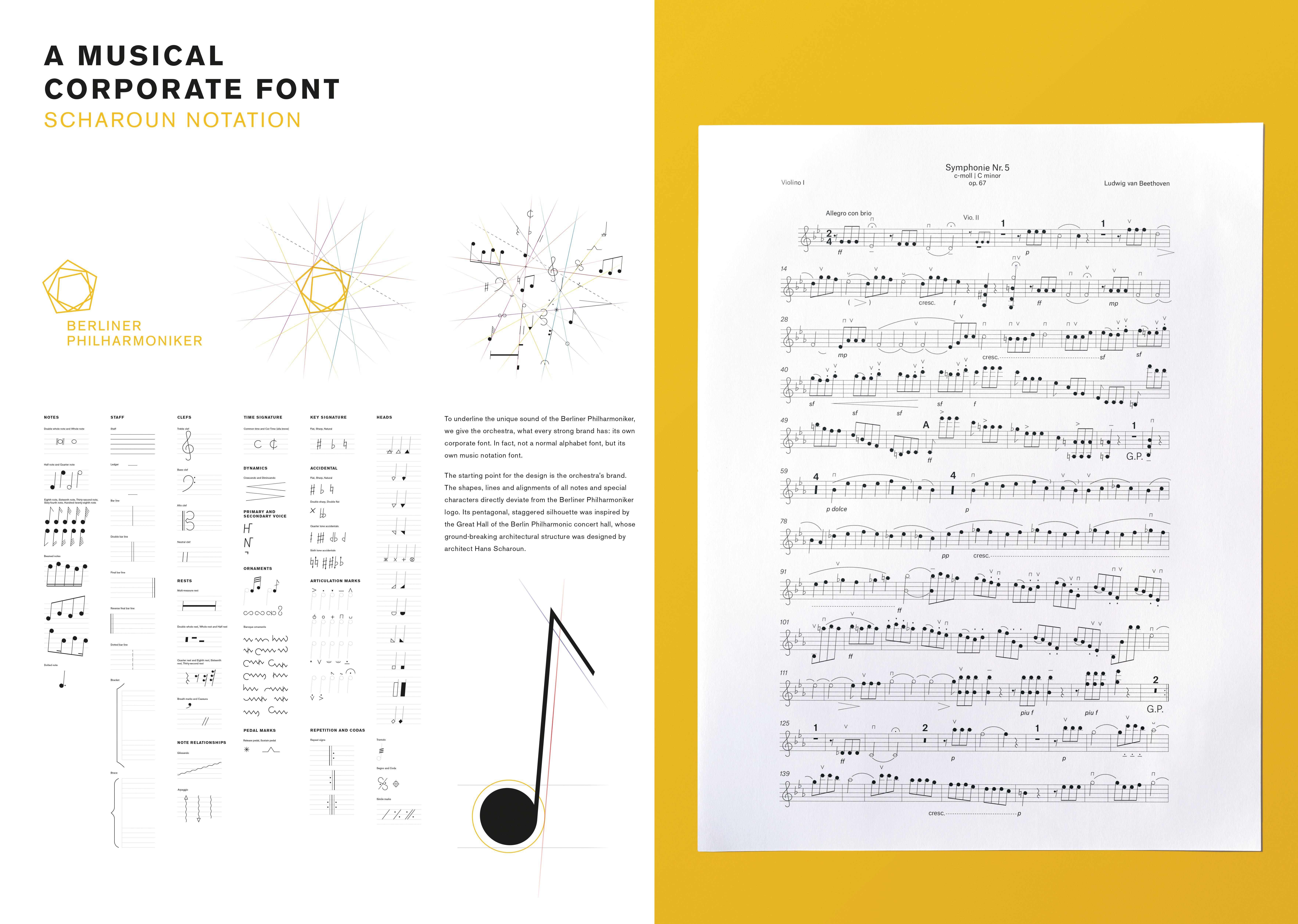
The Berliner Philharmoniker are one of the best orchestras in the world. For many decades, they have been known for their supreme and distinctive sound that sets them apart from other classical orchestras. The objective was to communicate this exceptional status – within the limits of a tight budget. Therefore we had to look for an unusual approach.
Execution
The starting point for the design is the orchestra’s brand. The shapes, lines and alignments of all notes and special characters directly deviate from the Berliner Philharmoniker logo. Its pentagonal, staggered silhouette was inspired by the Great Hall of the Berlin Philharmonic concert hall. The hall’s ground-breaking architectural structure was designed by architect Hans Scharoun, after whom the notation font was named.
Similar Campaigns
12 items


