Cannes Lions
Center Parcs Europe: It's Human Nature
DESIGNSTUDIO, London / CENTER PARCS EUROPE / 2023

Overview
Entries
Credits
Overview
Background
For over 55 years, Center Parcs Europe has been a pioneer of the travel and hospitality sector in Europe. With 29 Parcs throughout the Netherlands, France, Germany and Belgium, Center Parcs Europe brings people together in nature to enjoy unforgettable holidays and make new memories with their loved ones.
In line with a broader reinvention strategy, the modernisation of existing parks and investment in new locations, Center Parcs Europe appointed us to reimagine the brand idea and visual and sonic identity. The brand refresh needed to:
*Reposition Center Parcs Europe from an option for families with young children to become a popular choice for all loved ones – be that friends; traditional, extended or blended families; teammates or colleagues
*Better reflect Center Parcs Europe innovative spirit and the modernisation of their parks
*Define a brand story that would become the foundation for the entire brand experience
Idea
Center Parcs Europe was founded on the concept of ‘man + nature’. Our brand idea, Human Nature, goes back to these founding roots and symbolises how the brand enables you to truly connect with nature and each other. It becomes the guiding vision to reimagine the Center Parcs Europe experience across every touch point and unite all brand communication.
Center Parcs is aimed at travellers who are looking for local, sustainable vacations and authentic experiences in nature. A focus of the brief was to extend the appeal of Center Parcs beyond families with young children to anyone looking to share travel experiences with their loved ones - be that friends, family or colleagues.
Execution
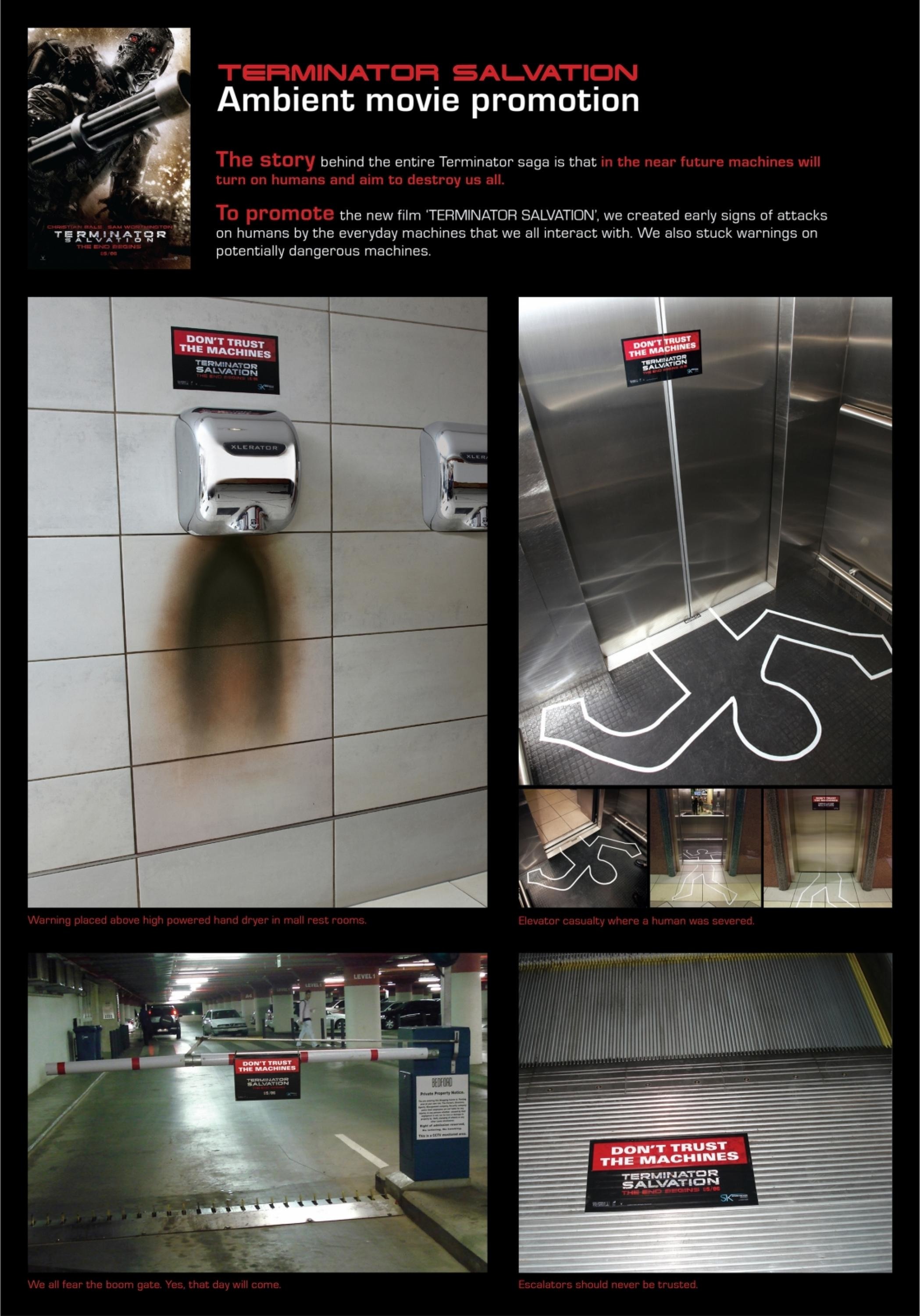
Logo - brings together the three crucial elements: brand name, nature and humans.
Typeface - Bagoss was chosen for its circular joints and organic terminals.
Colour palette - moves beyond the expected green to a vibrant and flexible palette inspired by all facets of the natural world.
Location badges - create consistency across the 29 parks of Europe whilst celebrating the uniqueness and heritage of each location.
Illustrations - inject warmth, joy and a human touch across the system, providing CP with a new way to share stories and ideas
Bespoke photography - depicts the full CP experience, the quieter moments, fun, adventures, connection. Photography works across three tiers: the textural close-ups of nature; real, candid shots of people and the coming together of humans and nature.
Graphic shapes - inspired by moments and elements in the parks, used to express content and form joyful patterns across environments and collateral.
Outcome
Whilst it is still early days to report on overall business impact, the launch of the new brand resulted in significantly increased traffic across all of CP's channels and website.
The new brand delivers against all aspects of the brief. It goes back to Center Parcs Europe’s roots but modernises it for travellers today who are looking for local, sustainable vacations and authentic experiences in nature. Initial research conducted with IPSOS by Center Parcs Germany shows the new brand "drives modernity and premiumness while fitting well with Center Parcs. For families with children, the new brand shows a positive intention trend to find out more and to visit. Among adults without kids, perceptions of Center Parcs have changed for the better. The brand has more equity and is seen to be more attractive."
Similar Campaigns
8 items