Cannes Lions
Design Language
GREY, London / BRAUN / 2018
Awards:
Overview
Entries
Credits
OVERVIEW
Description
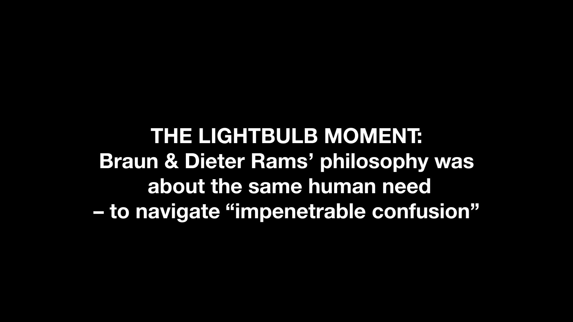
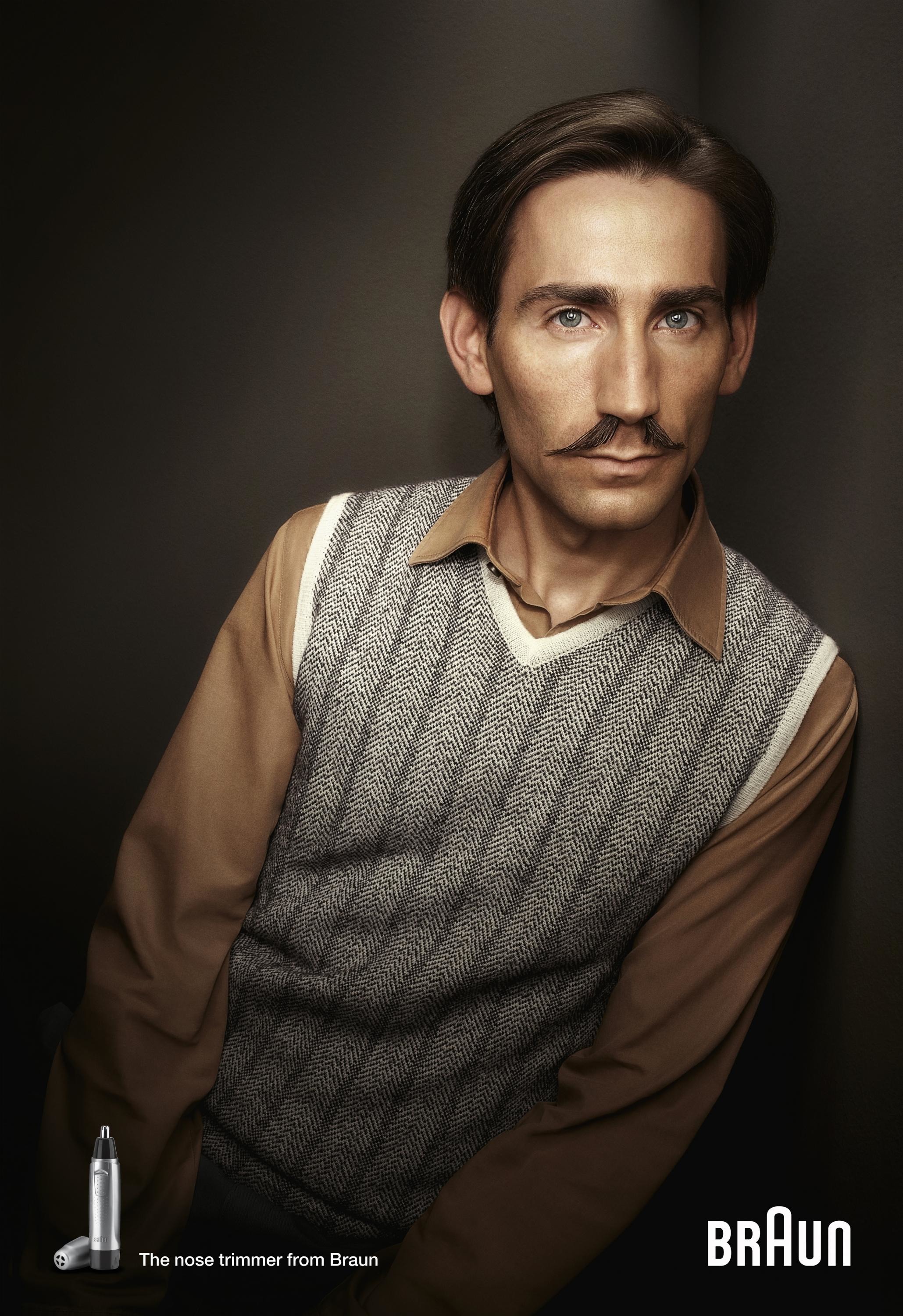
A reductive geometric language was created, derived from product design past and present, and reframed to communicate the brand essence to a modern audience who uses Brauns current products.
A system was developed around the new design language, balancing core principles of functionality and order with aesthetic beauty and craft. Developed to work across all touchpoints from retail to poster to ecommerce and digital, the new look and feel successfully bridged the past and the present.
Execution
While the brand refresh worked across a deep range of executions, it was best distilled in the form of simple graphic posters where the geometry, product and design system were at their purest. These principles of these posters were then applied in varying forms to every touchpoint across a vast commerce focused toolkit.
Special posters were re-produced in a vintage style, with screen printing and hand mechanical techniques in order to understand the subtle technique necessary in making modern digitally produced elements feel rooted in the rich past of the brand. These techniques of overprinting, composing and typesetting were then translated for digital reproduction in the brand guideline.
Outcome
Launched at the October Strategic Design Meeting, where the global deployment and sales teams ratify the marketing plans, the new Brand Identity was met with incredible response. Enthusiasm and excitement for the brand refresh increased toolkit adoption, retention and reproduction and has re-invigorated the entire organization to re-connect with the essence of this iconic brand.
Similar Campaigns
12 items