Cannes Lions
ELECTRICITY AND ENERGY COMPANY
SAGMEISTER INC., New York / EDP / 2012
Overview
Entries
Credits
Overview
Description
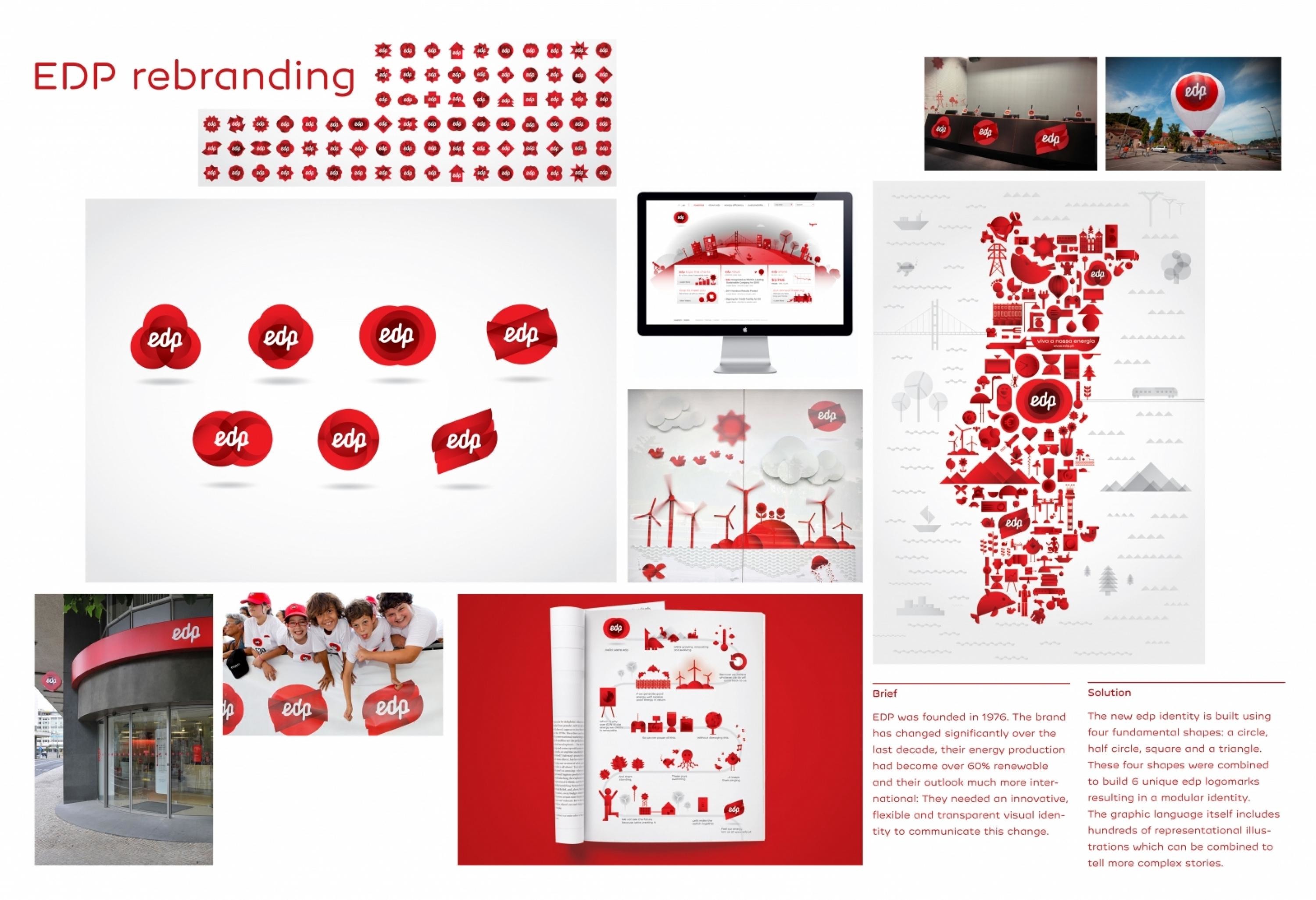
EDP was founded in 1976 from the merger of 13 of the 14 companies existing at the time, which had been previously nationalized. The brand has changed significantly over the last decade, their energy production had become over 60% renewable and their outlook much more international: They needed an innovative, flexible and transparent visual identity to communicate this change.
Execution
The new edp identity is built using four fundamental shapes: a circle, half circle, square and a triangle. These four shapes were combined and layered to build 6 unique edp logomarks resulting in a modular identity which is transparent, innovative, customizable, and can evolve over time: much like the edp brand. The graphic language itself includes hundreds of representational illustrations which can be combined to tell more complex stories. The commercial uses this language to introduce the new edp identity, highlight edp's impressive numbers relating to renewable energy and communicate edp's commitment to people.
Outcome
The identity was extremely well received by all stakeholders, including receiving positive reviews in the Portuguese main stream press.
Similar Campaigns
12 items