Cannes Lions
huevos de Clara y Ema
CREAMOS ESTRATEGIAS, Medellin / HUEVOS DE CLARA Y EMA / 2020
Overview
Entries
Credits
Overview
Background
We received a brief to create branding for free range eggs in Bogotá, Colombia. We looked to captivate the young audiences of today that make decisions to buy something based on responsibility and consciousness, as well as based on a brand's new and attractive storytelling. A free range egg brand is a great way to differentiate the product from industrialized eggs, but once in that category it's hard to stand out among brands.
We had a low budget to invest in media but we had a client wanting to impact different audiences, we made the decision to differentiate ourselves with a new idea and a very attractive and fun graphic proposal that would engage anyone who comes into contact with it.
Idea
We decided to differentiate ourselves using creativity and with the position of the brand in the market. We found the thing that makes our eggs unique and once done nobody else could use the same creative resource to position themselves as a brand.
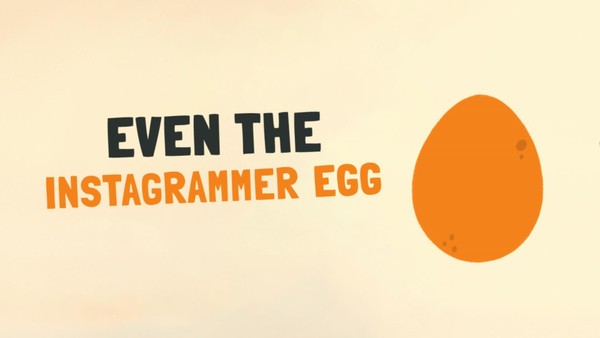
We know all eggs are the same, there’s nothing in their shape that makes one different from another, even the Instagram egg is just like any other; but we did find something that makes eggs unique and that is the shape they take in the frying pan. So we created a brand of free range eggs that are free to take any shape they want in the pan.
A new liquid branding concept was created. We started with a logo that changes its Isotype in a very fluid way depending on its application, and we continued to create a unique typography as a brand asset.
Execution
We created the whole brand's visual system using the following pieces:
Typeface: We created Fallin’ eggs, a display typography, meant to be used as a main brand asset to reinforce the communication in all media available. A color font was proposed in SVG.otf format which allows the same color, textures and other brand values to be used in design and web applications. The font is formed by 87 glyphs in upper case and lower case, accents, numbers and basic signs of punctuation.
Packaging: Where the whole liquid system was used to create container and label designs.
Merchandising: A fun collection of aprons, t-shirts, socks, pins, and notebooks which have captivated audiences since launch and today have become a new business opportunity for the owner of the brand.
Communication pieces: We also developed outdoor communication pieces with fun insights from Colombian pop culture.
Outcome
-The number of calls to the Customer Support Team doubled.
-There was a 25% increase in sales at its launch alone.
-A new apparel and accessories business was created with the fun image of the brand.