Cannes Lions
Identity rebrand of Monoprix's private labels
EXTREME, Paris / MONOPRIX / 2022

Overview
Entries
Credits
Overview
Background
Monoprix is a major French retailer, half department store, half corner shop, which makes grocery shopping a pleasurable experience. Thanks to its unmissable assortment of food, fashion, home & beauty products, nugget-brands and inspiring creatives, Monoprix opens the definition of a daily routine in the city.
Indeed, far from bland copicats, Monoprix’s brands have proven that the retailer never lacks audacity to offer a supplement of soul and happiness to its clients.
And the audience of this new range is no niche, it is all of Monoprix’s clients: grandad that comes 4 times a day; couples in their fifties decided to treat their friends with a dinner party; parents pushing the trolley to feed the tribe; young adults passing through every day after work; teenagers with pockets full of change for crisps and sweets. It’s you, us, those from urban areas and beyond their screen, trying to become better consumers.
Idea
Multiplying the efforts to create products that are more kind to environments, to animal well-being and to humans, Monoprix was looking for a global packaging concept enabling the brand to visibly translate its commitments in the most enjoyable way. And we're not talking about a few statement SKU's, but hundreds and hundreds of products that will leave behind the iconic stripes of the Bayadère graphic concept to join a new core-range, providing a higher perceived quality and more product appeal.
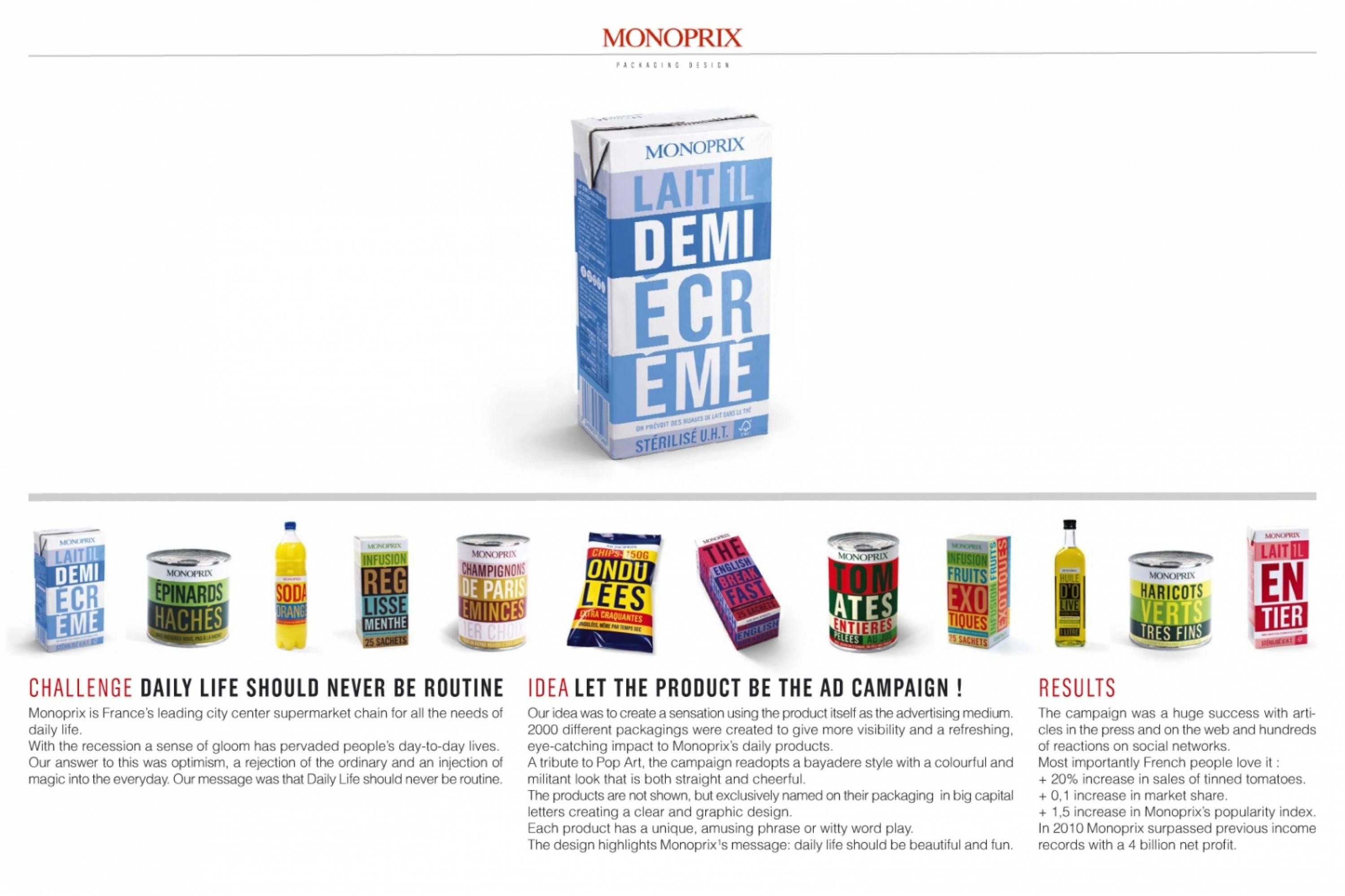
“Ping-pong" pays tribute to the visual heritage of the previous "Bayadère"graphic concept in reinventing the iconic stripe pattern and the playful taglines. Still, the core concept is very different: demonstrating the profound bound between the products' ethics and benefits. This split-structure creates a discussion between the good and the gorgeous and places Monoprix as the main actor of reconciliation.
Execution
Ping-Pong starter-pack can be summarized in 4 points:
A colorful and refreshing palette conceived to pop in the isles and enhance your kitchen cupboards.
A proud and central brand, which is highly uncommon for a private label.
Playful taglines that emphasize the products commitments, opening a cheeky conversation between the most conscious and the most pleasurable product attributes.
A Glamourous photo shoot to wrap the story in the deliciousest way.
As a whole, the new design raises the perceived-value to match the reality of the products quality and price, and provides the creative agility required to fit in all the product-categories, numerous types of packaging shapes and technical constrains.
Each product has its own structural packaging, constantly reaching for eco-materials: less and recycled plastic (no more transparent windows), natural resources, reduced ink coverage ie. on the back by letting raw materials or white background show through.
Outcome
Dealing with consumer goods representing 40% of the market, we're unable to give any requested information at this stage.
At the very beginning of production, we can say that the consumer tests passed with flying colors and that the project asks to deploy some 3000 references, released since November last year and progressively in 2022 and 2023.
All the references will be found in all Monoprix shops (700 shops in more than 250 French cities) and on the following websites: courses.monoprix.fr and www.amazon.fr.
Similar Campaigns
12 items