Cannes Lions
KOHO
ONE TWENTY THREE WEST, Vancouver / KOHO / 2019
Overview
Entries
Credits
Overview
Background
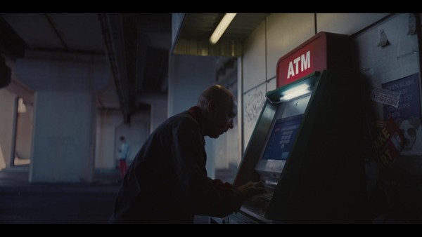
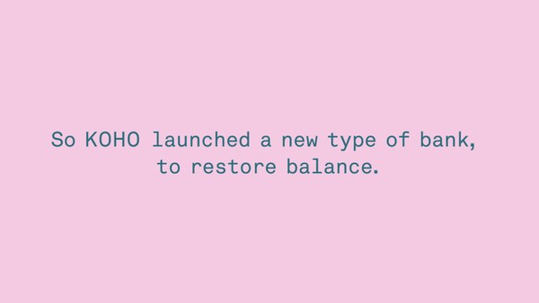
KOHO was built to help people restore balance to their finances. Our task was to create an identity that would entice consumers, make them proud to be a part of KOHO, but not see them as another bank. The brand needed to feel leading, energetic, but secure and stable.
The target was individuals who are aware enough to know that banks are increasingly imposing on their customers. They are avid consumers and manage their cash flow quite actively. They are more socially minded and progressing; open to change and willing to test new waters.
Idea
We created a platform for KOHO built on putting financial power back into the hands of the people. At the core, it was about finding balance between spending and saving both functionally and aesthetically.
Execution
Each logo and corresponding card featured two bold colours in different level of balance, representing how your balance will constantly shift from spending and saving modes.
The identity continued across the brand including the KOHO app that give them immediate insights into their finances.
The new identity launched in Canada on July 1, 2018, and cards could be acquired online via website, or the KOHO app.
Outcome
People really loved their new cards. KOHO saw a 35% increase in retention of new customers and a 50% decrease in Cost Per Acquisition with cards featuring the new card design and an overall 50% increase in customer activations. People also shared their love of their new cards on social media in surprising numbers.
Similar Campaigns
4 items