Eurobest
La Redoute is transforming
CARRE NOIR, Paris / LA REDOUTE / 2023

Overview
Entries
Credits
Overview
Background
Context:
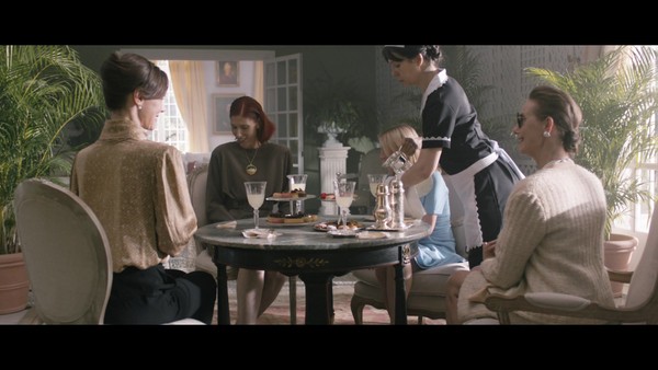
Now integrated into the Galeries Lafayette group, La Redoute, French e-commerce leader in Fashion & Home Decoration, opens a new chapter in its history.
While La Redoute has been a model of creativity and reinvention for generations, its transformation has accelerated significantly in recent years. La Redoute no longer just dresses families, it furnishes and decorates their interiors. A renewal that La Redoute must now proclaim loud and clear through a brand new identity and a new very rich graphic territory.
Challenge:
Support the acceleration of the brand by embodying a strong digital brand capable of
to welcome on its platform a great diversity of products, national brands but also its own brands.
Budget:
230k
Idea
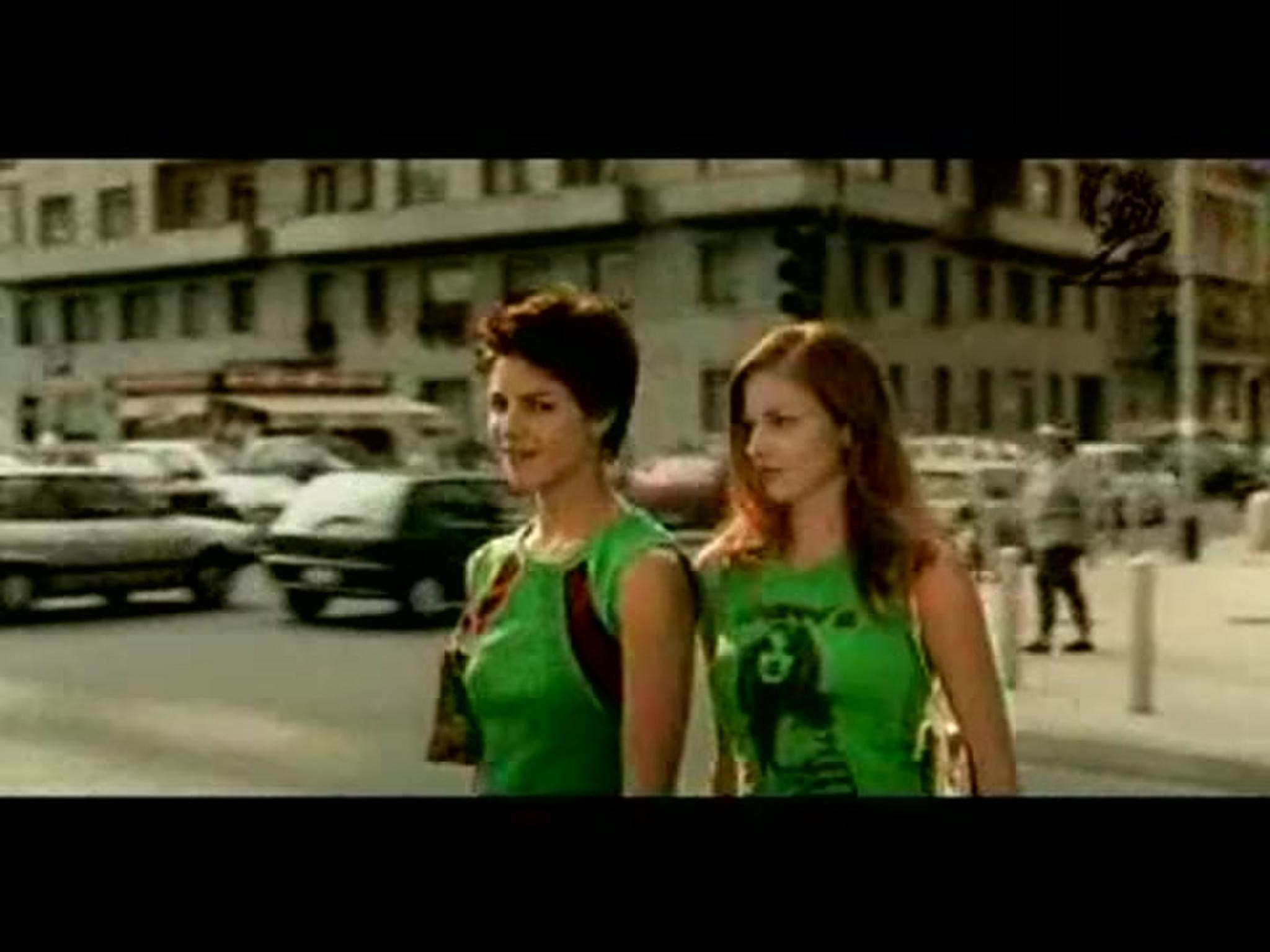
In a constantly changing world, where profusion of choice has become the norm, La Redoute, the leading e-commerce platform for fashion and home decoration, is a true point of reference for families when it comes to making the best choices for their home furnishings. Its mission: to make life more beautiful for families.
La Redoute simply reflects life, our stories and therefore our homes. A mix of genders, ages, bodies, styles that live with each other. La Redoute is a personalized and inspiring shopping experience: "the perfect blend".
Execution
In line with this new platform, we created a disruptive identity: square (like a house) and in motion. A chameleon-like visual identity that can be adapted endlessly, in bright, vibrant colors and bold prints, symbolizing La Redoute's adaptability to every household and to the trends of its time.
True to La Redoute's personality, the brand and its universe are pop, colorful, spontaneous, always on the move and resolutely trendy. It can take all the colors in La Redoute's palette and be worked with materials such as gradients, textures and images for more specific messages. Its fonts, the first rounded and the second condensed, echo the duality of the logo.
With a graphic structure that blends both right angles and softer curves for another perfect blend of endless combinations.
Outcome
• A change that is highly noticed and appreciated by users
• Influencers, journalists, followers saw a real break with a very modern ID.
• A social media reveal that engages
• More than 26 press releases
• La Redoute also interviewed a panel of 703 customers to gather their impressions on the new identity: The feedback on the logo is mostly very positive (about 78% of verbatim positive). They find it much more modern, dynamic, colorful and find that it rejuvenates the brand.
Similar Campaigns
12 items