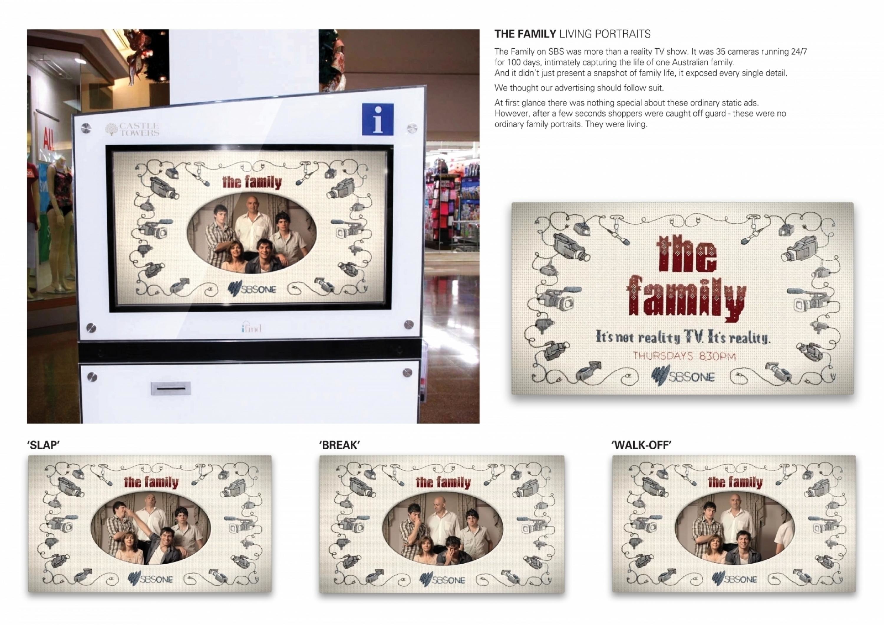
Cannes Lions
MARCO POLO TITLE SEQUENCE
MILL+, New York / NETFLIX / 2015

Overview
Entries
Credits
Overview
Execution
The directors spent time in the Mongolian art section of the Metropolitan Museum of Art, inspired by historical calligraphy, painting and ceramics associated with narrative arts.
To decide which images to use in the titles, the directors read through the shows’ scripts, highlighting scenes and moments that personified the main themes, and then distilled those into simple silhouettes. The traditional inky medium created a surprising contrast when the violent images were viewed.
The ink was captured practically. A two-camera set up was used, so the artists could safely film interesting ink movement in the wide shot while capturing compelling macro images.
To create the appearance of an invisible hand “painting” the visuals, the director painted an image with water onto dense paper that prevented it from being absorbed. Ink was dripped in, which quickly spread to “fill in” the image. Complex illustrations were composed of multiple elements by 2D artists, in some cases utilizing over 20 elements combined to create a final image.
The typography had to integrate subtly into the scenes and support the imagery. Modern, sans serif letterforms were used for a look similar to the era of the show, but with a connection to the present.
Outcome
The sequence explored Marco’s life in the Mongol court, capturing the spirit of his continental adventure through ink washed imagery and themes. Similarly grim scenes greeted the legendary traveller as he journeyed to meet the conquesting Kublai Khan. The relationship between the Venetian and the Khan, between eastern and western cultures, was central to the Netflix series.
The titles were about setting up the show. The directors wanted to create shocking and intriguing images that spoke to the main themes of the show, but were articulated in a traditional and beautiful ink technique. Viewers are surprised by the images after being made to feel safe by the gentle flow and grace of the ink.
By manipulating ink, the team found they could instill a feeling of controlled anxiety. The subject matter for each illustration is revealed to be much more gruesome than expected; a tethered hawk, horses, a severed head, and armies of both the living and the dead.
The desired result was for the titles to feel monochromatic and simple in contrast to the shows ostentatious production design.
Similar Campaigns
12 items