Cannes Lions
MAX Burgers packaging design
N96, Copenhagen / MAX BURGERS / 2024
Overview
Entries
Credits
OVERVIEW
Background
We needed a way to structure the portfolio in a clear way taking into consideration 2 primary users: Guest & Crew. It was important to accommodate the storage space in the restaurants — but with 10 wraps and over 50 burgers on the menu we needed to think smart — also creating tiers in the portfolio with a naming convention and distinct look for MAX’s deluxe burgers and their classic burgers.
Project scale and volume : MAX Burgers is a QSR- business with 186 restaurants in 4 markets. With a turnover of SEK 5.3 billion and approximately 71 million guests visiting us annually (2023).
Idea
The updated visual and verbal representation of MAX Burgers packaging, the climate-positive food company and renowned Swedish burger chain, pays tribute to its Swedish roots and the rich legacy it has cultivated over the years. The primary objective was to strike a harmonious balance between a refreshing new design and the comforting familiarity that MAX embodies. By delving into the essence of MAX through its iconic logo, the design system was anchored in the foundation of the brand, emphasising the distinctive red and white stripes. This simple yet powerful symbol serves to unite the brand and its diverse portfolio while retaining a sense of familiarity for the loyal MAX guests. To infuse a sense of fun and flexibility into the system without excessive material usage, stickers were ingeniously crafted to customize each burger for the guests various preferences, and providing adaptability for a constantly evolving portfolio.
Execution
This project had a high complexity that was distilled into a simple solution through a portfolio architecture that holds complexity but translates into an easy and joyful visual language. Working with this we have had to have a strong synergy between the strategic thinking to be able to realise a system that leverages the iconic heritage of max, adding their love for innovation and creations within in their food portfolio.
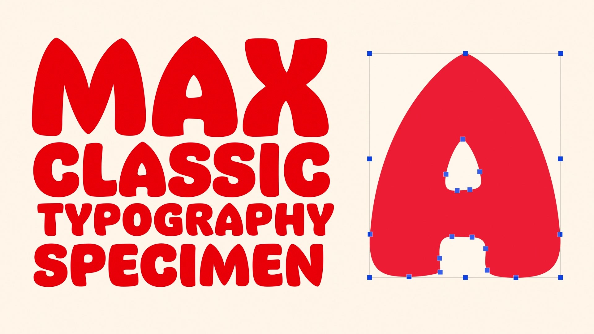
Further enhancing the brand’s uniqueness, a custom-designed typeface Max Classic™ was introduced. This exclusive font, solely owned and utilized by MAX, was meticulously crafted to convey MAX’s dedication, craftsmanship, and the sheer joy of food. Inspired by the iconic brandmark, this cheerful typographic element adds depth and distinctiveness to the MAX packaging and brand, contributing to its overall personalised and engaging identity.
Outcome
We’ve sought to strike a delicate balance, where innovation meets heritage, and the familiar embrace of the MAX brand endures in the face of change.
Max innovates and is an agile creator that never stops creating new and exciting flavours which was one of the main things we had to help them being able to do still — which is where the stickers is an active tool. With a set of core stickers that creates possibilities for the guests to create their own bespoke burger and a set of stickers for limited editions and innovative creations.
Similar Campaigns
12 items