Cannes Lions
Movati 2018 Rebrand
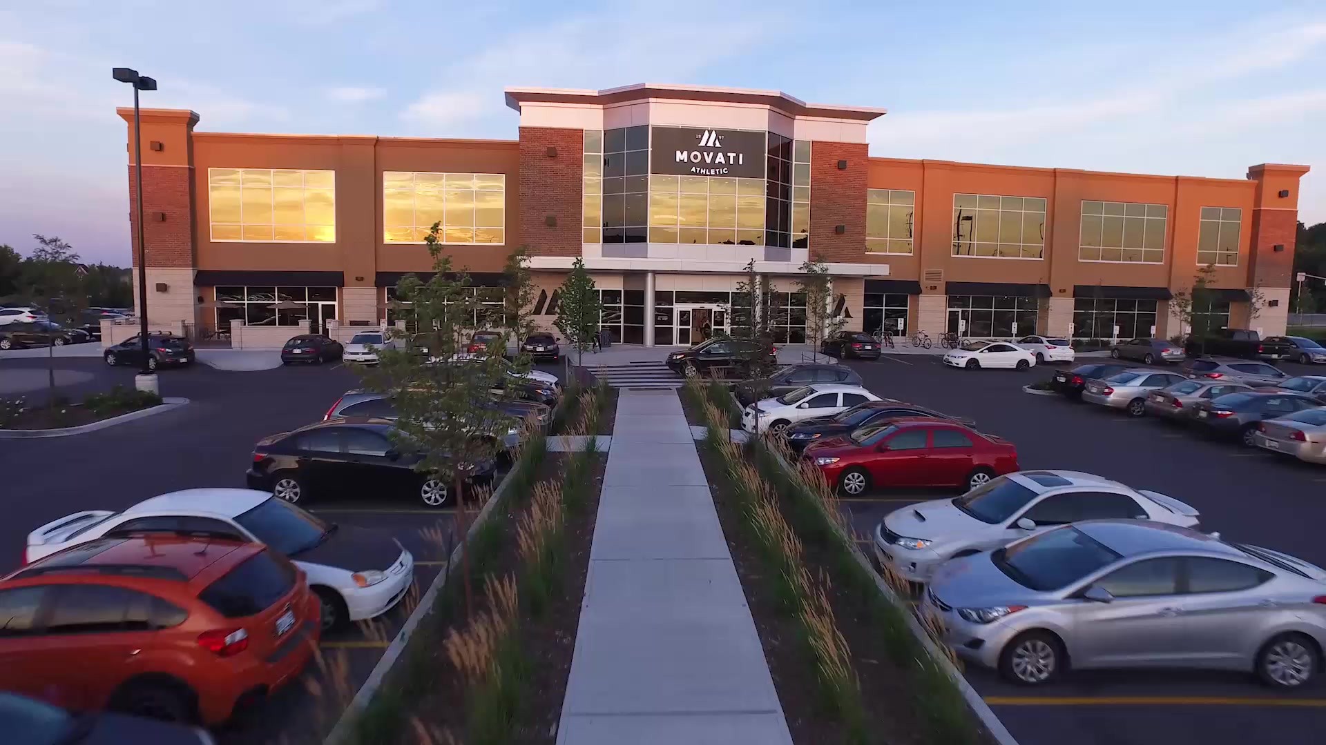
ICF NEXT, Toronto / MOVATI ATHLETIC / 2019

Overview
Entries
Credits
Overview
Background
Situation:
The affordable luxury of Movati’s unique club offering was lost in generic gym marketing.
Brief:
Transform the brand to stand out against the noise of the competition.
Objectives
Increase awareness and foot traffic.
Demonstrate that Movati isn’t like any other gym.
Show that it’s a luxury club that’s actually affordable.
Budget
Brand refresh: $61,000.
Ongoing advertising average: $29,200 /month for creative production, $150,000 / month for media.
Project scale and volume
Our refresh affected all of Movati’s properties and advertising, including their website, out-of-home (billboards, transit shelter, transit station), direct mail, door-hangers, newspaper, print, social media (Facebook / Instagram), and in-store signage. The new identity was applied to their first-ever radio spot, which uses moments of quiet to capture the audio version of our use of white space to create a clean sound indicative of the spotless clubs.
The work ran throughout 15 target cities in Ontario, Canada.
Idea
"Fitness that puts you first"
In speaking at length with the club founder, we learned that his approach was based on talking with club members, on offering premium amenities at an affordable price and building facilities to last. He wanted the same from the rebrand. Our creative idea was to manifest the beliefs of the brand in every piece of creative – luxurious, affordable, spotlessly clean, premium, welcoming.
That’s why all the creative is human-centered, with an emphasis on extensive white space to separate us from noisy gym advertising, and as a nod to Movati’s obsession with cleanliness.
Our target is spread across several types of club-goers, but our primary target is women, aged 35+ with a HHI of $85K or more. They are social fitness users who value the experience of the club more than notions of "gains".
Execution
Design elements and their integration:
Logo design incorporated into whitespace and used as creative dividers.
Extensive whitespace to communicate cleanliness and separate us from other loud gym ads.
Design touch points:
Website, billboard, direct mail, print, Facebook, Instagram, radio, transit (shelter, station, vehicle), in club signage, apparel.
Materials, style elements, design choices:
Logo elements are factored into all creative, with angles and curves of the Movati ‘M’, what we call the "Serif", subtly woven into all creative.
In copy, a blue text signifies a foundational belief, never a transaction.
The tone of voice and copy is simple, inspiring and welcoming.
Offers and transactions are treated differently from aspirational brand messages.
Design development and process:
Used actual club members in our ads (conducted a 3-day photoshoot).
Choice of campaign elements:
Distinct approach for transactional vs brand messaging.
Approach:
Highly collaborative with client, club members.
Scale
Ontario-wide
Outcome
Value added to brand:
Prior to this refresh, their brand was more reflection of the what they saw in the industry as opposed to their own identity. the value is seen as enormous by client.
Value for consumer:
Members tell us that our line, “Why settle for a gym when you can join a fitness club” resonates as we continue to own an area of a luxury that’s surprisingly affordable.
Reach/cultural impact:
Our reach is in one province of Canada, but just one of our newspaper ads in Burlington, Ontario resulted in 100 walk-ins in a single day. The work is getting noticed.
Sales:
Sales have been on a steady increase, with learnings along the way. For example, our recent leads were targeted at 9,552, actuals were 12,636.
Achievement against brief:
The brief was to take the advertising into the ‘approachable, affordable luxury” category, and that has been achieved.