Cannes Lions
NYPhil
OGILVY, New York / NEW YORK PHILHARMONICS / 2022
Overview
Entries
Credits
Overview
Background
Despite its modern and vibrant programming and ambition to be at the center of New York City's cultural conversation, people perceive the New York Philharmonic as elitist, unapproachable and uninviting.
The opening of a newly reimagined hall for its 2022/23 season was the opportunity to dust away its elitist and unwelcoming perception. Our agency was briefed to rebrand the New York Philharmonic to appeal to all music lovers, not just classical ones, and to compete with the breadth of iconic art institutions across NYC. The revival needed to be more human, welcoming, dynamic and modern, while honoring the history between the city and its orchestra.
The agency developed a new logo and identity to usher in the next chapter in the New York Philharmonic's storied history. The system needed to have flexibility to work across the portfolio of offerings and types of performances while staying bold and expressive.
Idea
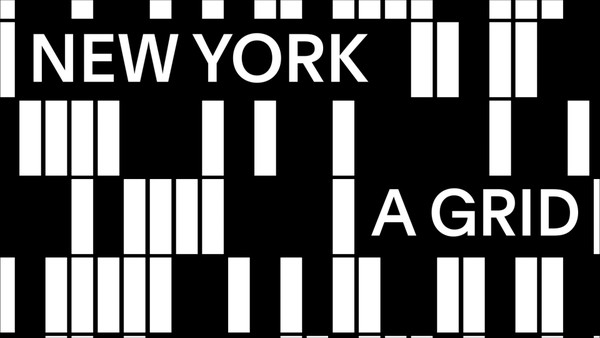
With a newly reimagined David Geffen Hall, the NY Phil is turning its hall into a home for all music lovers. Its new home will allow people to see, hear, and experience the NY Phil from every possible angle by inviting the audience to surround the orchestra, enabling people to have a more inclusive and ground-breaking connection to music. The new logo and visual identity reflect this while keeping New York at its heart. New York surrounds the Philharmonic, just like the audience surrounds the orchestra. At 65th and Broadway, the NY Phil is located at the heart of Lincoln Center, an iconic three block campus dedicated to the performing arts — a rare square inside the grid that is New York City, one that represents infinite possibilities.
Execution
With a newly gut renovated David Geffen Hall, the stage was moved towards the center — allowing the audience to surround the philharmonic. Our goal with the identity was to express this new intimacy, while placing the concerts and performers at the center of the brand. We did this by using the logo as a frame over stage and portrait photography. The system also expands into using 3D models for special concerts such as film scores and rare music pieces.
The system is built around three key elements: logo, square and typography. Each getting their own moment in the spotlight. It was important for NY Phil to stay away from any music design clichés in order to not be mistaken for music education. Instead, we took inspiration from museums and institutions to create a system that would last decades while also being as expressive and bold as their world-renowned performances.
Outcome
After losing more than $27 million in anticipated ticket revenue during the pandemic lockdown and moving into a new $500 million home in the fall, the stakes were high.
The rebrand was a historical success achieving dual goals of re-engaging our core audience and bringing in new audiences. Following the announcement of the inaugural season in the new hall with the rollout of the new visual identity, the NY Phil recorded the strongest subscription on-sale in recorded history, increasing revenue by over 40% in the first four weeks of the campaign. The new Identity also achieved its goal of attracting new audiences by bringing in nearly 6 times more new subscribers than usual at this first stages of the sales cycle.