Cannes Lions
OSOM
VOSKHOD, Ekaterinburg / OSOM FINANCE / 2020
Overview
Entries
Credits
Overview
Background
An Estonian-Belgian fin-tech startup has launched OSOM – a cutting-edge online service for finance management. The new product needed to make an outstanding market entrance. The app was launched in Europe in the environment of huge competition between financial institutions that develop their own digital products. OSOM is multi-purpose and is designed to fit all requirements of careful finance management. Its dynamic nature was created to match the equally dynamic lifestyle of those who would agree to no compromise as for controlling their money in the most efficient way possible.
Idea
OSOM is the world’s first application for private users that allows managing traditional and digital assets through one account and transfering money between them. It is designed to fit all the needs of digitally savvy consumers and their finances. Its dynamic nature matches the equally dynamic lifestyle of those who would agree to no compromises controlling their money in the most efficient way possible.
The brand identity needed to reflect the easy-to-manage and flexible character of the application.
Execution
The idea of constant ongoing transformation lies at the core of the brand style, symbolizing ease of finance management and currency transformation. The dynamic logo is a symbol of financial management and free flow between currencies. It is based on color-shape transformation, that’s why instead of a typical brand color there are only color pairs «form/logo». No rigid color-coding was implemented to reflect the ease of currency conversion within the service.
The brand color continues the idea of the logo – the free flow of money supply, the constant alteration of letter sizes and colors.
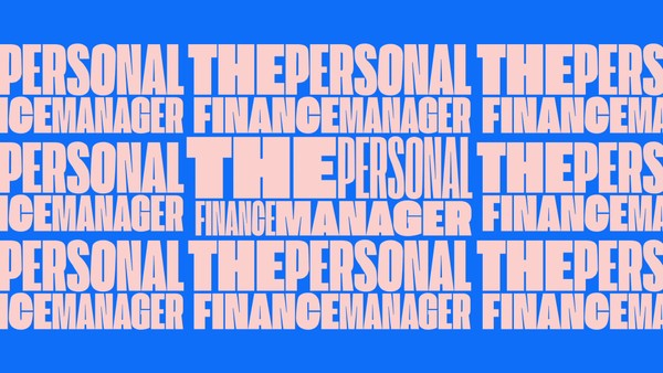
The experimental typography has become the accidental element of the identity. Morphing of typefaces — where Extended switches to Condenced, and color filling of one word comes in contrast with contouring typeface of the other — it all vividly illustrates the movement of money flows and changes of their volumes.
Outcome
Since its launching, the app brought the company over 10 000 new users.