Eurobest
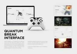
Quantum Break Interface
GREAT APES, Helsinki / MICROSOFT STUDIOS / REMEDY ENTERTAINMENT / 2017


Overview
Entries
Credits
Overview
Background
When we were asked for a proposal on the interface for Quantum Break we looked at vast amounts of sci-fi entertainment as a benchmark. Very quickly it became obvious that nearly all sci-fi entertainment (be it games, movies, websites etc) pretty much follow the same aesthetic of elements in slightly futuristic frames, flickering motion design, monospaced typography and a huge amount of elements to crowd the screens.
The objectives were to challenge how AAA game interfaces both look aesthetically and bring in some best practices from more refined interfaces (such as operating systems, apps and such).
The project was approx. 8 months and the overall budget around 100.000 euros.
Execution
The general visual concept was set at the original pitch. After this we started to finetune the style. This was mostly a process of taking out elements and getting the menu system don't to it's minimal visual core.
We wanted to keep the colour palette very simple so all the images used were monochromatic. We chose a light background for the game menus so there would be a very clear distinction between actual gameplay and the menus. This also helped to keep the typography more readable and allowed negative space to shine.
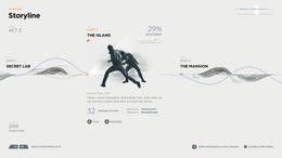
Since the game is about time travel we had to build a chronological timeline that connects different acts within the game to each other and so's the butterfly effect of the players actions. For this we developed "time strings" which are a simple visualisation connecting certain events within the timeline.
For the menus we produced a fully working HTML prototype to test the UX on a full HD tv with a Xbox controller.
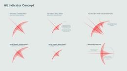
As for the HUD (heads-up-display) our dedication to absolute minimalism proved to be even more challenging. We didn't want the elements to seem at all blurry so eventually the only option was to align all illustrations into a pixel grid for all resolutions. For the more abstract time powers we simplified each of them to a symbol that would be understandable but would take as little screen real estate as possible.
The motion design is extremely functional and to an extent similar to the motion design of mobile apps. This was also important due to the extremely visual and hectic nature of the actual gameplay.