Cannes Lions
You've Never Been In Better Hands
DROGA5, PART OF ACCENTURE INTERACTIVE, New York / ALLSTATE / 2021


Overview
Entries
Credits
Overview
Background
The insurance category is notoriously loud, chaotic, negative and full of scare tactics. And Allstate was no different—using the same destruction and mayhem to sell their products. But this chaos wasn’t just in their ads.
Founded in 1931, Allstate has been revolutionizing the category for nearly 90 years, which means 90 years of campaigns, spokespeople and different brands being shoved under one umbrella. And all this clutter added to an inconsistent and disjointed brand identity.
So when Allstate came to us, we wanted to transform Allstate’s brand from chaotic to simple and from negative to positive.
Idea
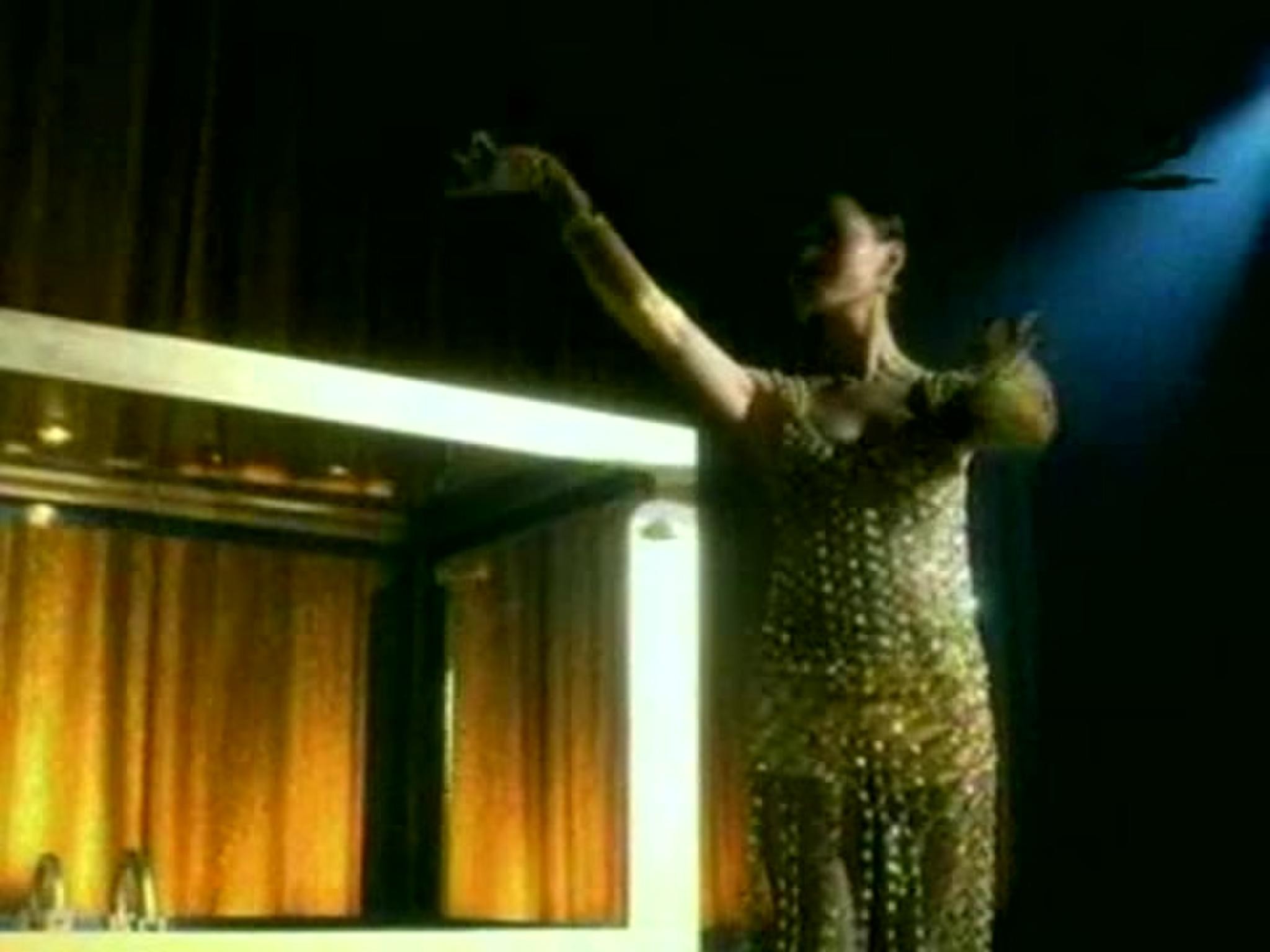
To unify the brand, we focused on an ethos that could be reflected in all that we do and say: showing people what it’s like to live well protected. This meant throwing out the chaos and destruction that are so prevalent in the category and replacing them with positivity, optimism and charm.
This came through loud and clear in our redesign as we simplified and unified the Allstate brand under this one clear thought. Everything from our logo, which we broke apart to make more iconic and bold, to adding more bright and optimistic colors helped to create the all-new Allstate—a new, positive insurance brand.
Execution
Allstate’s brand transformation started with their famed ‘good hands’ logo, which we pulled apart into two pieces. On its own, the wordmark created a more simple, bold and iconic look. Then we used our good-hands beacon as an element of its own, too. We added an echo that rippled outward to signal our growing world of protection. New bright colors injected optimism and lightness into our palette. These paired with our Allstate sans typeface created friendly, inviting and legible messages. And it all sat in a flexible grid, which used color and blank space to organize content with a contemporary look.
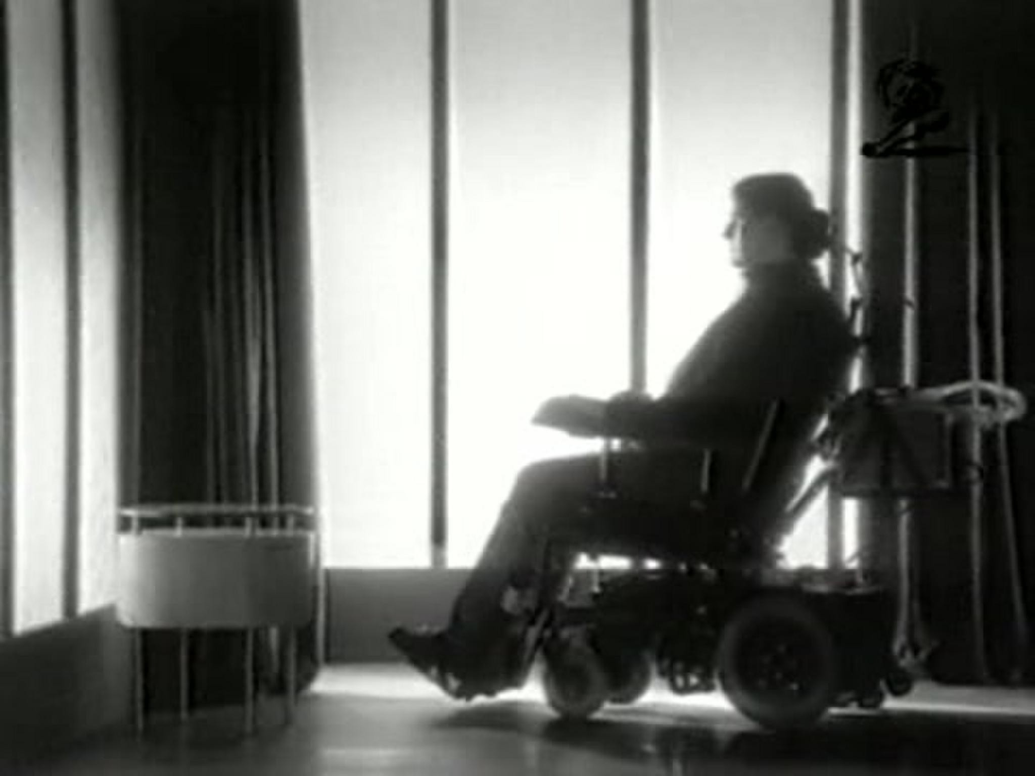
Even our photography avoided negative imagery to portray an easy confidence that showed real life, authenticity and charm. And it was no different in our films. That same optimism and rhythm paired perfectly with our clean, direct Allstate branding, touching everything from the digital experience, to communications, to retail.
Outcome
When all was said and done, we unified a brand with almost 90 years of products, policies and ad campaigns with a central design system that touched every aspect of Allstate’s business. We infused the brand with an all-new bold, optimistic and positive identity that touched everything from products, to communications, to our digital channels and retail.
Similar Campaigns
12 items