Eurobest
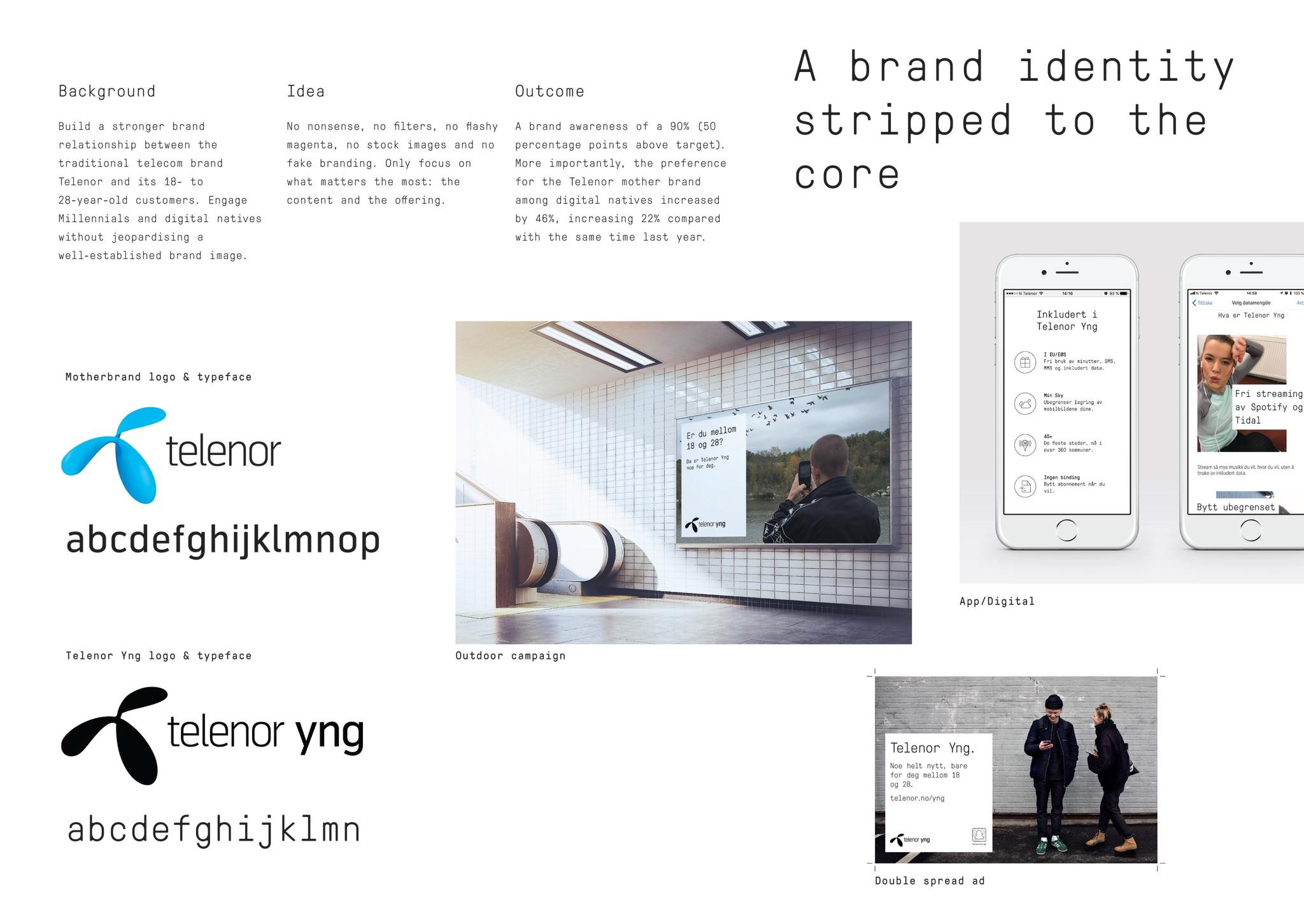
A brand identity stripped to the core
ANTI, Oslo / TELENOR / 2018

Overview
Entries
Credits
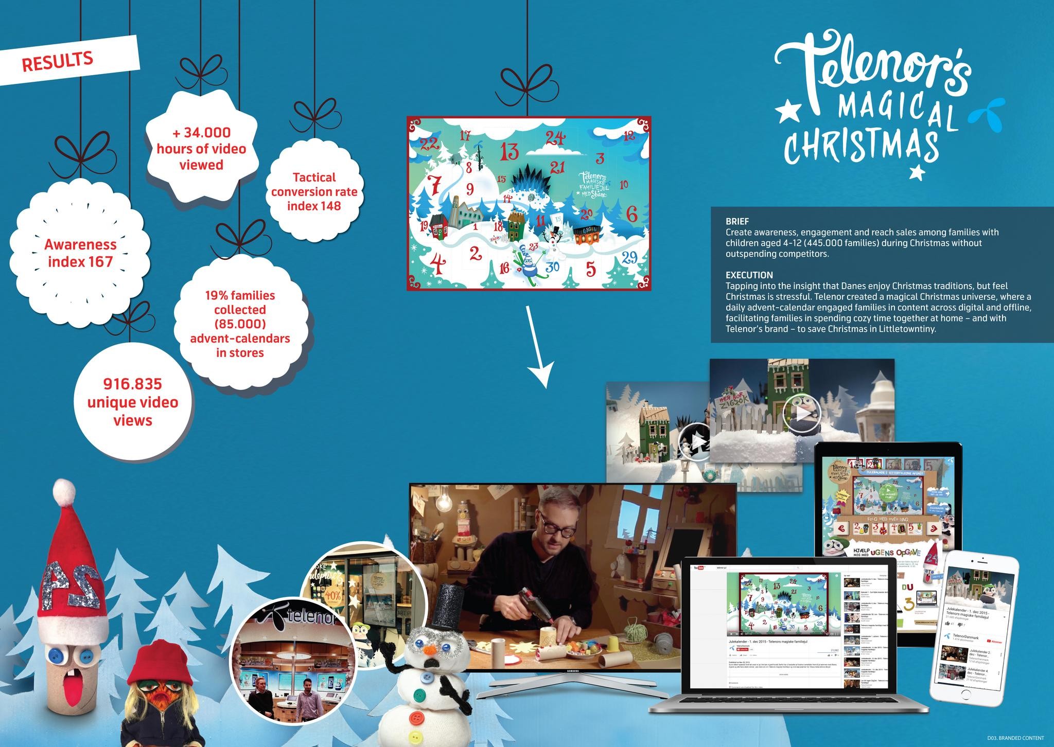
Overview
Execution
By stripping the communication elements to their core across all touch points, we made each offering clearer and more candid, using concise and plain language. We combined a stripped-back colour palette and a cut-and-paste aesthetic with no-nonsense copywriting, devoid of corporate smalltalk. Texts are presented in a monospaced font that’s reminiscent of bare-bones coding itself. Even the word Young is abbreviated to yng, to bolster its no-time-to-waste attitude.
The sum of all these parts is a comprehensible, commercial visual identity with a clear focus on what matters the most: the content itself.
Similar Campaigns
12 items