Cannes Lions
CIVIL RIGHTS DEFENDERS
PRIME PR, Stockholm / CIVIL RIGHTS DEFENDERS / 2010
Overview
Entries
Credits
OVERVIEW
Description
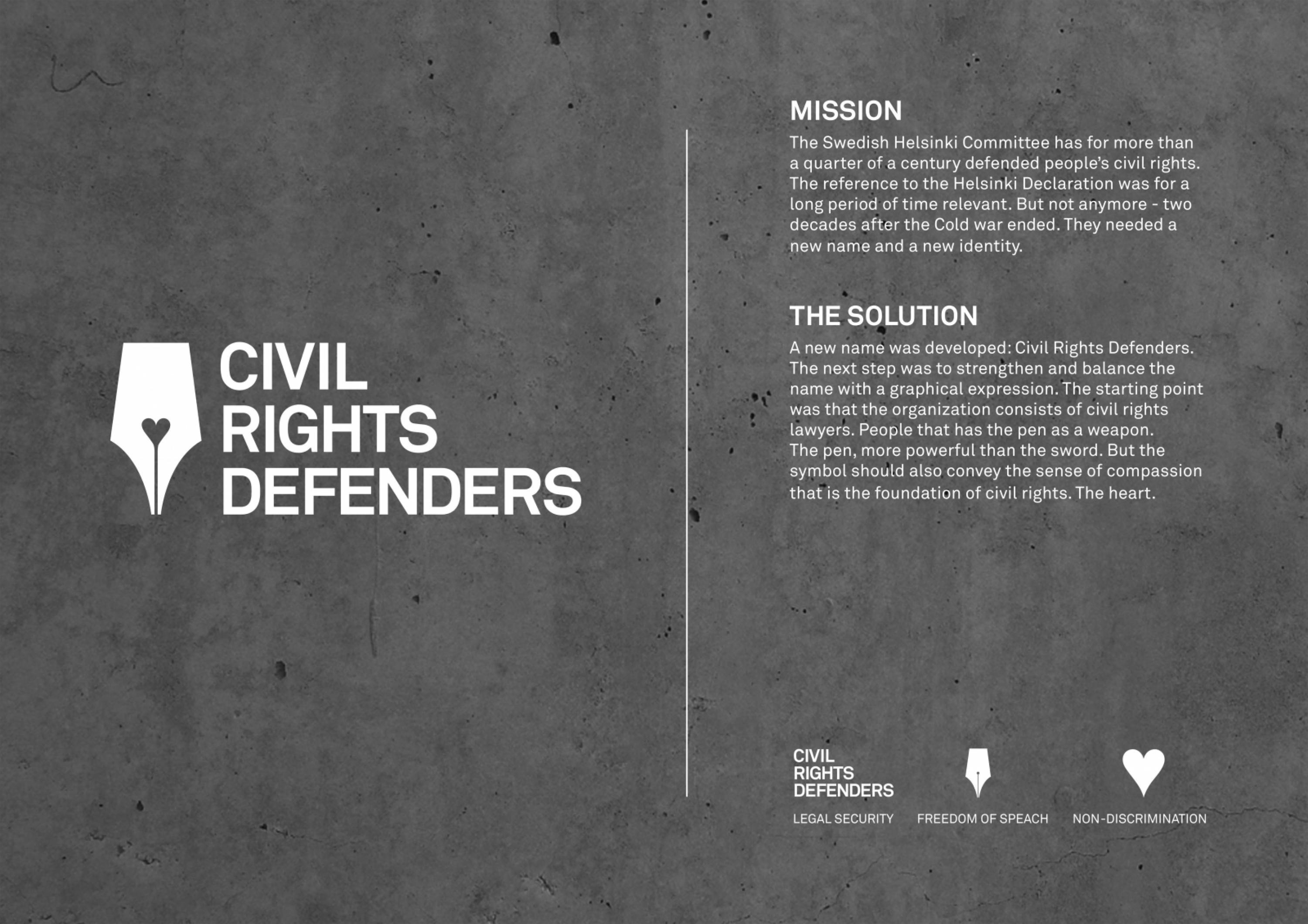
The Swedish Helsinki Committee has for more than a quarter of a century defended people’s civil rights. The reference to the Helsinki Declaration was for a long period of time relevant. But two decades after the Cold war ended that deal has lost its contemporaneity. The younger generations are not even aware of the agreement. The Swedish Helsinki Committee was in need of a new name. A new identity.
Execution
The next step was to strengthen and balance the name with a graphical expression. The starting point was that the organization consists of civil rights lawyers. People that has the pen as a weapon. The pen, more powerful than the sword. But the symbol should not only reflect how the organisation acts, but also why. It should convey the sense of compassion that is the foundation of civil rights. The heart.
Outcome
Changing both name and logo on an old, established and respected organisation is difficult. Especially within the field of non profit organisations where people work on the basis of belief and are expected to have opinions. In an evaluation interview with General Secretary Mr Robert Hardh, both himself and others involved in the project were very surprised not having received any negative feed back at all regarding the new identity.
Similar Campaigns
12 items