Cannes Lions
DOJO
DOJO, San Francisco / DOJO / 2011
Overview
Entries
Credits
Overview
Description
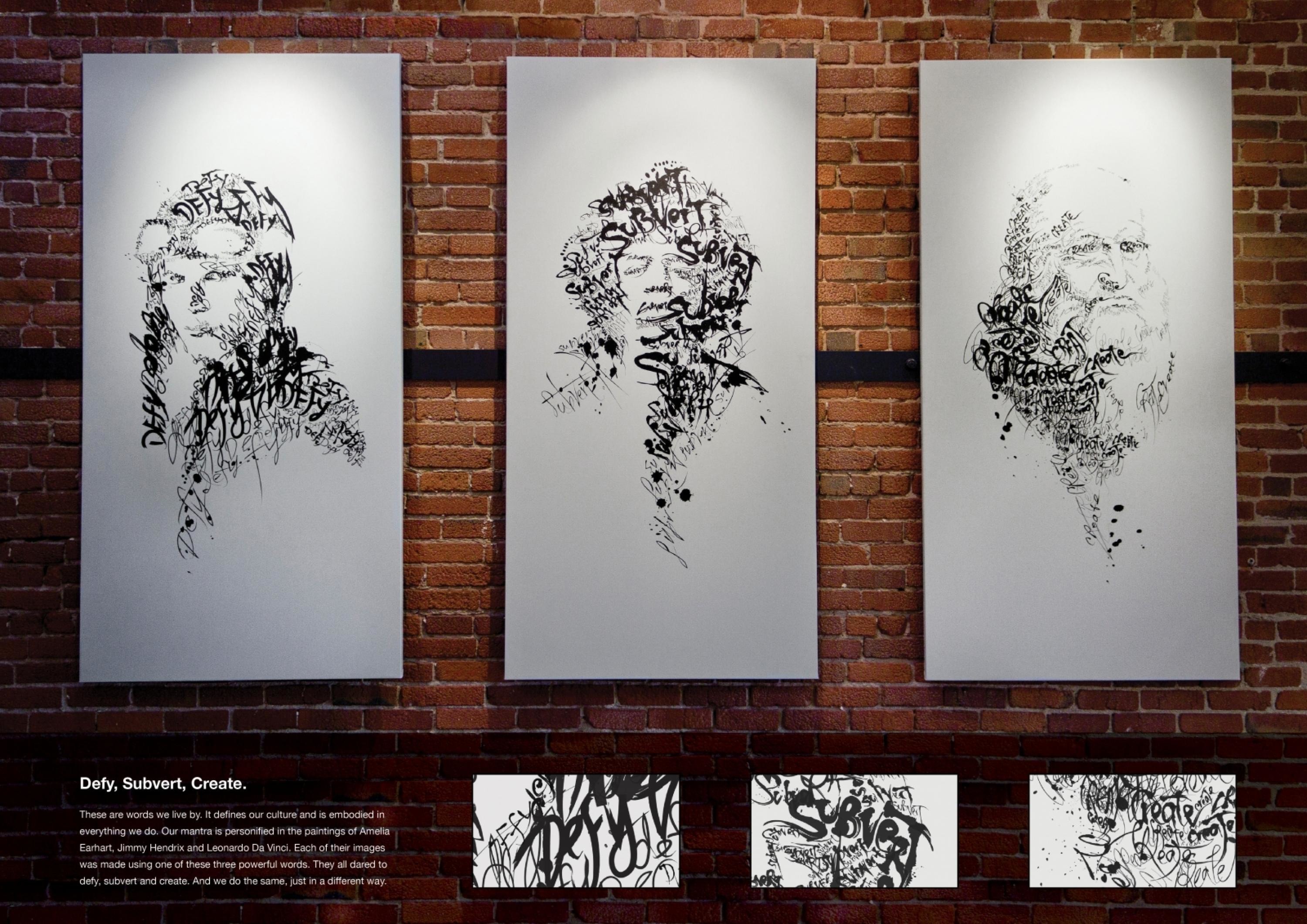
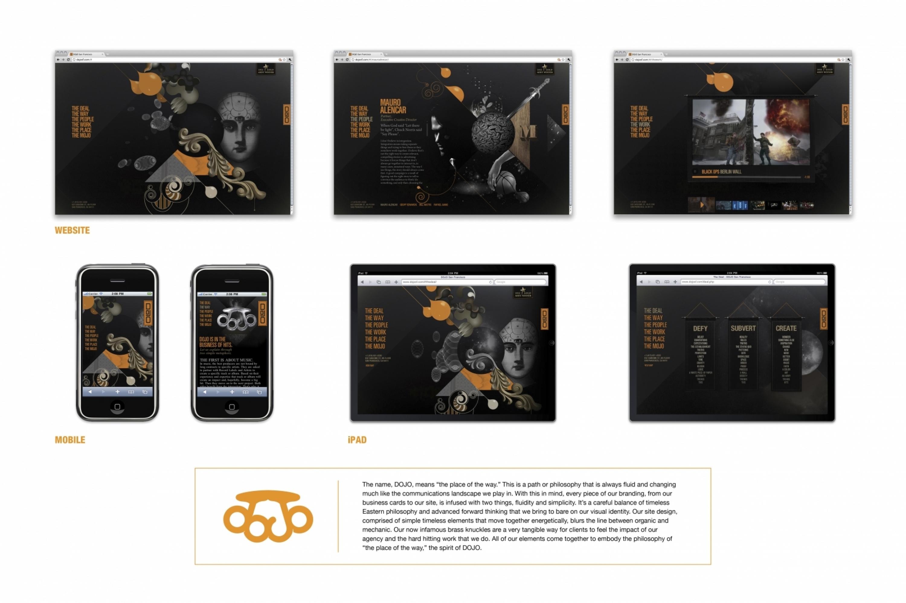
DOJO set out to create a visual ID that represented the toughness associated with starting an agency during a recession. We decided to have all of our brand messaging reflect toughness, perseverance, constant self-improvement and unity. The 3 words that make up our dogma are DEFY, SUBVERT, CREATE, and they speak to the mission of this organization. Those words represent never loosing sight of the barriers but always taking the 'road less travelled.' This belief lead us to everything from our name “DOJO” - which means “place of the way” to the “Brass Knuckle” logo created as our signature.
Execution
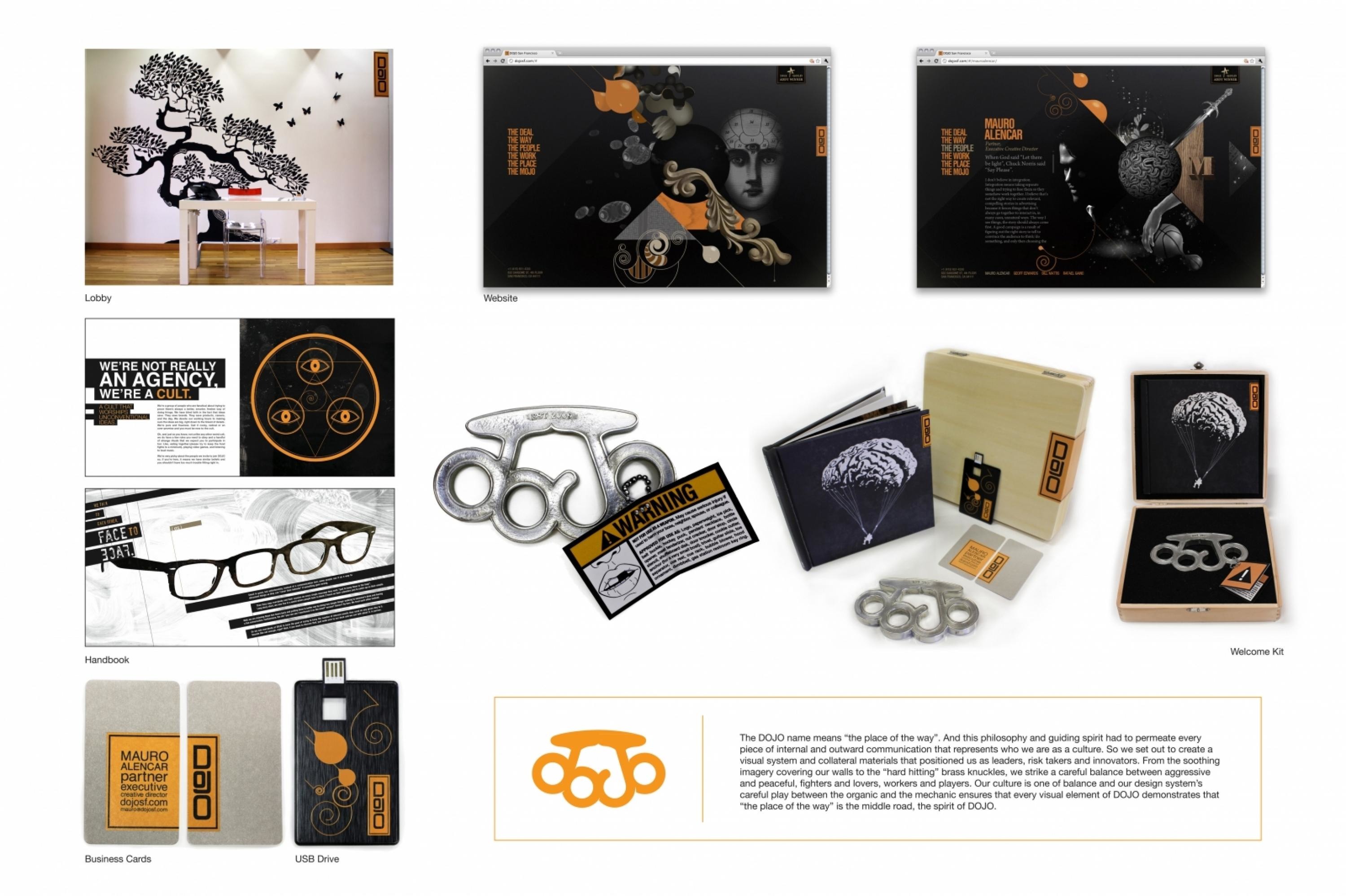
The creation of the DOJO logo paved the way for the remainder of our collateral materials. We didn't want just a logo. We wanted a flag. A beacon. Something with gravitas. We made an effort not to use cliché imagery or typography associated with DOJO schools for self-defense or other strong Asian references because we were interested in the spirit of the word DOJO and not it’s origins. We settled on a design that took the word 'DOJO' and moulded it into the shape of brass knuckles, which was an image we had been playing with for a while.
Outcome
Astonishing! 1 month after the DOJO website launched we won the FWA. The DOJO 'Knuckles' logo and the real “brass knuckles gift box” - which contains a real metal version of the logo encased in laser-cut foam inside a wooden box that also includes our reel on a USB CARD - became a hit with our clients and prospects. So much so that our Activision client invited us to create the logo for the widely acclaimed video game Call Of Duty Modern Warfare 3 due for release in 2011, along with a few other logos for their products and services