Cannes Lions
LEO BURNETT LONDON
LEO BURNETT, London / LEO BURNETT / 2011

Overview
Entries
Credits
OVERVIEW
Description
Leo Burnett’s website was awarded a D&AD Black Pencil in 2005. Back then it was an example of what websites were: Rich Media, flash-based destinations. But, back then, there was no Facebook, no Twitter, no iPhone, no Social.The brief quickly became one of how the agency would manage its Social, Case-Study, Marketing and Content. By using smart-tech and UX, manipulating new standards in html 5 code, we needed to build a scalable, OS friendly platform, with an idea behind it and a clear role within a wider communications eco-system connecting us with journalists, clients, agency partners and our Group.
Execution
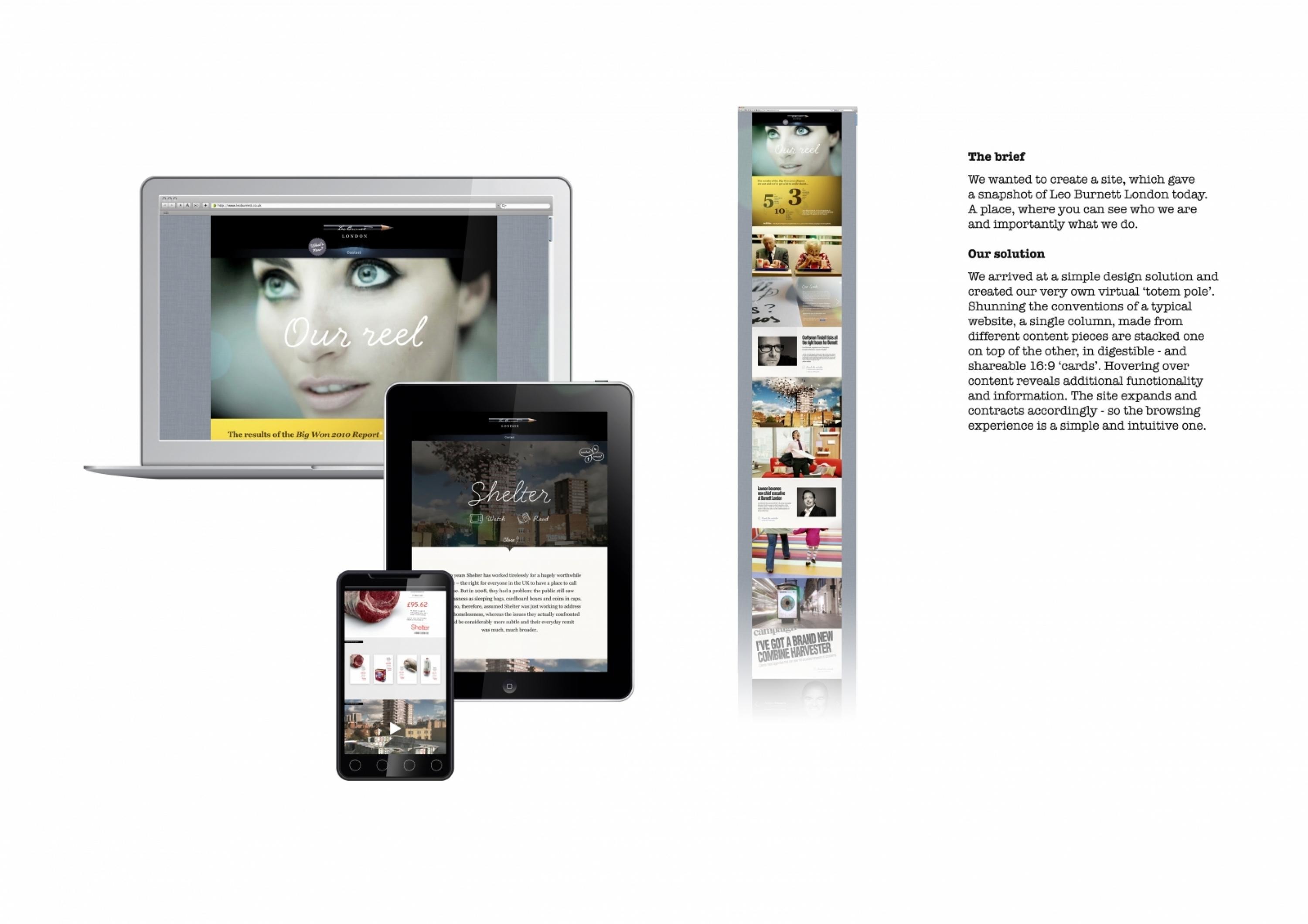
We wanted to create a site, which gave a snapshot of Leo Burnett London today. A place, where you can see who we are and importantly what we do. We arrived at a simple design solution and created our very own virtual totem pole.Shunning the conventions of a typical website, a single column, made from different content pieces are stacked one on top of the other, in digestible – and shareable 16:9 ‘cards’. Hovering over content reveals additional functionality and information. The site expands and contracts accordingly so the browsing experience is a simple and intuitive one.
Outcome
Launch saw crazy spikes in traffic… 6,390% rise over the first 2 weeks. 83% unique and global.The response from industry magazines, bloggers and clients has been hugely flattering. It has re-ignited our link with our portfolio.Three months on and traffic has settled to +800% more (daily) than ever before. Return rates at an impressive 42%.
We see PC, Mac, iPad, iPhone, Android traffic and half of it is direct or referred.
Dwell-time has rocketed, averaging 3.5minutes. +900% on previous site.
Our work is shared daily across 170+ social sites and feeds.
More than we had wished for.
Similar Campaigns
12 items


