Cannes Lions
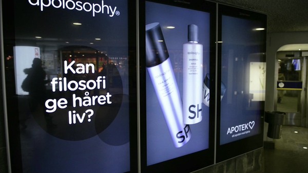
PHARMACY
BVD, Stockholm / APOTEK HJARTAT / 2012
Overview
Entries
Credits
OVERVIEW
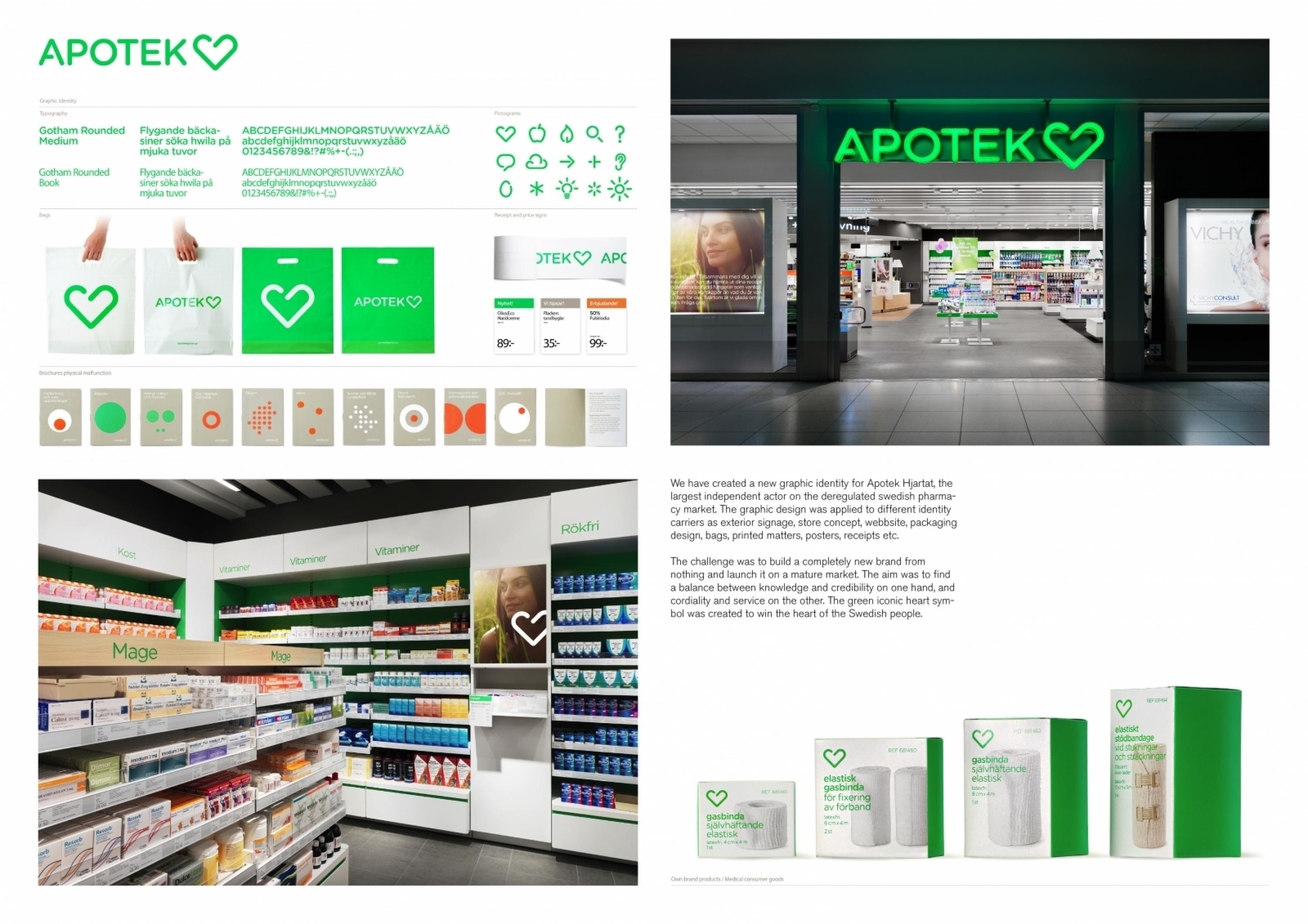
Description
The assignment was to create a new graphic identity for Apotek Hjärtat, the largest independent brand on the Swedish pharmacy market. Apotek Hjärtat wanted their new graphic identity to communicate credibility, knowledge and health in a modern and inspiring manner as well as typifying a pharmacy in a clear and smart way. The logotype should be applicable across many different types of media profiles.
Execution
The traffic-light green colour is an obvious signal that is easy to see and identify. The iconic heart symbol is unique because of its opening in the centre, which creates a feeling of openness and welcome. The rounded shape of the heart (and in the typeface) is an important element for the overall impression. The sharp and the soft round dots is a graphic tool that is used to vitalise printed matters and packaging.
Outcome
“Apotek Hjärtat is the player that comes top of the list when it comes to knowledge and in second place (after Apoteket, owned by the state) when it comes to how well the clients recognise the logo.” – Market, an independent consumer test magazine, in April“We have succeeded with a graphic identity that is clear, particularly in the shop environment,” says Apotek Hjärtat’s vice president and marketing manager Bodil Eriksson to Market.
Similar Campaigns
12 items