Eurobest
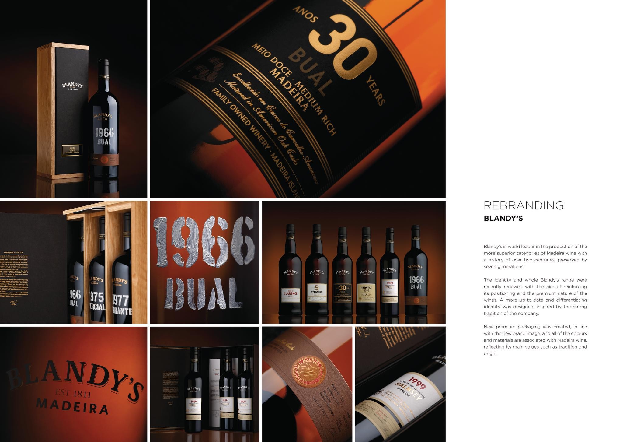
Rebranding Blandy’s
OMDESIGN, Matosinhos / BLANDY'S / 2016
Overview
Entries
Credits
OVERVIEW
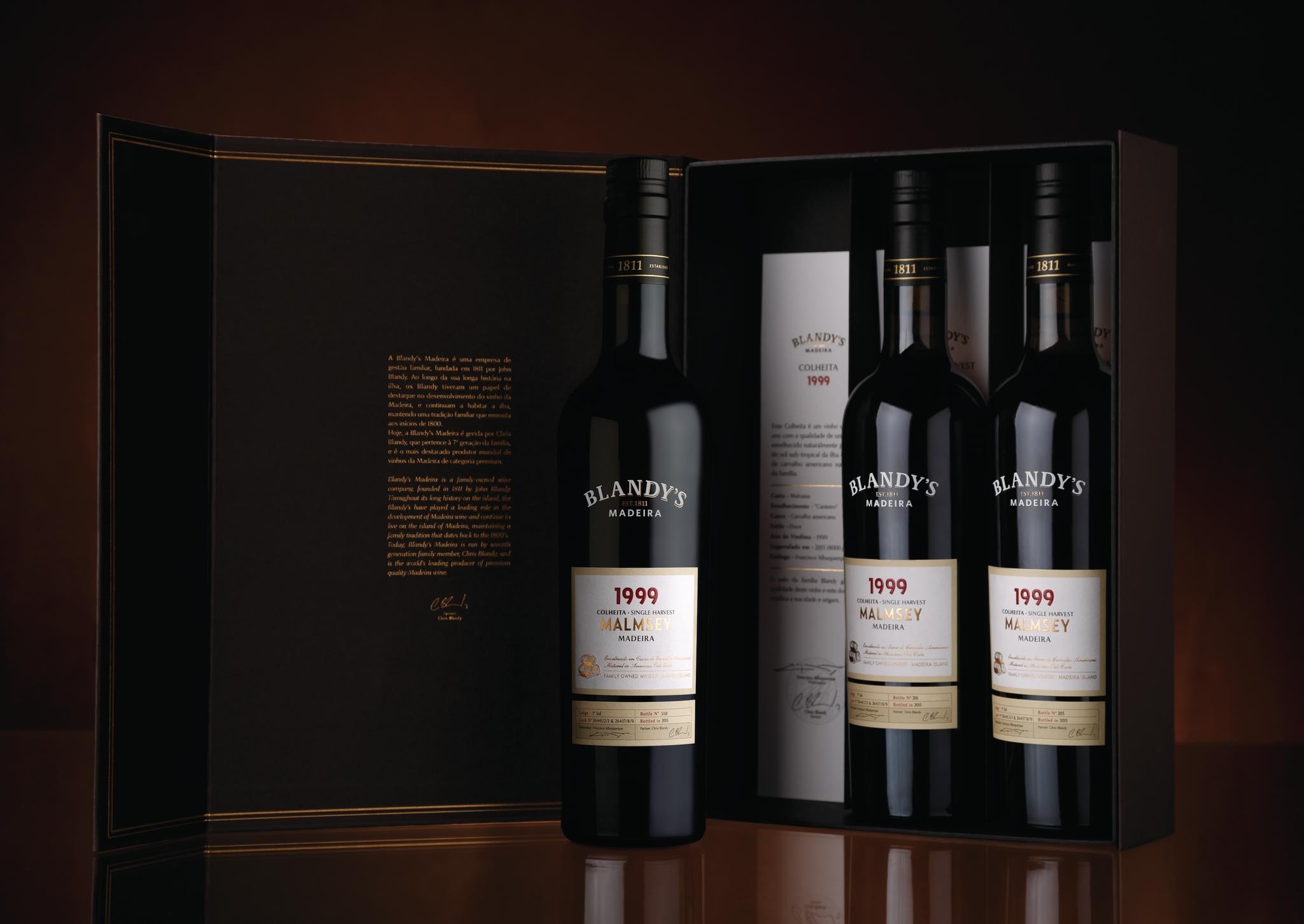
Background
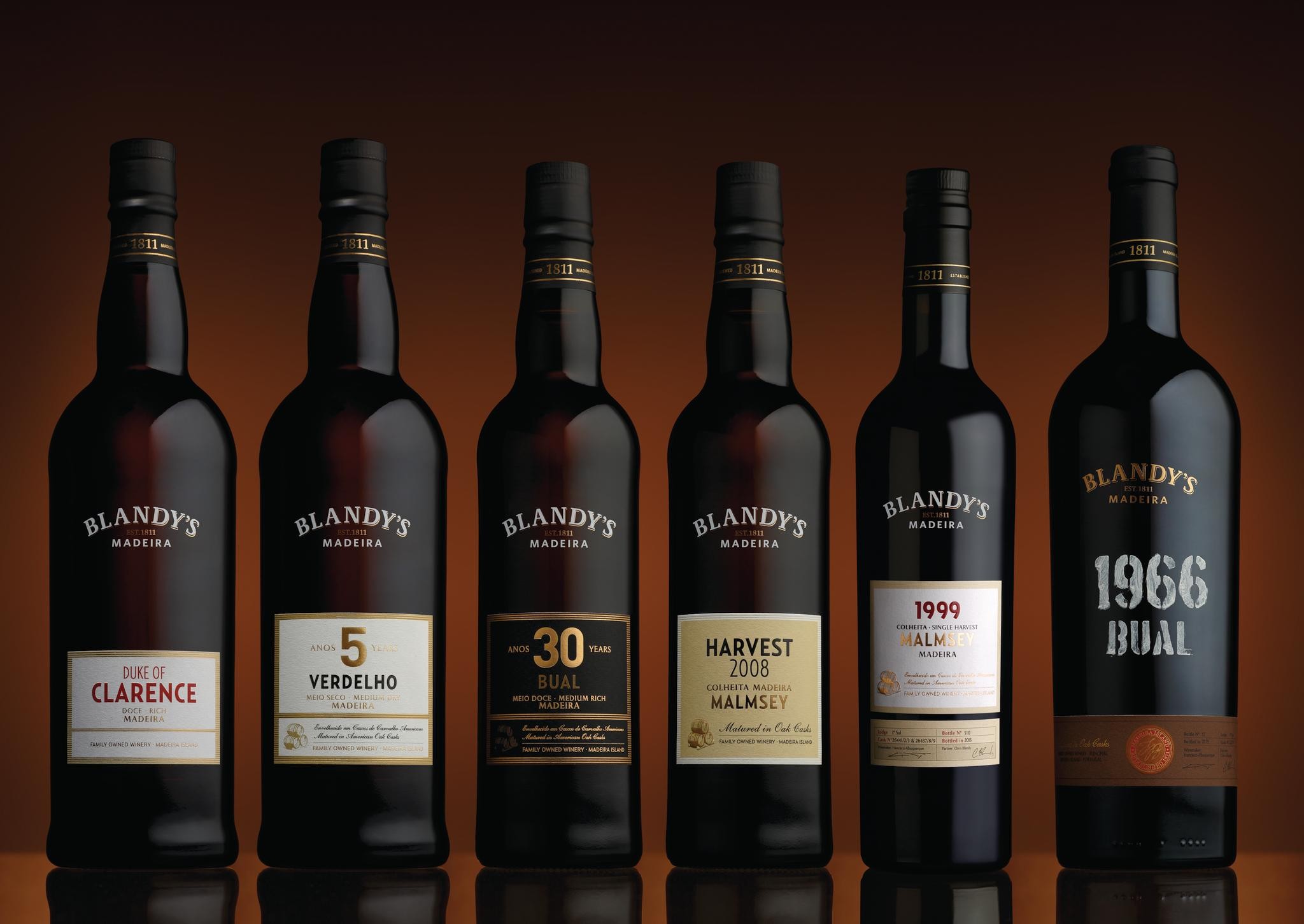
Blandy’s is world leader in the production of the more superior categories of Madeira wine with a history of over two centuries, preserved by seven generations.
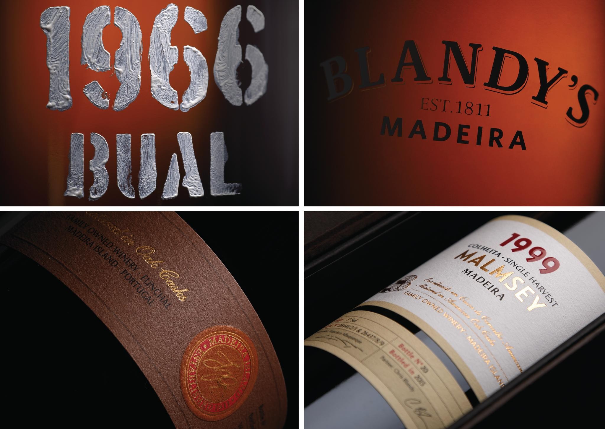
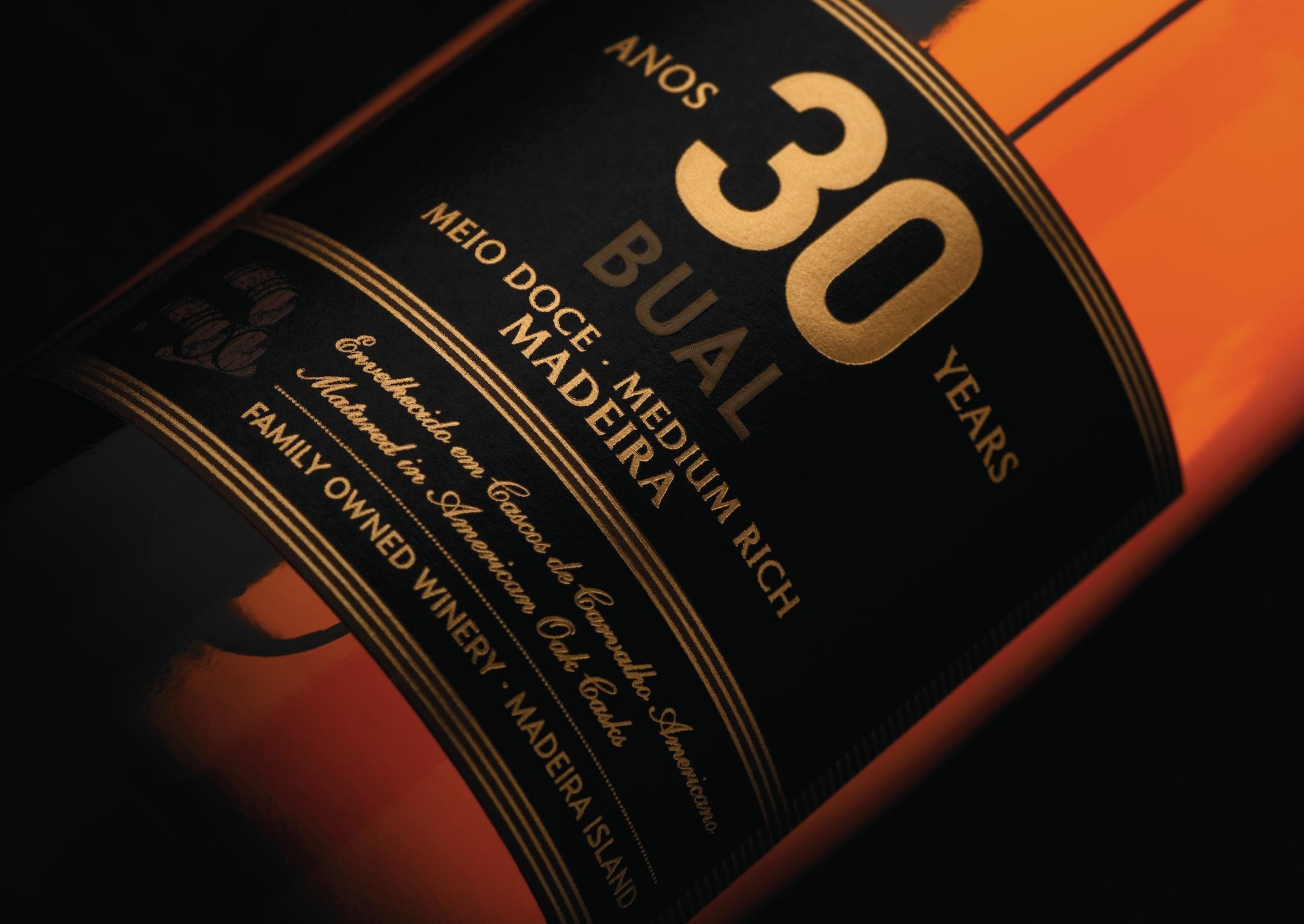
The identity and whole Blandy’s range were recently renewed with the aim of reinforcing its positioning and the premium nature of the wines. A more up-to-date and differentiating identity was designed, inspired by the strong tradition of the company.
New premium packaging was created, in line with the new brand image, and all of the colours and materials are associated with Madeira wine, reflecting its main values such as tradition and origin.
Execution
The new image was adapted to the entire Blandy’s range. Additional features include the family crest, which reinforces the date the company was set up, as well as the symbol of casks, a reference to the aging form of Blandy’s wines in oak casks. This is an ancient technique still used today in the production of these unique nectars, which are known worldwide.
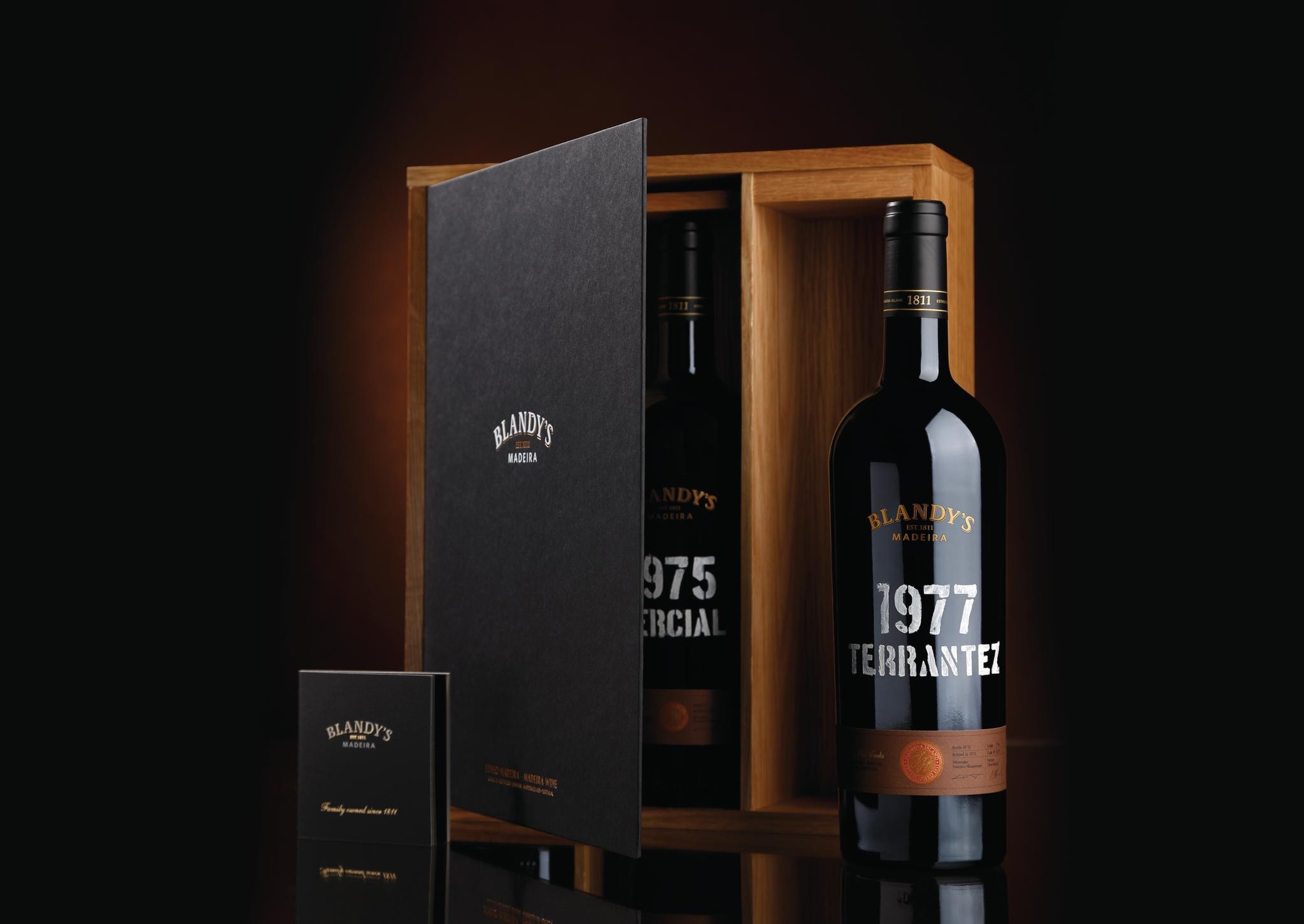
The Frasqueira packaging has a new logo and the Blandy family crest on top of the box, heat engraved into the wood. Inside, there is a certificate of quality and origin of these wines, as well as a brochure signed by the CEO of the company, Chris Blandy.
Similar Campaigns
7 items