Eurobest
SAS
BOLD, Stockholm / SAS / 2016
Overview
Entries
Credits
Overview
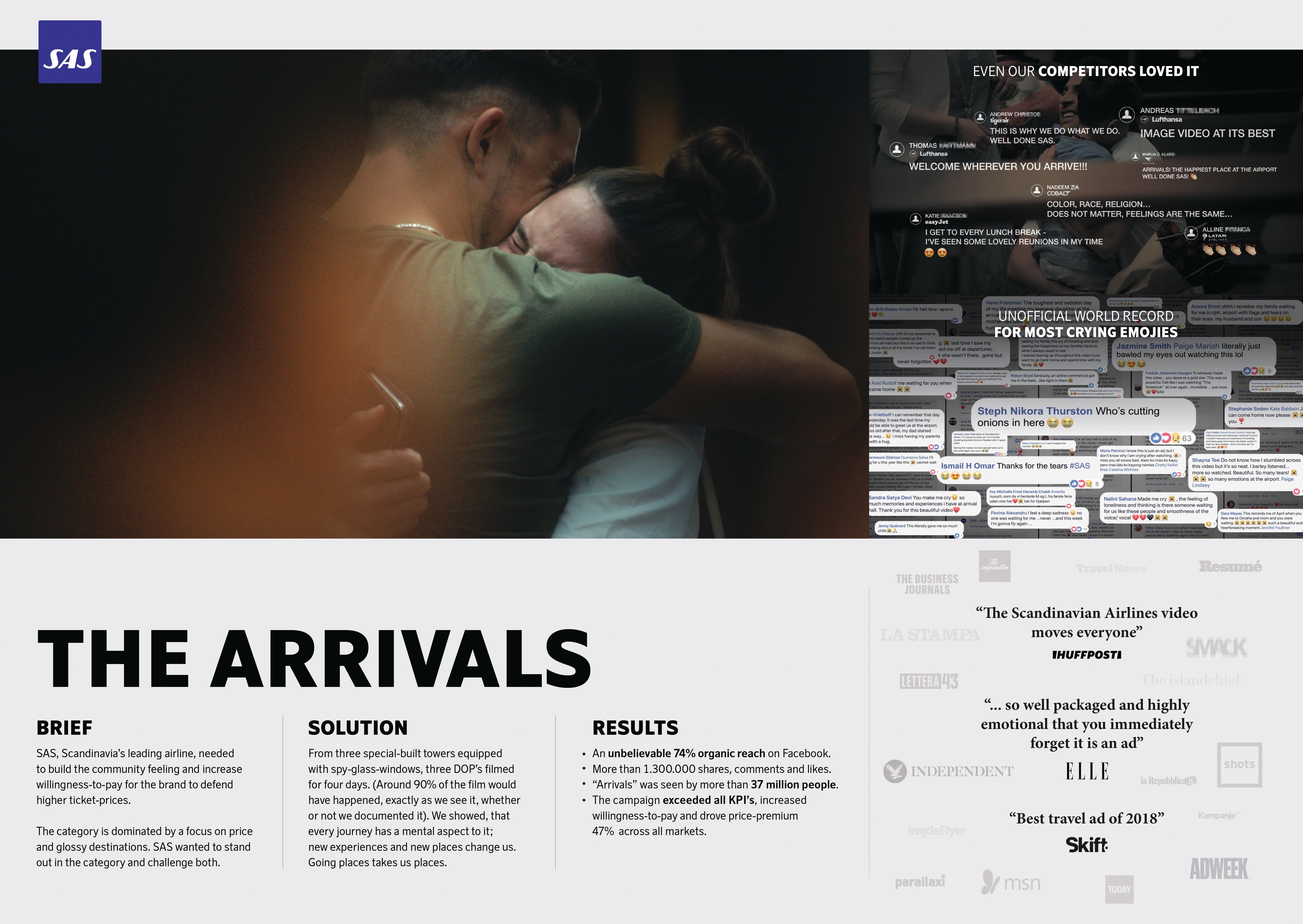
Background
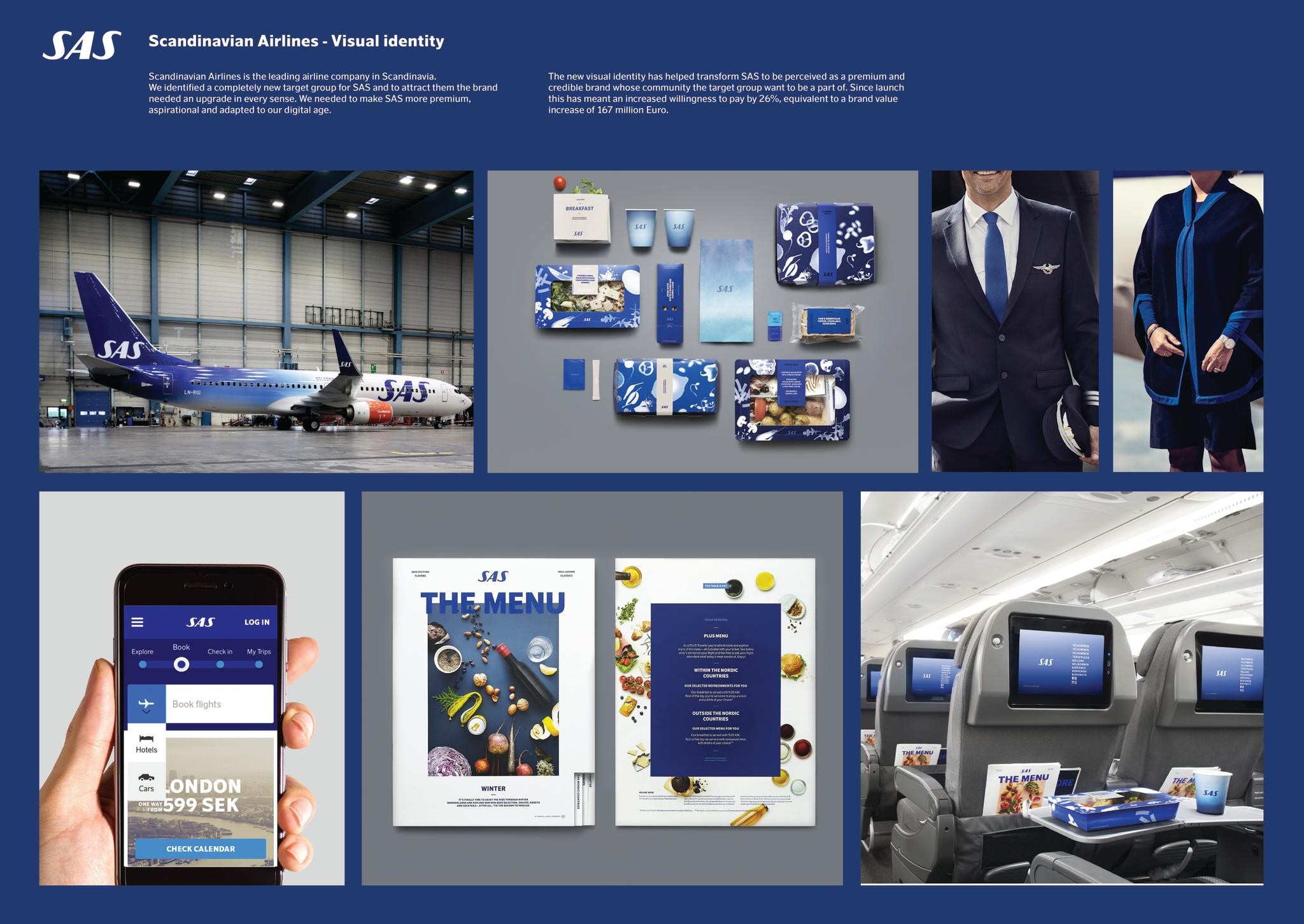
Scandinavian Airlines is the leading airline company in Scandinavia and one of the regions strongest and most recognized brands. When we started working with SAS in early 2014 they were under tremendous pressure to accommodate changing customer habits and were targeting bargain hunters. The identity looked like any of other of the low price competitors and the brand was suffering from declining sales, a deteriorating reputation and a lack of direction both internally and externally. Our brief was to provide a more coherent, premium and Scandinavian SAS expression that would create a sense of community for the SAS customers.
Execution
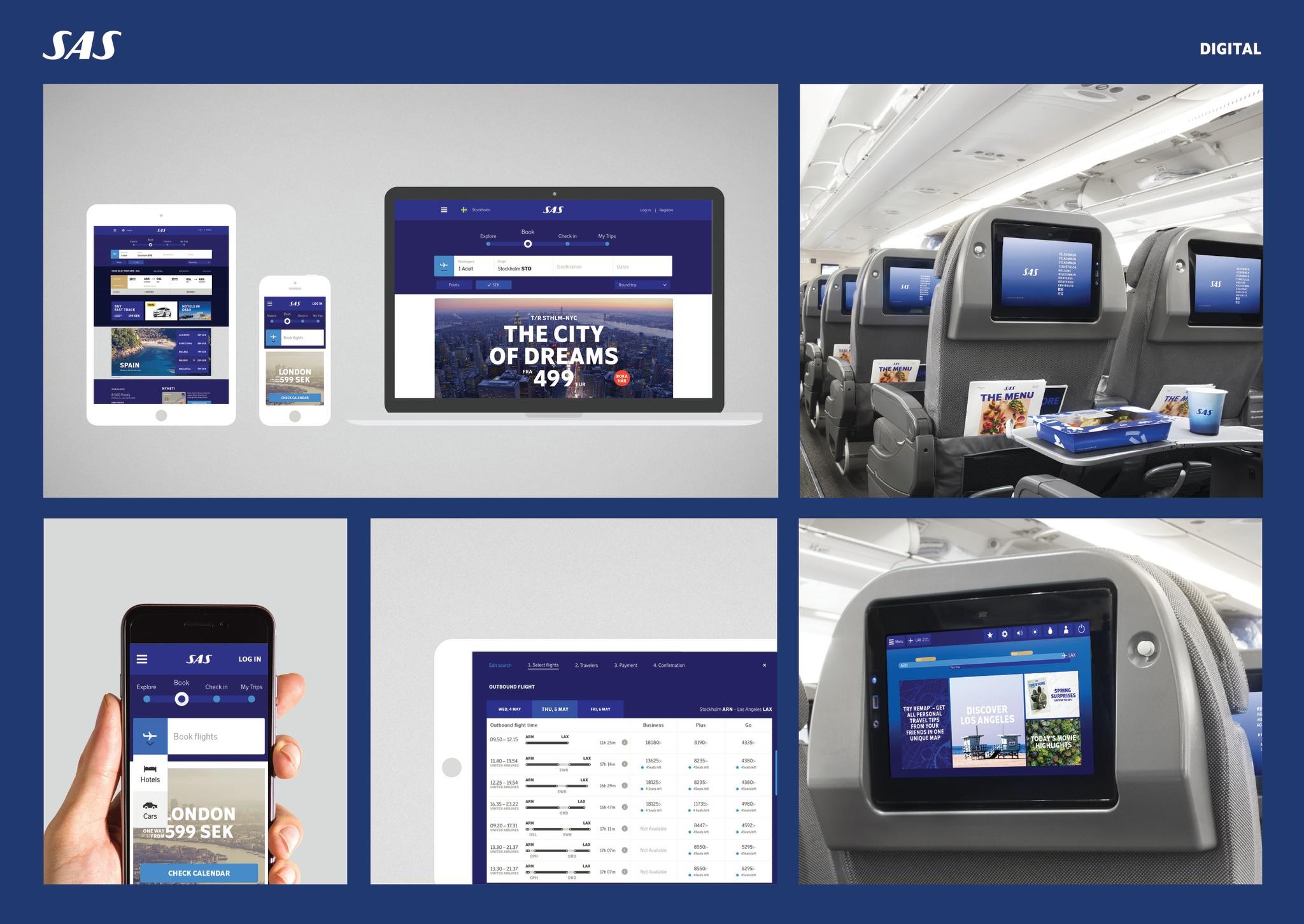
We let the wordmark free from its box, letting it roam free - just like our travelers. The color palette was updated with several new shades of blue and together with a photographer we created the SAS Sky gradients. A new image style inspired by the true travelers view of the world was implemented, and since our new target group craved a brand as dynamic and vibrant as they are, our typeface, pictograms, graphic elements and layout system was adjusted and updated for all digital media.
After finishing the core elements, we started implementing the new identity on all of the brands touch points. The roll out has to date included everything from advertising templates, packaging design and uniforms, to airplane livery, signage, printed materials such as stationery, menus and magazines and a vast array of digital implementations such as a new site, inflight entertainment and digital booking screens.
Similar Campaigns
12 items