Cannes Lions
We're Out There
SPECIAL, Sydney / KATHMANDU / 2022


Overview
Entries
Credits
Overview
Background
In 2021, Kathmandu faced a huge challenge: the outdoor adventure category it helped create 30 years prior, was leaving it behind.
Outdoor clothing had crossed into the fashion mainstream and was worth over $170b globally.
But Kathmandu’s sales were declining.
The thing is, the category’s biggest growth drivers were 18-35 year olds. But Kathmandu’s average customer was over 50.
So, our task was to refresh Kathmandu and make it more appealing to young adults.
Idea
The outdoor category had become a cliched dichotomy. It seemed brands were either for people to conquer mountains (hyper masculine and technical) or save mountains (activists). Two exclusive clubs.
But our research found young adults were craving a place where they could just be themselves and feel happy.
This led us to a new, more inclusive brand platform: We’re Out There - a celebration of the uplifting effect time spent in nature has on our brains and bodies.
Studies have shown that exposure to nature has a transformative effect on people’s physiology and behaviour. When we spend time outdoors, our stress goes down, empathy goes up, we feel happier and become more creative. Even if we don’t climb a cliff.
This science informed every decision in our nature-inspired brand identity overhaul. Out with the expected, neutral and staid. In with a vibrant new world of ‘out there’ bold, colour-filled joy.
Execution
Kathmandu’s brand relaunch broke all category norm by flooding advertisements, stores, collateral and even new products with a completely ‘out there’ look and feel.
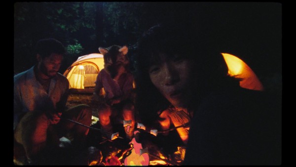
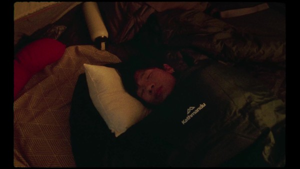
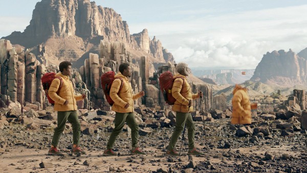
We started by replacing slice-of-life travel photography with energetic fashion-forward imagery that captured the raw joy of being outdoors.
This was paired with most striking changes in the brand identity; a kaleidoscopic new colour palette that drew inspiration from fire, earth, air and water and complemented Kathmandu’s more colourful products.
Then, across all comms we switched to an expressive serif font, Larken, that was originally inspired by nature and balanced confidence and youthful quirk.
We even flooded our previously flat logomark with vivid nature cues and adjusted its proportions to create greater impact. Whenever it appeared, the enlarged ‘peaks’ acted as a window to the outdoors, showcasing stunning photographic textures, colours and illustrations.
Simply put, we flooded a 30 year old brand with bold, nature-inspired joy.
Outcome
PR coverage reached 10.6 million people (Australia’s population is 25 million)
E-comm conversion rates jumped 8% in AUS and 10% in NZ y.o.y.
Online order value jumped by 7.5% y.o.y.
Similar Campaigns
6 items


