Design > Communication Design
NIKE AIR MAX KIDS
MANVSMACHINE, London / NIKE / 2023
Awards:
Overview
Credits
OVERVIEW
Background
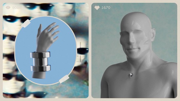
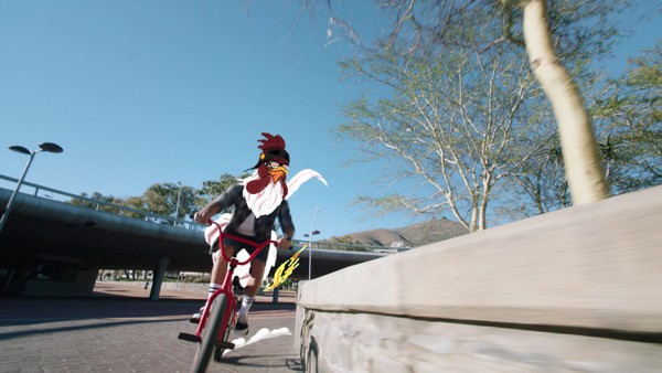
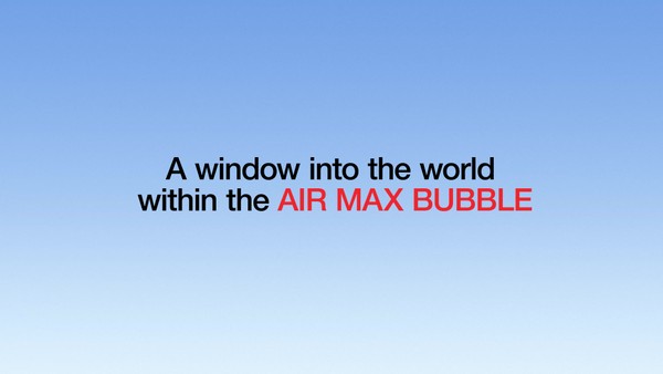
Nike Kids sought a brand system that would establish their Air Max shoes to a younger demographic. Our goal was to create a bold, exciting, and long-lasting connection with the audience, which would inform and inspire all future aspects of the Kids Air Max visual language. We worked closely with Nike to expand their existing Kidvision brand system, defined a brand groundwork and developed a variety of Air Max-inspired assets, such as a bubble typeface, graphic library, and aerated characters.
Describe the creative idea
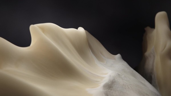
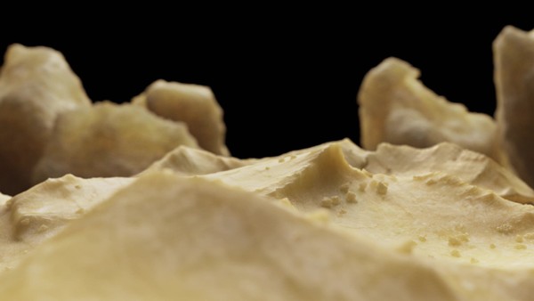
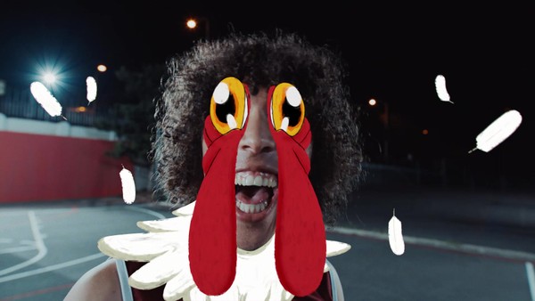
Our creative solution was to highlight Nike’s ‘Air Max’ innovation in a fun, inspiring, and imaginative way, championing everyday play. We considered Air Max in its broadest sense and explored it in its most abstract forms. Injecting ‘Air’ into all our creations, whether a wing-suited squirrel or a slice of NYC-inspired pizza, everything was Air-infused and bursting with playful energy. We brought these aerated objects to life in an anti-gravity photoshoot featuring two of the world’s most inspiring young creatives: illustration artist Doodle Boy, and musical virtuoso Nandi Bushell. The brand system celebrates the innovation of Air Max while sparking kids’ imagination and encouraging a lighter approach to life when wearing Air Max shoes - fun with a healthy dose of surrealism.
Describe the execution
The final output was presented as a tightly defined brand framework and a vast library of 3D assets that were rolled out in a global seasonal campaign; both online and in-store across the Nike ecosystem, including out-of-home in London, Paris, and Barcelona, and a Nike-first: DOOH within the Roblox game environments in Nikeland.
We integrated the bubble typeface, aerated characters, and graphic library assets throughout a breadth of touch-points, including in-store mockups, out-of-home mockups, and digital mockups paying close attention to typography and layout, making sure that everything was consistent with the Kids Air Max brand system.
Giant blown-up versions of the characters were used in two key retail stores: Nike Town London and Paris House of Innovation, a large OOH-painted mural featured in Westfield Shopping Centre in London and the character designs were made into toys for an Air Max 270 Go campaign.
List the results
Our collaboration with Nike on their first-ever Air Max brand designed for kids resulted in a fun, imaginative, and innovative brand system that captured the spirit of playfulness and wonder.
The top-level results were as follows:
There was a strong brand recall amongst the Kids' audience.
The delivery was across every market with over 7 million impressions.
Interaction rates were above 75% in the top-performing channels.
Blown-up characters were placed in two key retail stores: Nike Town London and Paris House of Innovation, they had a huge response from both a consumer and an internal leadership point of view.
The global Nike team created toys out of the air character designs and used them in an Air Max 270 Go Campaign.
The results were hugely positive across the board, including sell-through, engagement and reach.
More Entries from Brand Collateral in Design
24 items
More Entries from MANVSMACHINE
24 items
