Design > Brand-building
TYMEBANK BRAND IDENTITY
KING JAMES GROUP, Cape Town / TYMEBANK / 2019
Overview
Credits
Overview
Background
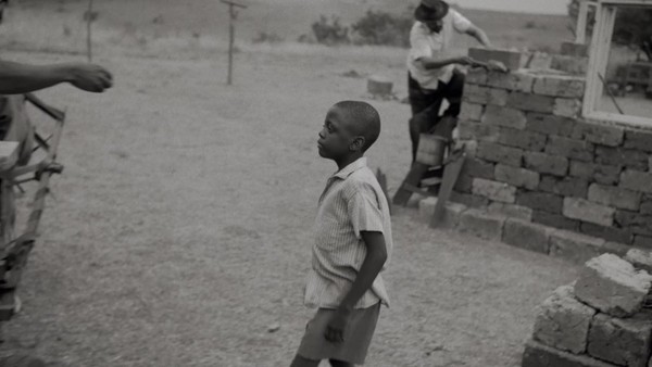
Approximately 21 million South Africans are unbanked/underbanked due to a lack of access to traditional financial institutions. TymeBank aims to change this by creating a digital bank with no branches that can be accessed via mobile, online or at grocery stores nationwide (including low-income areas). This new bank needs a visual identity to represent its modern, inclusive nature. ??We were tasked to create a logo and identity system built on the values of simplicity, transparency, progression and potential. The budget was R350 000 for the conceptualisation, design and roll-out of the CI. Our task was to help TymeBank achieve their goal of signing up 1 million customers in their first year.
Describe the creative idea
TymeBank is paving the way for a new banking experience. We started by identifying a symbol that represents the digital generation – a pixel. This simple square portrays stability and trust, the foundation a new bank should be built on. Then we split the square into stripes, indicating pathways and a forward motion – symbolic of our defiant target audience who, despite their socioeconomic status, are on their way to becoming successful. It also seemed fitting to create a digital bank's logo in a digital space, so we turned our stripes into a 3D-rendered object and created a new perspective by ‘twisting’ the pixel. The angles of this stylised pixel show dynamism, progressive thinking and a new way of looking at things. Ultimately, we created a logo that is true to the personality of a new-school bank in a country full of traditional ones.
Describe the execution
Our stylised pixel became the foundation for all design elements. The pixel shape informed the design of our icon set, the pocket shape of a folder, the corners of a print advert, and it helped us to create a brand identity that is entirely ownable by TymeBank. The outlined shape of the pixel was used as a building block to create a palette of bold bespoke patterns. The patterns brought the energy of the youth of the TymeBank audience into the identity. We used our patterns as animated graphics to engage in the digital space. The new visual identity has been applied to design elements, digital, social media, retail, print, outdoor and TV. An unexpected colour palette helped to differentiate us from the corporate greys and blues of the banking world.
List the results
We created a brand identity for TymeBank that is original and built on the pillars of their business. We have achieved brand differentiation and recognition through a design look and feel that is unusual in the visual landscape of South African banks. This has led the unbanked/underbanked of South Africa to secure their financial future through the services of TymeBank: Within two months of our launch campaign going live, TymeBank signed up 250 000 new customers and are currently operating at a rate of 2 500-3 000 sign-ups a day. They are well on their way to achieving their goal of signing up 1 million customers in their first year.
More Entries from Creation of a New Brand Identity in Design
24 items

More Entries from KING JAMES GROUP
24 items