Design > Corporate or Brand Identity
AMSTEL - ONS BIER
VBAT, Amsterdam / undefined / 2010
Overview
Credits
Overview
BriefExplanation
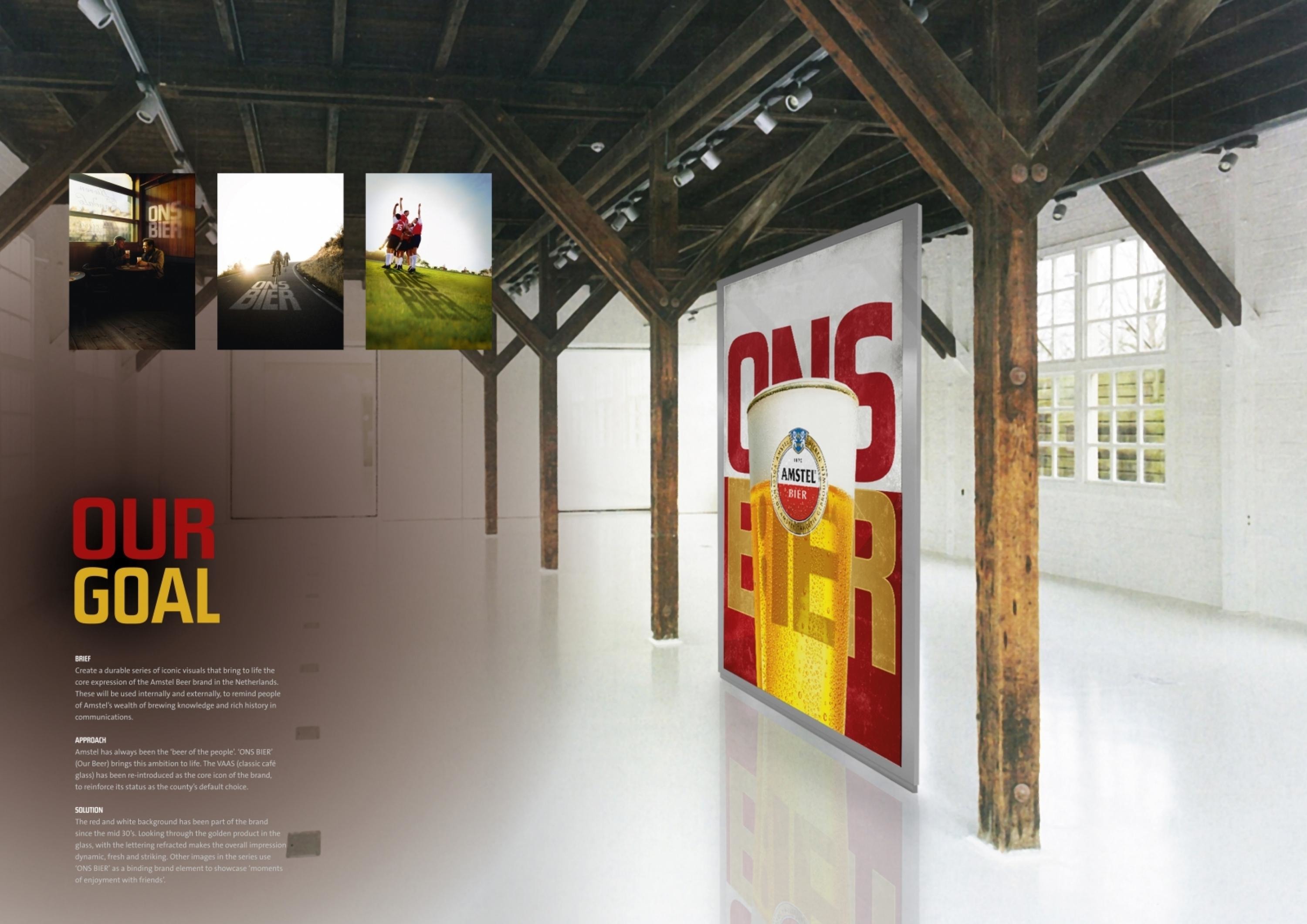
Create a durable series of iconic visuals that bring to life the core expression of the Amstel Beer brand in the Netherlands. These will be used internally and externally, to remind people of Amstel’s wealth of brewing knowledge and rich history in communications.
ClientBriefOrObjective
Amstel has always been the ‘beer of the people’. ‘ONS BIER’ (Our Beer) brings this ambition to life. The VAAS (classic café glass) has been re-introduced as the core icon of the brand, to reinforce its status as the county’s default choice.
Effectiveness
The ONS BIER visuals are situated in a place of prominence at the Amstel offices throughout the Netherlands. These posters have received an excellent response, awakening the feelings of pride and ambition that have always been an integral part of the Amstel brand.
Execution
The red and white background has been part of the brand since the mid 30’s. Looking through the golden product in the glass, with the lettering refracted makes the overall impression dynamic, fresh and striking. Other images in the series use ‘ONS BIER’ as a binding brand element to showcase ‘moments of enjoyment with friends’.
More Entries from Posters in Design
24 items


More Entries from VBAT
24 items