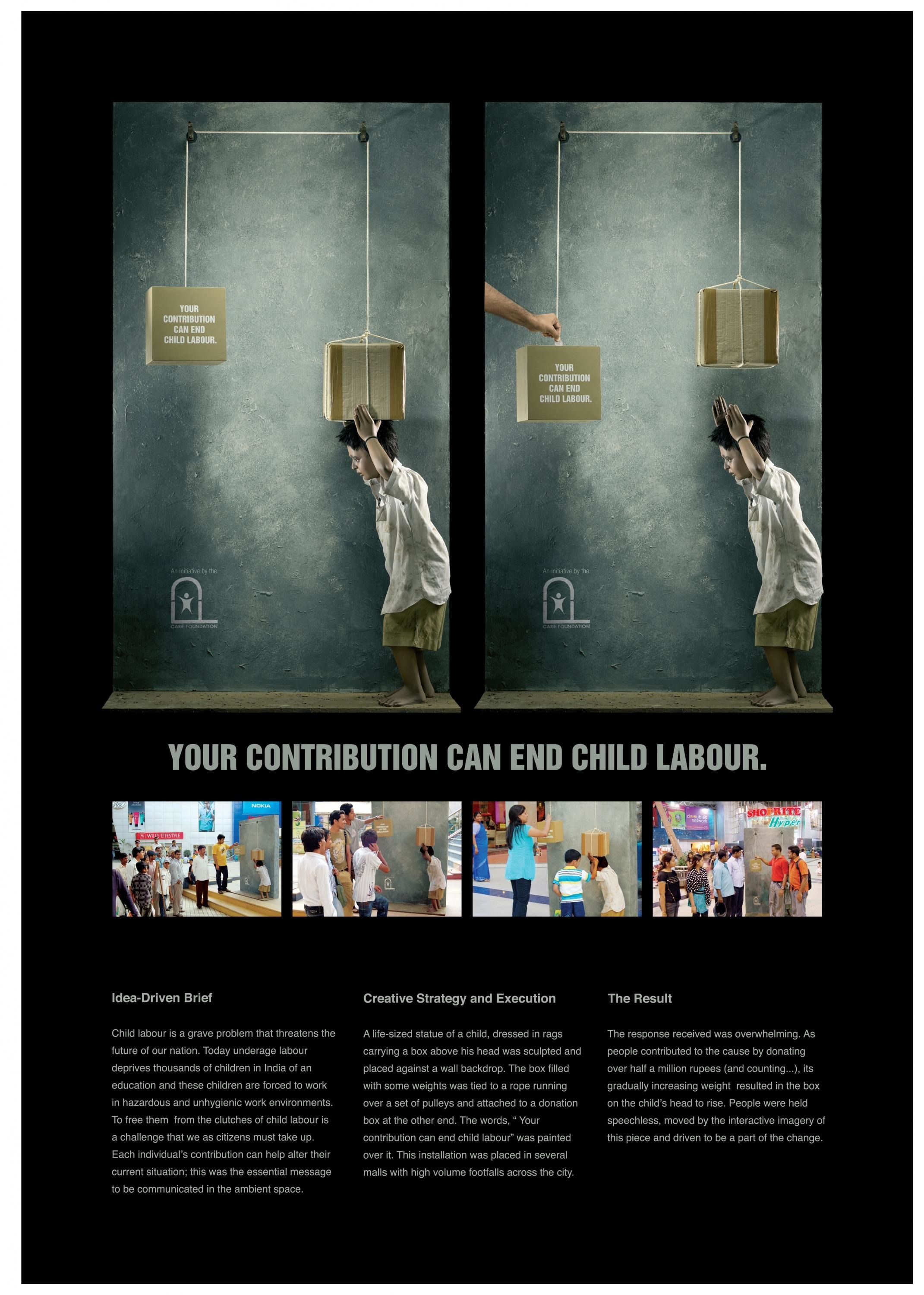
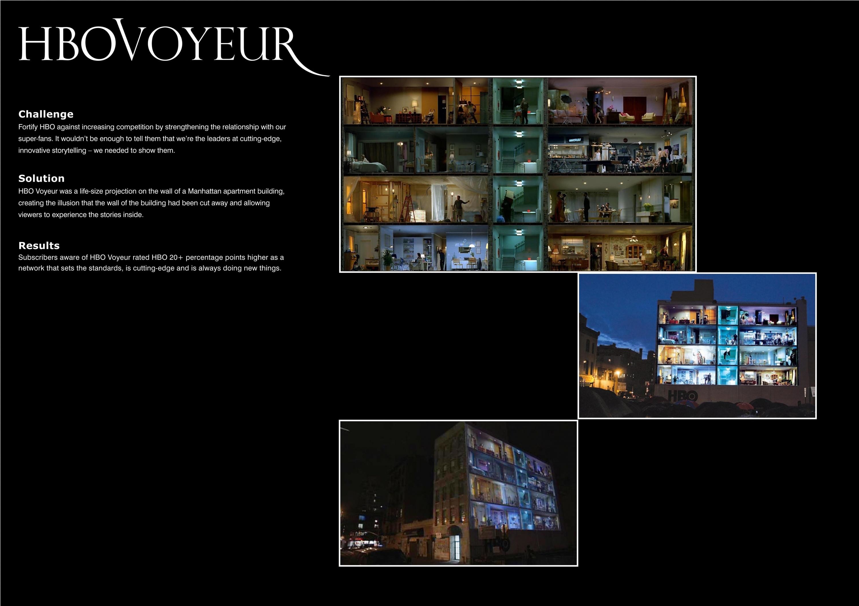
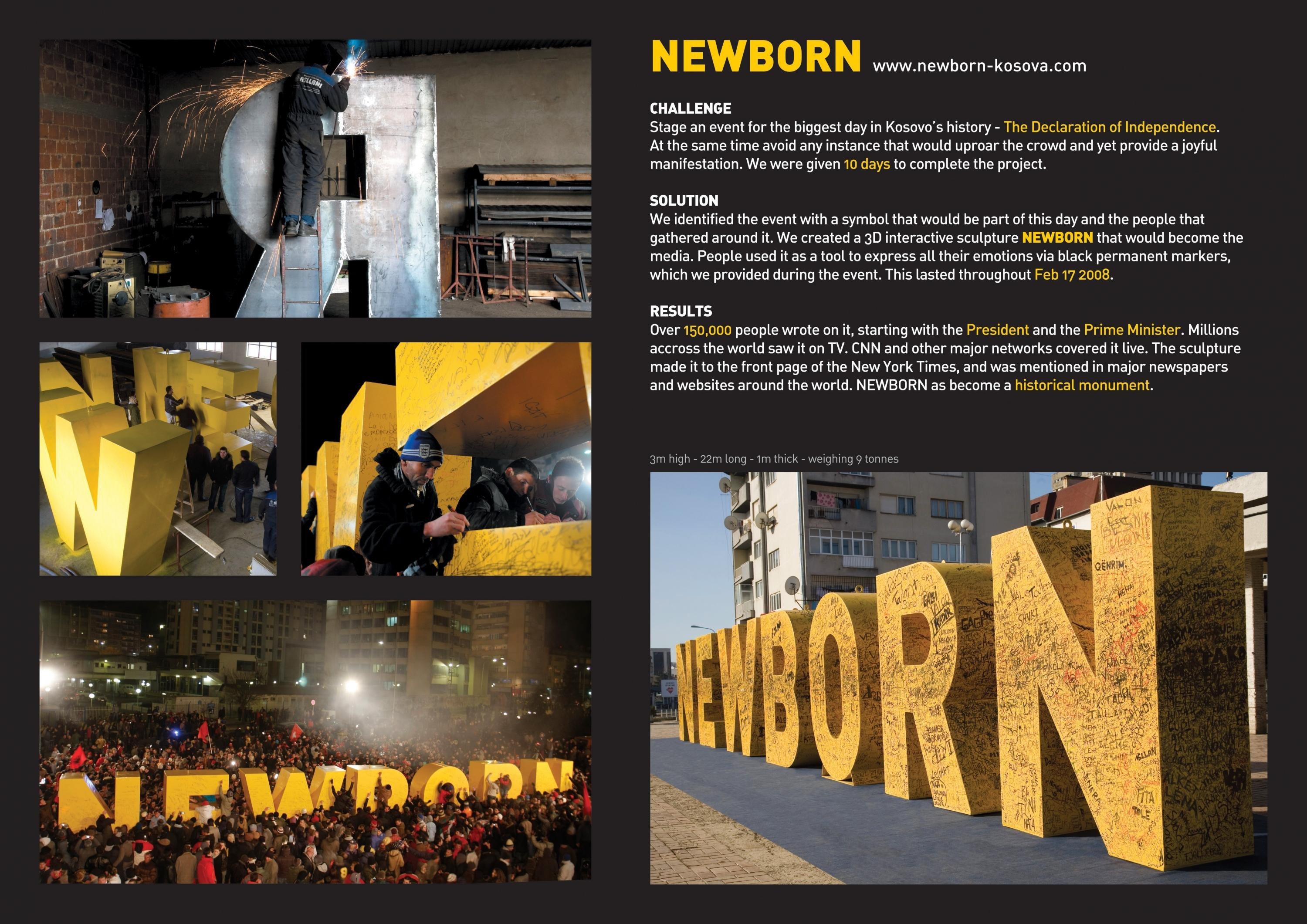
Design > Packaging Design
AMSTEL PREMIUM QUALITY LAGER
VBAT, Amsterdam / HEINEKEN / 2008
Awards:

Overview
Credits
Overview
ClientBriefOrObjective
Amstel is a respected lager brand globally. This new iconic Premium Quality Lager taps into two major consumer trends. One: the increasing desire for more accessible beer tastes and two: growing health awareness. The desire was to create a pack that felt different to standard beers; something contemporary, something new, nothing less than an icon.
The developed bottle profile is elegant, tall and transparent. Slim and spear-shaped, it thrusts upwards. ‘In hand’ the bottle is easy and lightweight. There's little graphic clutter on the bottle. The Amstel brand is simplified to its original circular device. A subtle 3D button effect modernises this iconic Amstel logo. Relatively small in size, the new logo makes the new bottle feel special. A ripple device, representing the brand character, surrounds the logo. Not composed of standard and traditional beer codes, it's outgoing, self-assured and magnetic. The addition of the embossed, bold AMSTEL name is almost architectural and contrasts the refined logo. The neck label is kept relatively clean. A silver background together with red, project a fresh and modern character. Not baroque in design, just simple and balanced.Differentiating from standard ‘crown’ tops of competitors, the ‘pull’ top is active and accessible.
More Entries from Alcoholic Drinks in Design
24 items


More Entries from VBAT
24 items