Eurobest
Barcode Visual Identity
ANTI, Oslo / DNB BANK / 2016
Awards:
Overview
Entries
Credits
Overview
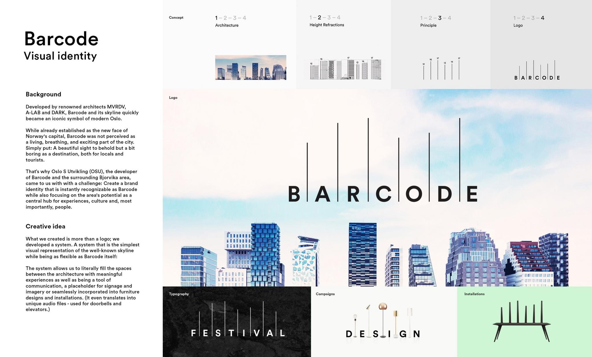
Background
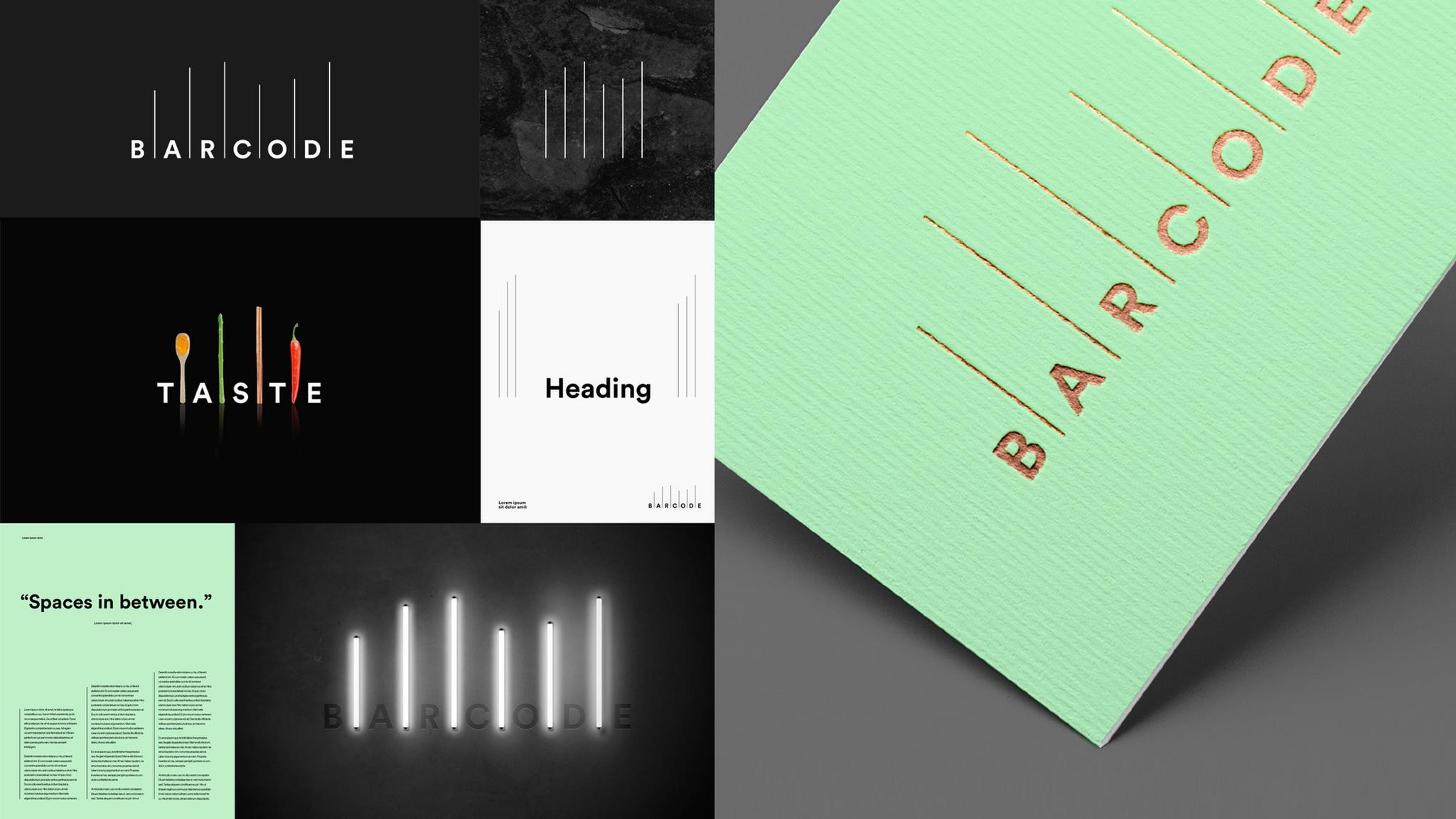
Developed by renowned architects MVRDV, A-LAB and DARK, Barcode and its skyline quickly became an iconic symbol of modern Oslo. Established as the new face of Norway's capital, Barcode is an area that is in constant growth, with cultural buildings like the Munch museum, and the National Library being developed as the city emerges. A beautiful sight to behold but the area needed to tell the audience that it step by step alongside the development of the area will be the new downtown of Oslo. That's why Oslo S Utvikling (OSU), the developer of Barcode and the surrounding Bjorvika area, came to us with with a challenge: Create a brand identity that is instantly recognizable as Barcode while also focusing on the area's potential as a central hub for experiences, culture and, most importantly, people.
Execution
The lines in the Barcode logo directly correlates to the floor heights for the first six buildings in the Barcode line, developed after receiving detailed information from the architects. When using different wording in the logo system, we can easily communicate relevant content such as restaurants, special events, different experiences and products from Barcode. The line system is the base for all the flexibile solutions. When we are creating a campaign or an installation, the system allows us to replace the lines with objects with the same height refractions, always matching the real life proportions of the skyline.
Similar Campaigns
12 items