Cannes Lions
Campbell’s Red & White Condensed Soup Visual Identity
TURNER DUCKWORTH, New York / CAMPBELL'S / 2022

Overview
Entries
Credits
Overview
Background
Campbell’s Soup is an American icon of design and culture alike. Our assignment was to bridge the widening gap between historic brand love and decreasing space for Campbell’s in consumers’ shopping carts, and to reverse a steady decline in sales. Younger buyers were turning to a growing range of competitive products in and out of the soup aisle. Building on the insight that Campbell’s is often used as a meal starter, a cooking-focused positioning of “start something good” was introduced. We designed packaging and a broader visual identity centered around this idea.
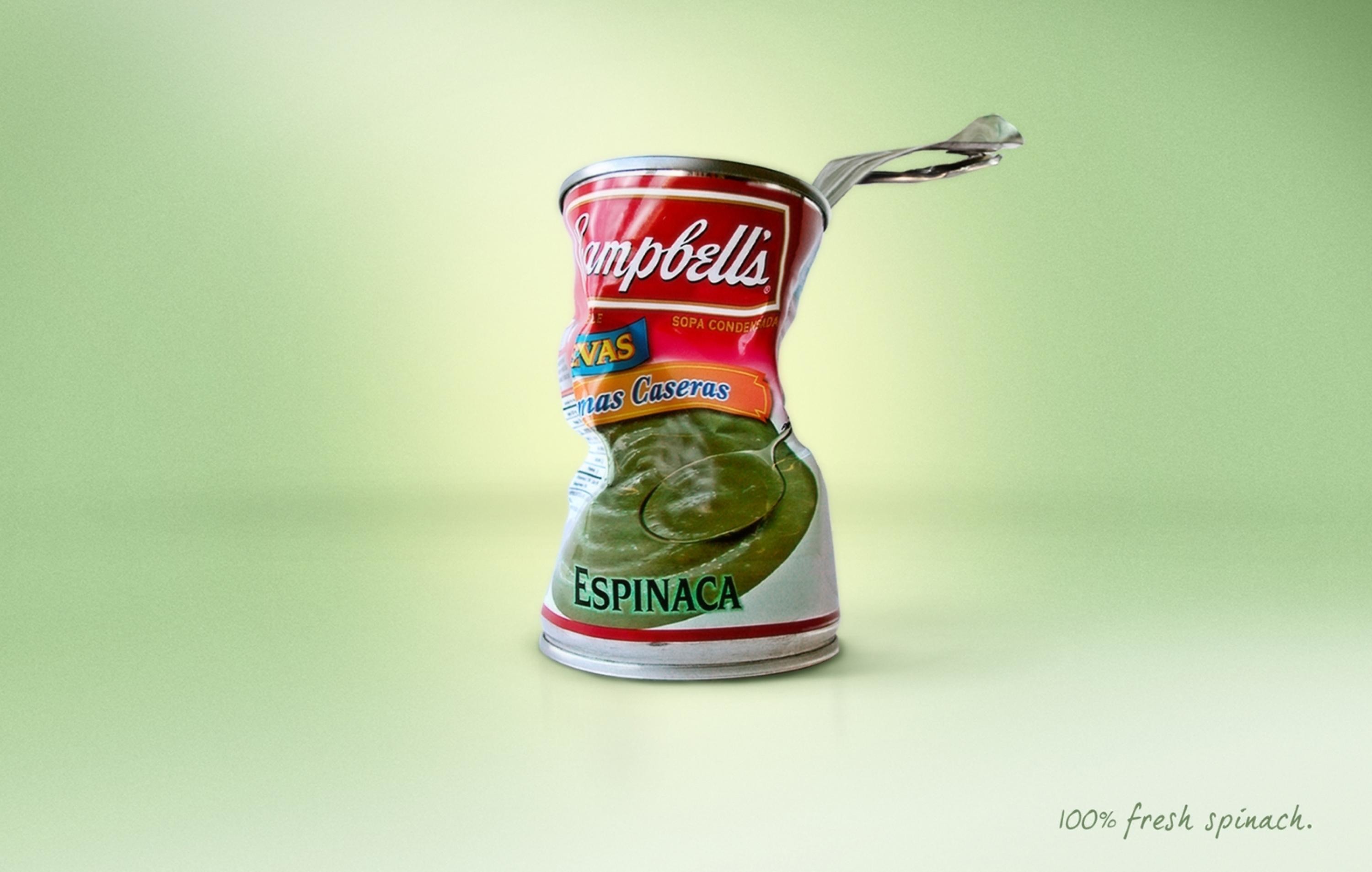
The Campbell’s soup that you’re picturing in your mind as you read this was largely missing from the shelf before this assignment. Over the years, 97% of the portfolio had adopted common CPG codes at the expense of the brand: swooshes, ribbons, big bowls of soup, and a plethora of claims all fighting for attention on the front-of-pack.
Idea
Our goal was to bring back Campbell’s confidence and earned swagger. We rebuilt the portfolio from the foundation of the classic red and white label architecture, and instead of just reprinting old graphics, we re-drew and lovingly contemporized assets that had been made famous over the past 124 years. We united a huge portfolio while still retaining navigability. We designed a system that inspires confidence and creativity both in the kitchen, and in the community. More than anything, the new design is intended to make the statement that this is not just another product on the shelf — this is Campbell’s Soup.
Execution
The redesign considered every aspect of the experience. We redrew the script, giving it a soup-dipped feel by separating the characters. We brought esteem back into the medallion with a crisp new illustration and updated, finessed typography. We added wit to the Fleur de Lys, creating it from the C in Campbell’s. Shifting focus from bowls of soup, we carefully shot real-food ingredients. We added charm and organization to claims. Off-pack, we introduced a vibrant, food-inspired secondary color palette that breathes life into all communications. Finally, a new illustration style uses the full palette to tell simple, heartfelt brand stories.
Outcome
"The R&W Redesign was featured in high-performing launch activations that haloed redesign news, and were strategically built to drive cultural relevance and modernization for the iconic brand. Activations include: An ‘AmeriCANa’ NFT drop: · 823MM Total Campaign Impressions. ‘What Sounds Good Tonight?’ cooking & music campaign, in partnership with Universal Music Group: 554MM total campaign impressions. To help ease the transition of the new label on shelf, RW launched a targeted shopper program (Aug.-Oct. 2021), which included following program highlights. Program was in partnership with the Mars agency."
Similar Campaigns
12 items