Cannes Lions
CLARO TELECOMMUNICATIONS
GAD', Sao Paulo / CLARO / 2009

Overview
Entries
Credits
Overview
Description
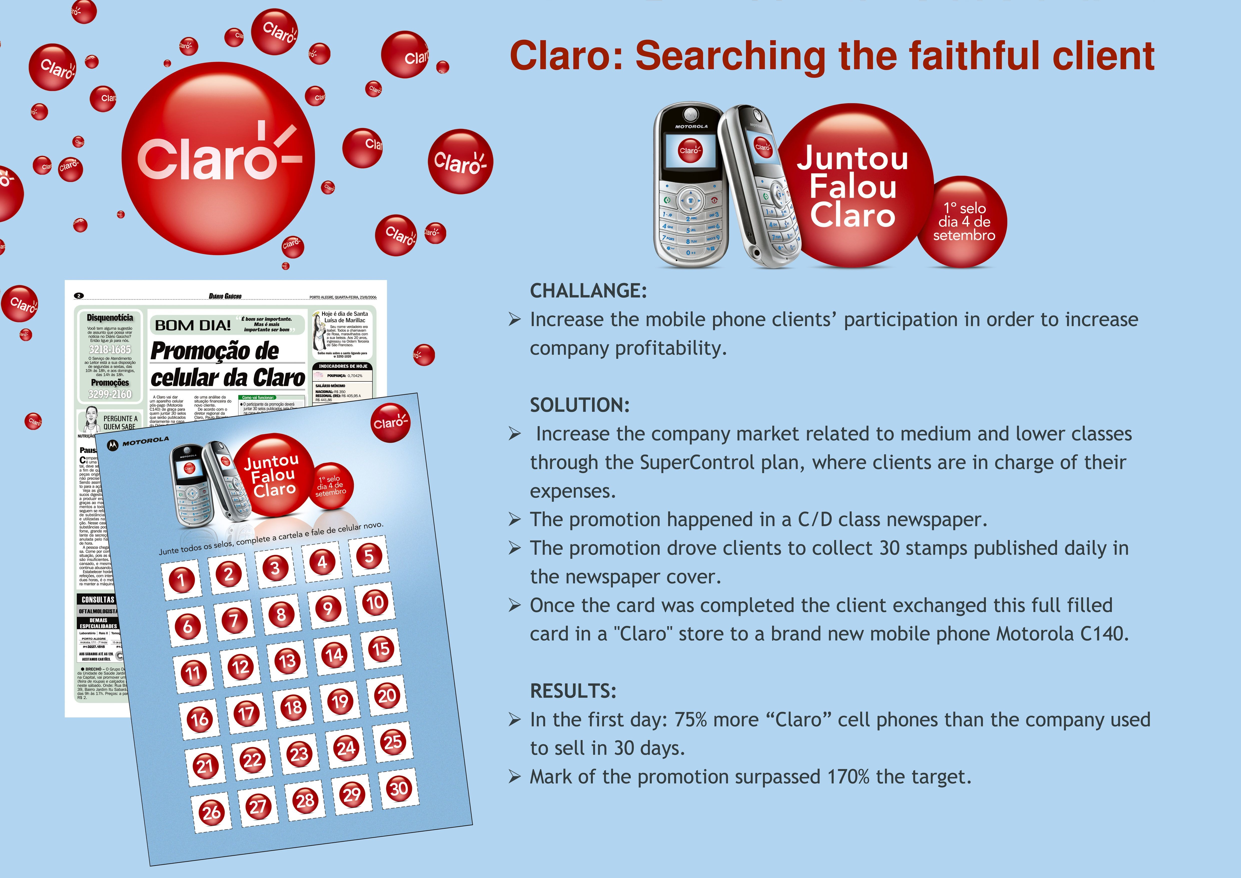
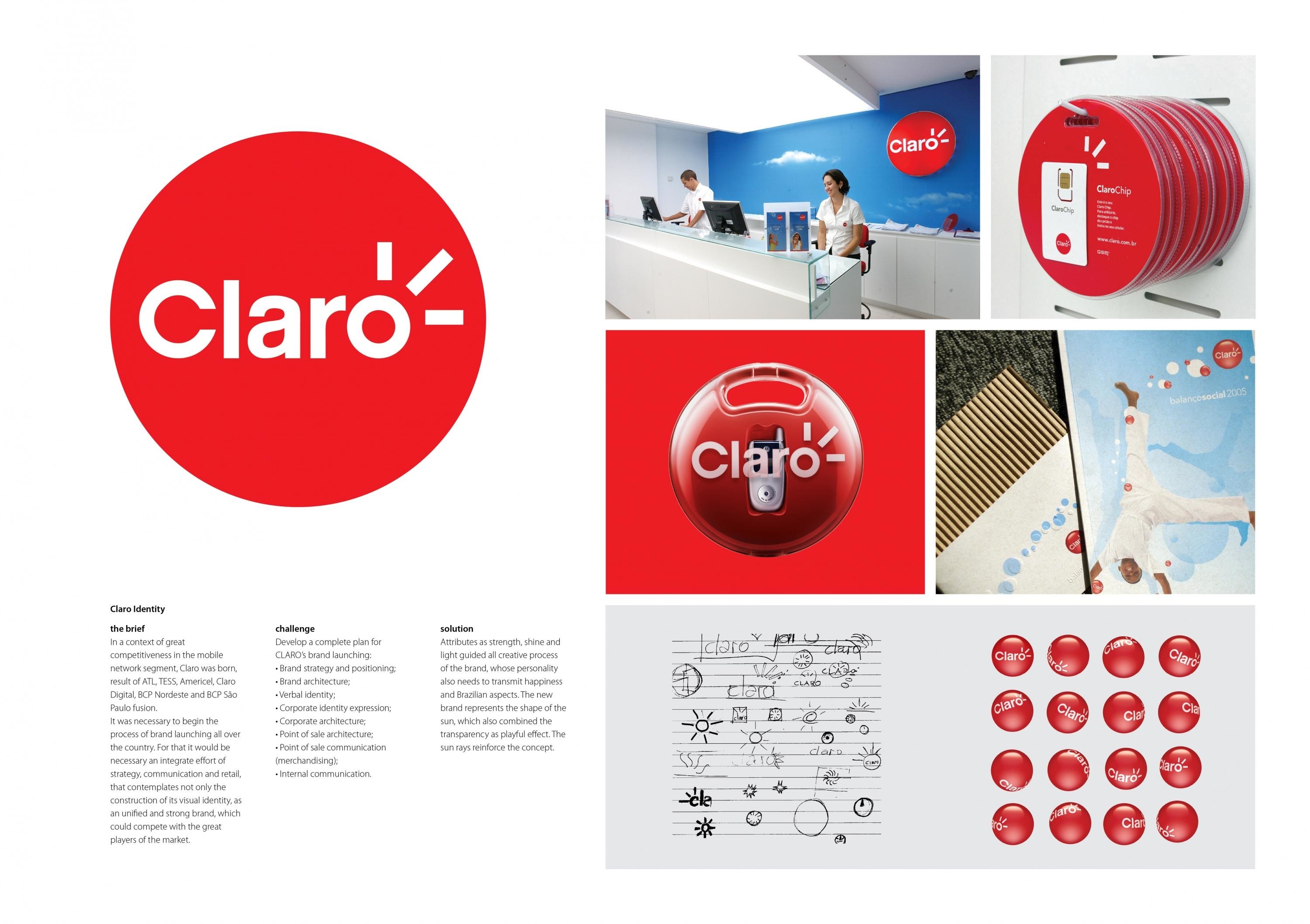
In a context of great competitiveness in the mobile network segment, Claro was born, the result of ATL, TESS, Americel, Claro Digital, BCP Nordeste and BCP São Paulo fusion.
It was necessary to begin the process of brand launching all over the country. For that it would be necessary for an integrated effort of strategy, communication and retail, that contemplates not only the construction of its visual identity, as a unified and strong brand, which could compete with the great players of the market.
Execution
Attributes such as strength, shine and light guided all creative processes of the brand, whose personality also needs to transmit happiness and Brazilian aspects. The new brand represents the shape of the sun, which also combined the transparency as a playful effect. The sun rays reinforce the concept.
Outcome
The first packaging produced was huge success. They disappeared of the shops in few days and in few months the packaging became one of the most successful cases of Brazilian packaging design history. The packaging reflects the brand expression in its shape and color. The concept of “gift package” promoted the reuse of the packaging and a long term relationship with the brand.
Similar Campaigns
12 items