Cannes Lions
FREE PHONE CHARGING
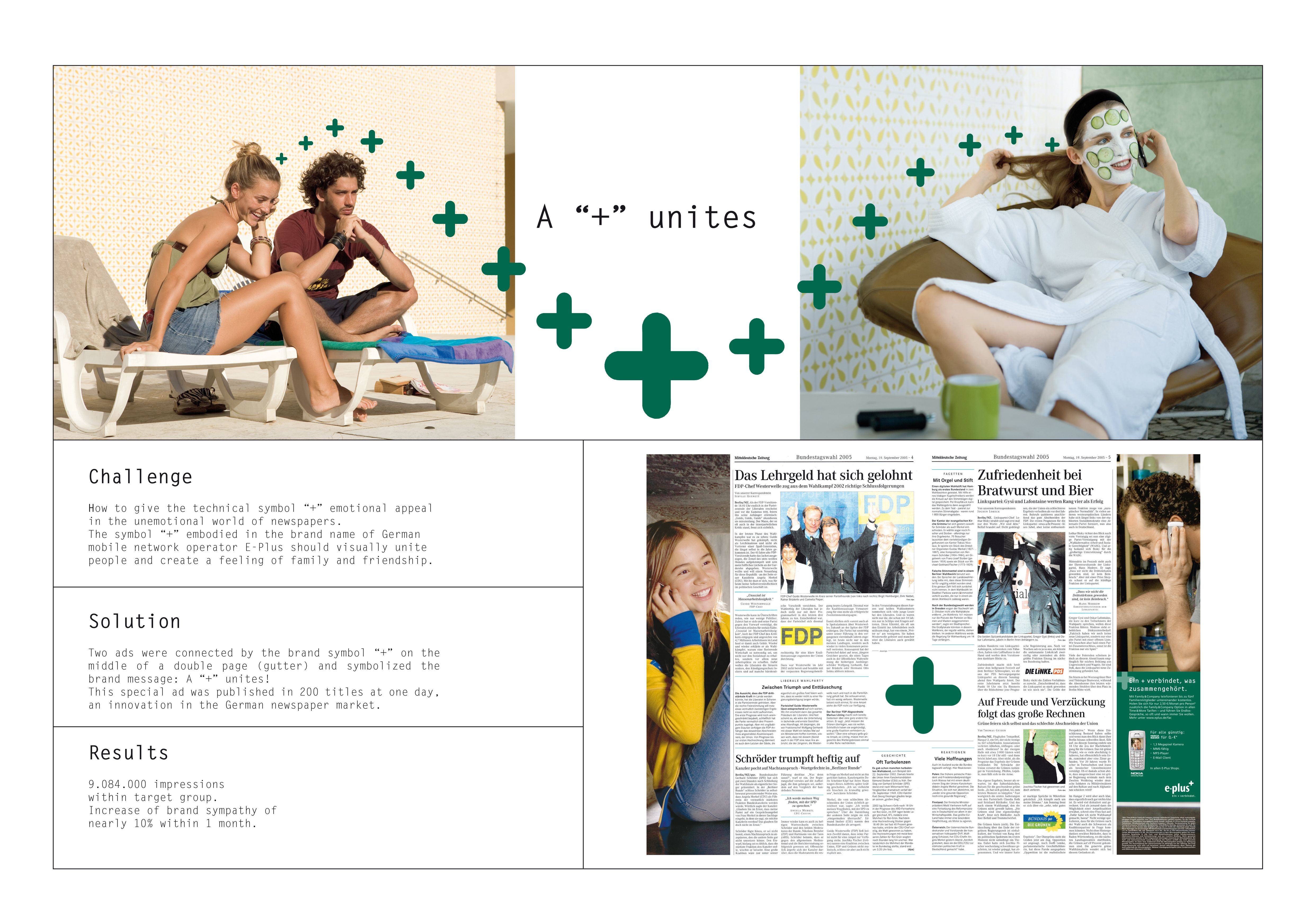
LEO BURNETT LONDON, London / MCDONALD'S / 2015

Overview
Entries
Credits
OVERVIEW
Execution
Trayliners were designed to resemble the home screen of a smartphone. Then, when placed within the iconic McDonald’s tray, the effect was to make it look like a phone with low battery, delivering the message in a fun and surprising way. The trayliners provided the perfect in-store medium, as it created a direct channel of access to the consumers McDonald's were trying to reach; people actually in the restaurant, alone or with friends, and almost certainly with a smartphone close to hand, right at the moment when the message is most relevant.
Outcome
The result is a graphic animated digital poster that uses simple graphics and clean lines to successfully combine the iconographies of smartphone design and the heritage of the McDonald’s brand.
It uses the universally recognised hamburger as the bars of a charging battery in a seductive motion graphics animation to announce an exciting and useful new service from McDonald’s.
But also, it announces a new reason for consumers to want to come to McDonald’s. It shows that McDonald’s have identified that in a country where 7/10 people own a smartphone, there are new ways to make consumers feel welcome, in this case by offering a place of refuge to those who need to charge their phones. It also presents the brand in a new progressive light, refreshing the role of McDonald’s as a sympathetic helping hand that understands the needs of its customers. When we asked McDonald’s customers, 75% of them who have seen the work agreed, expressing a desire to use the phone charging service as well as an improved and favourable impression of the brand.
Similar Campaigns
12 items


