Cannes Lions
HEINEKEN
VBAT, Amsterdam / HEINEKEN / 2010
Overview
Entries
Credits
Overview
Description
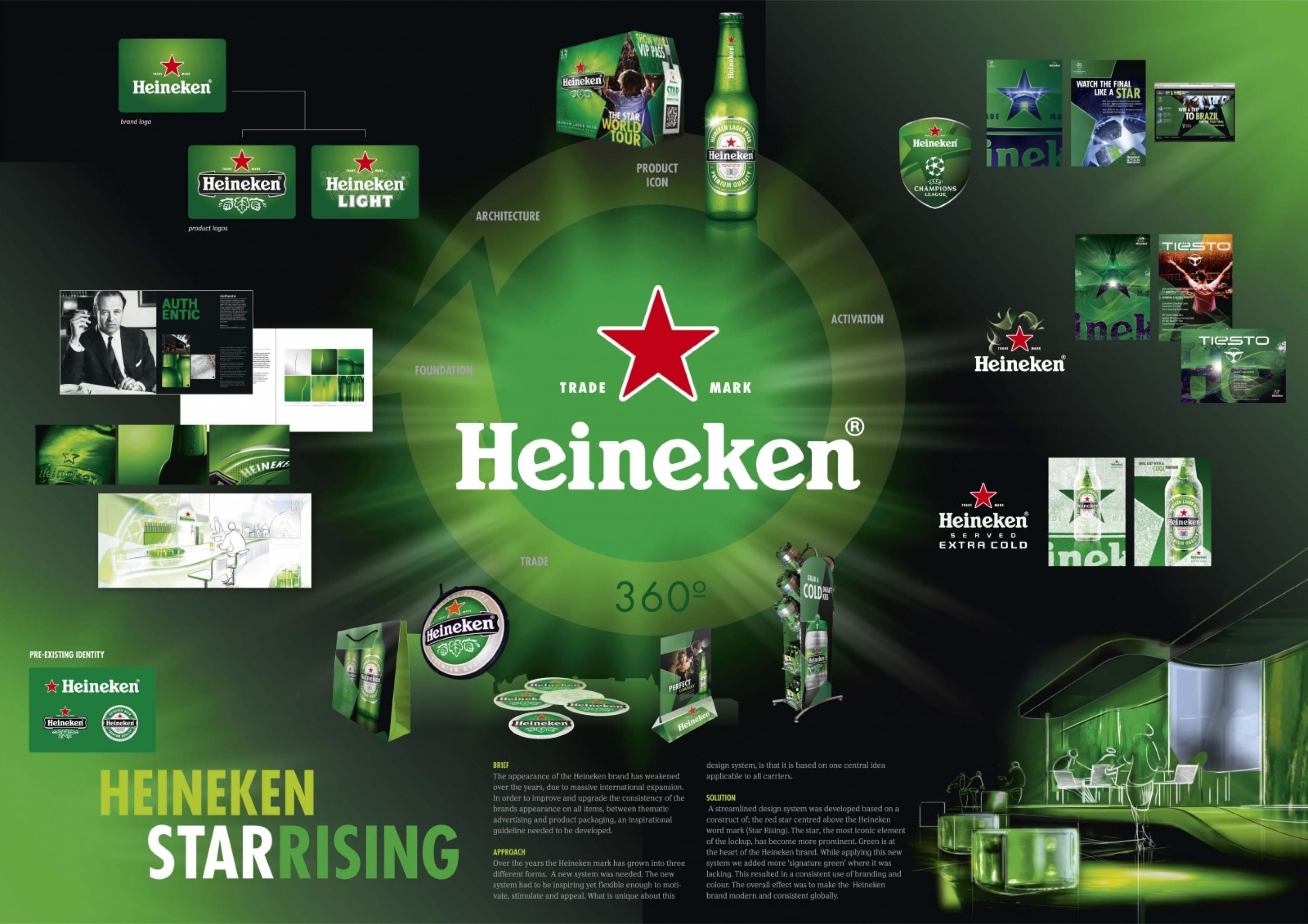
The appearance of the Heineken brand has weakened over the years, due to massive international expansion.
In order to improve and upgrade the consistency of the brands appearance on all items, between thematic advertising and product packaging, an inspirational guideline needed to be developed.
Execution
A streamlined design system was developed, based on a construct of; the red star centred above the Heineken word mark (Star Rising). The star, the most iconic element of the lockup, has become more prominent. Green is at the heart of the Heineken brand. While applying this new system we added more ‘signature green’ where it was lacking. This resulted in a consistent use of branding and colour. The overall effect was to make the Heineken brand modern and consistent globally.
Outcome
The new Heineken identity has brought the Heineken brand to a new level of consistency across all the markets where it is present. Over the next year, all of the Heineken brand platforms and communication outlets will incorporate the new identity, making Heineken a truly global brand.
Similar Campaigns
12 items