Cannes Lions
MILLER HIGH LIFE
LANDOR ASSOCIATES, San Francisco / MILLER BRANDS / 2011
Overview
Entries
Credits
Overview
Description
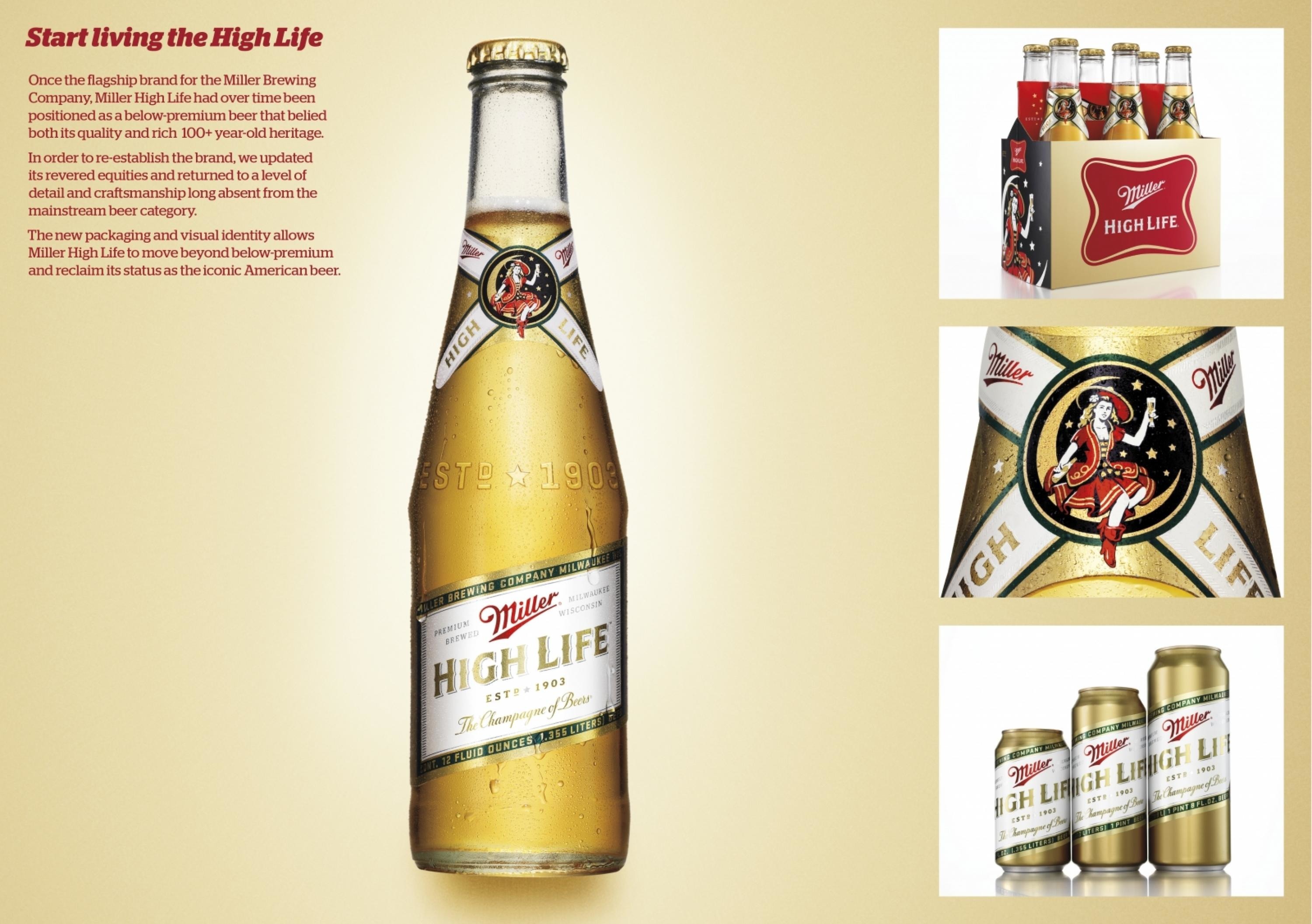
Originally launched in 1903, Miller High Life soon became one of the premier high-end beers in the United States and remained so for many years. It was offered in distinctive, clear glass bottles reminiscent of champagne bottles, and was commonly referred to as “the champagne of beers.” The Girl in the Moon illustration and the Miller soft cross logo also became recognized symbols associated with this pre-eminent American brand. Once the flagship brand for the Miller Brewing Company, Miller High Life had over time been positioned as a below-premium beer that belied both its quality and rich 100+ year-old heritage.
Execution
Given Miller High Life’s heritage, our firm saw an opportunity to celebrate its 100+ year history and make the brand more successful than it had ever been. To improve consumer perceptions, we returned to the brand’s most iconic elements—the soft cross, its proprietary champagne-like bottle, and Girl in the Moon—and contemporized them. By stepping away from traditional below-premium-beer segment semiotics such as ice, heavy gradients, and angled type, and simplifying the overall visual expression, we moved Miller High Life into a more premium territory.
Outcome
The new packaging and visual identity have allowed the franchise to stretch successfully beyond the below-premium segment, compete against more premium brands, and support a higher price point. The new design received an enthusiastic response internally at the 2010 MillerCoors annual distributors conference. It has also been praised externally on design blogs, honoured as the second best identity of 2010 on Brand New, and third best packaging of 2010 on The Dieline.
Similar Campaigns
12 items