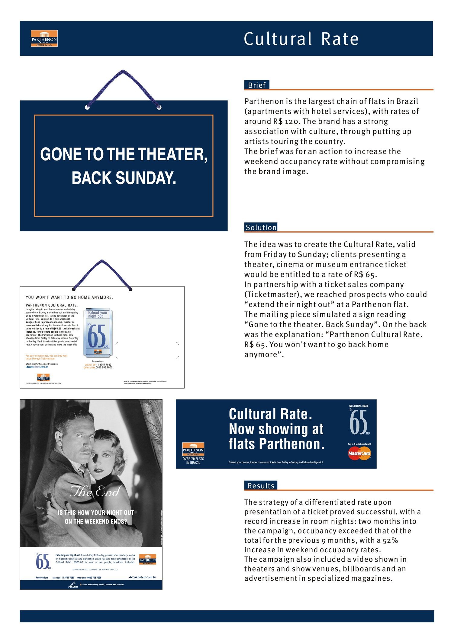
Spikes Asia
SO SOFITEL
W&CIE, Singapore / ACCOR HOTELS GROUP / 2016

Overview
Entries
Credits
OVERVIEW
Background
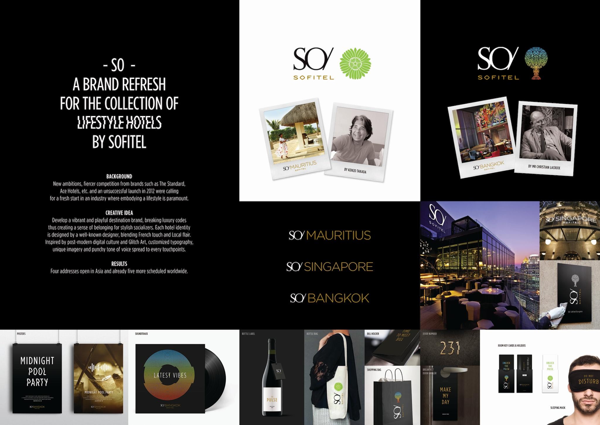
SO - A brand refresh for the collection of lifestyle hotels by Sofitel
New ambitions, fiercer competition from brands such as The Standard,
Ace Hotels, etc. and an unsuccessful launch in 2012 were calling
for a fresh start in an industry where embodying a lifestyle is paramount.
With this in mind, the mission was to develop THE daring brand, crafted for stylish socializers and hotels offering bold avant-garde design, top of its class well-being programs, unconventional F&B and social experiments.
Execution
City hotels and resorts are differentiated thanks to a dual territory and their emblem, beautifully combining with the Brand’s identity. Black, white and gold – shared through the Sofitel family – are enhanced by each of their vivid complimentary colours.
The identity beats to the rythme of the Pulse, inspired by post-modern digital culture and Glitch Art. It spreads to every touchpoint and electrifies the dual territory created for city hotels and resorts. A customized typography, a unique iconographic style, and punchy and tongue-in-cheek tone of voice animate more than 150 collaterals and signage elements as well as marketing materials.
Similar Campaigns
12 items