Design > Brand-building
E4 RE-BRAND
4CREATIVE, London / CHANNEL 4 / 2019
Overview
Credits
Overview
Background
Faced with significantly increased competition and the wide expansion in the quantity of television channels available, Channel 4 undertook a full rebrand of its digital channel portfolio in 2018, creating more visibility for the Channel 4 masterbrand and providing a clearer sense of family unity across the portfolio, placing the classic Channel 4 logo at the heart of all its channel logos, including E4. The challenge for E4 was to successfully adopt a new logo without losing its quirky, distinctive personality that had made it so popular with its young, commercially-important audience over the past 15 years. While slotting a more ‘corporate’ logo line up how would E4 retain its natural sense of mischief and creative energy, exemplified by ‘e-stings’ and shows like The Inbetweeners? And fully rebrand on a budget of £400k, including all new presentation assets on and off air.
Describe the creative idea
To distinguish E4 from the rest of the unified Channel 4 portfolio we decided to play up the relationship between the ‘E’ and the ‘4’ giving the ‘E’ in the 4 a life of its own as a mischievous, rebellious character, constantly trying to break free and rebel from its surroundings. We gave E4 permission to play the role of Channel 4’s naughtier rebellious sibling. So in all of the creative assets, from 40” idents to 3” opticals, we honed in on the relationship between the E and the 4, focusing on and celebrating the new logo while delivering a entertaining, playful branding assets, positioning E4 as the home of Channel 4’s less serious youth-skewing content. This resonated with viewer research which showed that viewers were drawn into E4’s free-spirited, playful, irreverent brand tone, a brand that didn’t take itself too seriously.
Describe the execution
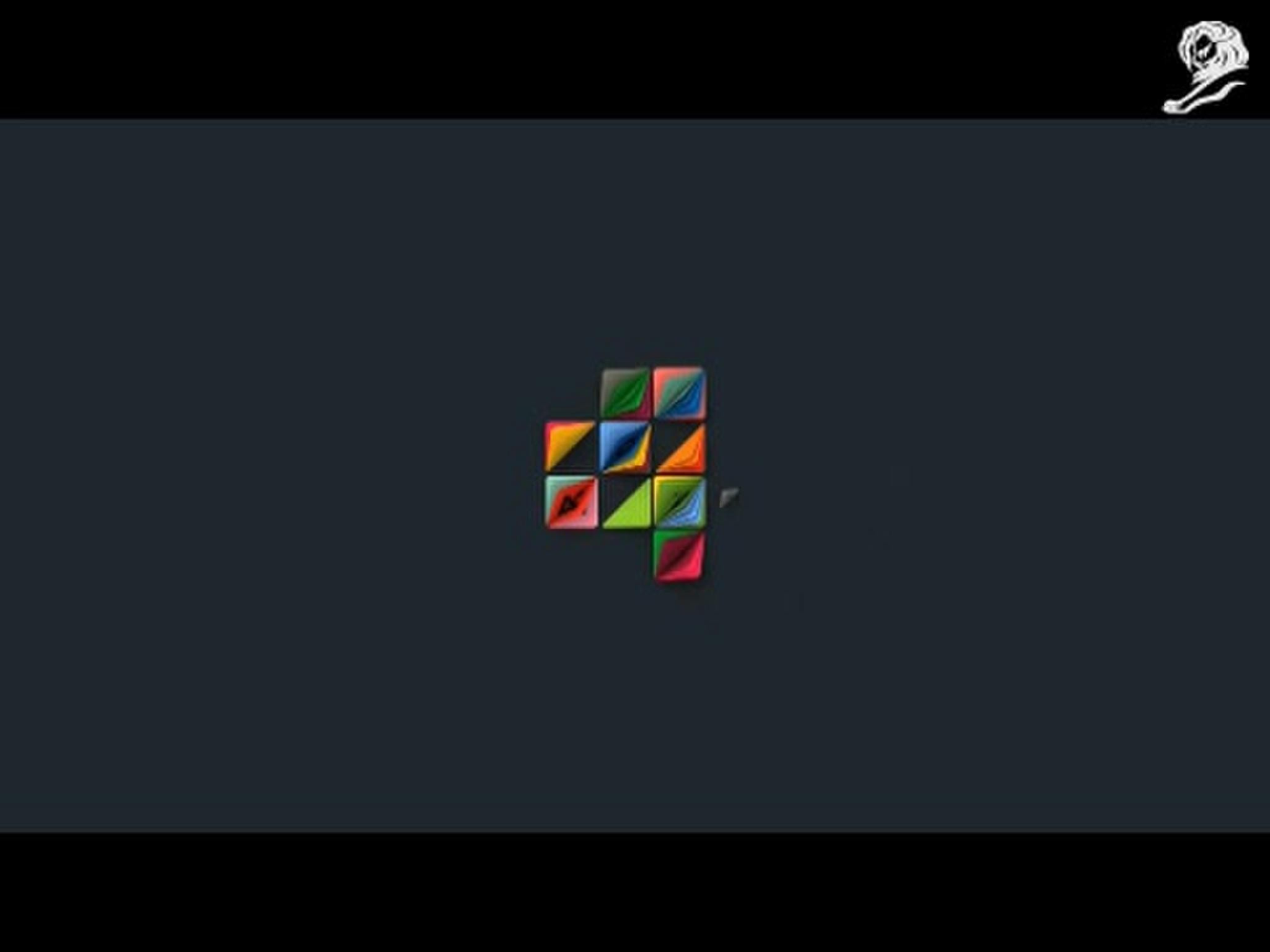
The starting point for the rebrand was a new E4 logo, designed by 4creative, featuring the purple ‘E’ of E4 neatly embedded within the Channel 4 logo.
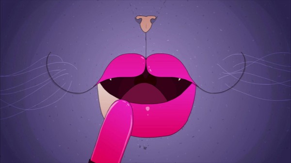
We then gave the new logo life through movement in the form of sixteen different 3-second opticals. Each movement is unexpected and playful and the ‘E’ does something fun that brings a smile, while the Channel 4 blocks react to the mischievous movement of the E, as it akes on different forms and textures, becoming a burst of purple sequins; oozing glue; purple bubbles; elastic worms, extruding plasticine.
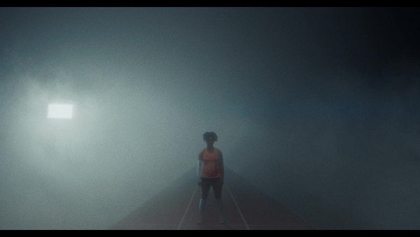
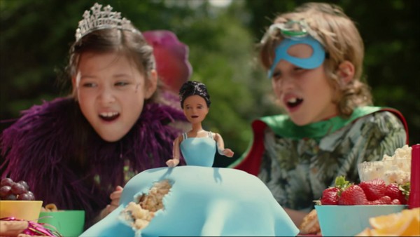
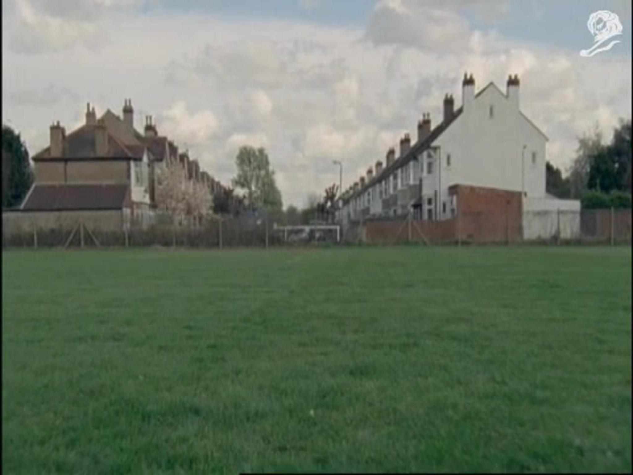
For the channel idents we gave 19 animators and film-makers across the UK the creative freedom to make their own E4 films, the only requirement that the new logo would be the hero of their film. The result is an eclectic, energetic, highly creative collection of E4 films that punctuate the channel throughout the day.
List the results
The rebrand went live in September 2018 so it’s early days and it has not been possible to directly measure an uplift in brand sentiment based on the E4 rebrand. Anecdotal evidence has been very warm with positive reaction to the new branding in social and through Channel 4 viewer inquiries.
More Entries from Rebrand / Refresh of an Existing Brand in Design
24 items

More Entries from 4CREATIVE
24 items