Digital Craft > Form
PULSAR STUNT FONT
OGILVY INDIA, Mumbai / BAJAJ / 2021

Overview
Credits
Overview
Describe the creative idea
For years Pulsar fans or Pulsarmaniacs used gravity defying stunts and adrenaline-fueled riding to express themselves on the road. As times changed and we entered the digital world, they needed a way to express themselves on social media like they did on the road.
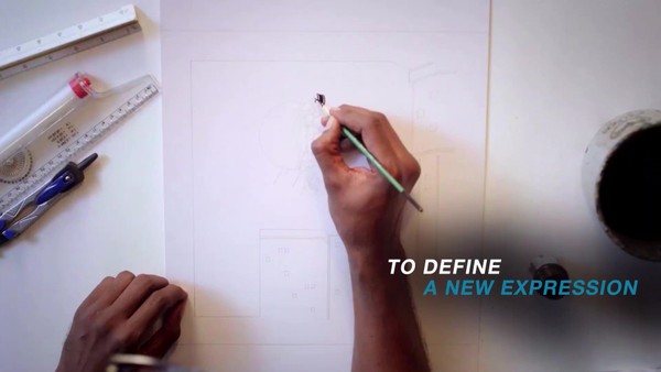
Introducing Pulsar Stunt font, A font inspired by stunting. An illustrated font that had a stunt embedded in each letter, designed for Pulsarmaniacs to take their mania from the road onto social media. 26 letters and 10 numbers that could be found as GIFs on Instagram stories and as Stickers on Facebook.
Finally, bikers around the world had a font they could call their own.
Describe the execution
Implementation:
We used Giphy and Tenor to make the font accessible as GIFs on Facebook, Instagram and Whatsapp. Each letter had a wheelie, stoppie, slide illustrated and embedded in it. Each letter was animated to add dynamism and character. So when fans used the font to create their own GIFs the text stood out in each social media platform.
Scale:
A total of 26 alphabets, 10 numeric and 72 phrases were created made available as GIFs to over 10 million Pulsar riders all over the world on social media and through a microsite the fans could download the fonts on their devices to customize t-shirts, merchandise and riding gear.
Brand relevance:
The brand is always been a pioneer in the Indian two-wheeler category be it in technology, design, and performance. It is also the first brand in India to put stunting as a sport on TV. Now, in this digital age the Stunt Font becomes the first specifically customized language for the thrill-seeking biking community to express themselves.
Touch Points:
Whatsapp Chats | Giphy & Tenor | Facebook | Instagram Stories
Materials – 26 alphabets, 10 numericals and 72 readymade phrases available as Animated GIFs and Stickers.
Style Elements- Each letter had a stunt embedded in it. The stunts were animated so when fans used it in their customized stories they stood out on their devices.
Colour scheme – The fonts are in Black&White so it appeared uniformly on every social platform irrespective of the device and screen resolution.
Negative space – The font used the negative space brilliantly. It was the negative space between the stunt in every letter that formed the alphabets or numbers.
Timeline: : 3rd December 2020 - 31 December 2020
Font: Available across platforms mentioned
More Entries from Digital Illustration & Image Design in Digital Craft
24 items
More Entries from OGILVY INDIA
24 items
