Design > Comprehensive Branding Programs
THE FRUIT LEATHER LABEL
GREY AMSTERDAM, Amsterdam / POTVERDORIE! / 2017
Overview
Credits
Overview
CampaignDescription
We told Potverdories’ story - their fight against food wastage - through the design of their product by literally creating their labels from wasted fruits & vegetables. This to even further minimize wastage. At the same time we created the worlds first visual expiry date product label. The lifespan of the labels is one year, exactly the same as the content inside the jar.
Execution
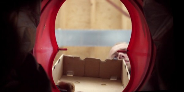
We created fruit leather product labels for every jam and chutney flavor, using the same ingredients found inside the jar. By doing this we also created the worlds first visual expiry date product label. The lifespan of the labels is one year, exactly the same as the content inside the jar. We started off by blending the fruit. Then we evenly spread the liquid fruit onto a baking tray and baked it in the oven. After 8 hours the liquid fruit becomes beautiful fruit leather. Every chutney or jam has its own label, made from the same ingredients inside the jar. The same love and craftsmanship was put into the design of their new logo which we then laser-cut out of the fruit leather. Finally, each and every label is attached to the jars.
Outcome
The 1st batch of 500 jars to test the new design have been delivered to stores.
We are currently awaiting the first results.
Strategy
The challenge with waste food is that there’s a negative connotation attached to it. In people’s minds it doesn’t look appealing and therefore they won’t buy it. That’s why we had to make sure Potverdories’ product looked appetizing and premium. At the same time, we wanted the product to tell their story - their fight against food wastage. We decided to use their product as the medium.
Synopsis
Potverdorie! collects wasted fruit and vegetables from supermarkets and turns them into delicious jams and chutneys. Consumers were very enthusiastic from the start, but there were retailers that didn’t want to sell the product because it didn’t look distinctive and professional enough. Not taking those comments lightly, Potverdorie! briefed us to re-design their logo and packaging design. The objective being; more product sales and word of mouth around the new packaging design. Because of their limited budget we decided to create and design a limited, 500 pcs seasonal range packaging serie with high attention and talkability value.
More Entries from Rebrand / Refresh of an existing brand: Consumer in Design
24 items


More Entries from GREY AMSTERDAM
24 items