Media > Channels
THE MELANOMA TYPEFACE
TBWA\AUCKLAND, Auckland / MELANOMA NZ / 2021
Overview
Credits
Overview
Why is this work relevant for Media?
To remind people to take a closer look at spots on their skin, we created a specially designed typeface made only of full stops. We hid these full stops where regular ones would normally be, excepts ours were mutated to show the symptoms of melanoma.
In this case, we put our full stops on bottle labels for a non-alcoholic beverage that was the primary sponsor of a summer festival, where people were spending the whole day in the sun. The spots were used on the thousands of bottles that were sold at the festival.
Background
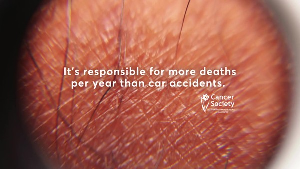
80% of all cancer diagnoses in New Zealand are for Melanoma. If left untreated it can rapidly spread to other parts of the body. But there’s a very good chance of survival if you catch it early enough.
The problem is, the only symptom is often a new spot or a subtle change to an existing spot, which many people pay no attention to.
And even if they do notice something, there’s little awareness around what to look for, and what actual melanoma symptoms look like.
Describe the creative idea / insights
We created a typeface that consists of only full stops: The Melanoma Typeface. The font was designed with a leading typographer and a dermatologist to accurately represent melanoma, with each weight depicting a different symptom. And just like a real melanoma, it changed in response to UV light.
To mirror the existing behaviour that people have with spots on their skin, we made subtle changes to spots that are in the public eye every day, in ads and on product labels for some of the biggest brands in the country. Designed for people to notice- or not.
Describe the strategy
We wanted to target people who are spending a lot of time outdoors in summer. So our media approach for this execution was to target the captive audience at a summer beachside festival who are spending the day in the sun. By putting our spot on every bottle in the festival we ensured that it would get attention.
By drawing attention to these usually benign spots we prompted people to take a closer look at their own, as well as learn more about what to look for when it comes to skin changes.
Describe the execution
We gave our Melanoma Typeface to some of the nation’s biggest brands to use in their summer advertising/product labels for two weeks during New Zealand’s hottest month- February.
In this execution, we gave the Melanoma Typeface to the sponsor of a one-day summer festival who applied it to their product labels. As our typeface included 7 weights representing the 7 different visual symptoms of melanoma, there were 7 different spots used across the bottle labels at the festival.
This was supported by brand messaging in other channels with the message: Don’t let a spot become a full stop, outlining the warning signs for melanoma and reinforcing the importance of regular skin checks.
List the results
Our message reached 95% of the population during the most dangerous time for melanoma- summer.
The bottles were circulated at the festival, attended by thousands of people.
More people than ever before were prompted to book potentially life-saving skin checks.
More Entries from Use of Ambient Media: Small Scale in Media
24 items
More Entries from TBWA\AUCKLAND
21 items