Design > Packaging
UNITED SODAS OF AMERICA
CENTER, Brooklyn / UNITED SODAS OF AMERICA / 2020
Awards:
Overview
Credits
Overview
Background
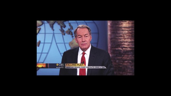
Soda. By 2020 this once great American past-time had become synonymous with dated products, corporate group think, and out-of-touch brands. There were no options for those who expected more from the dusty soda aisle. Furthermore, soda coolers, like the American psyche, were divided into a zero-sum decision: the big red brand or the big blue brand. Where others saw a dying, divided soda category we saw an opportunity to redefine what soda means for America from the inside-out.
The question was posed: how do you build a soda brand grounded in American ideals without using stars, stripes, eagles, flags and sweaty bottle shots?
Describe the creative idea
We founded United Sodas of America with a central premise: Soda shouldn’t be about one-cola-fits all brands, it should be about variety for all or “Variety for Society”, as we say. Given the future-looking nature of our vision, we needed a design system that felt fresh, modern and yet completely comfortable in the soda aisle.
In our consumer research, we realized that so many Americans are soda drinkers at heart. The pop and fizz gives a delight that few were able to deny. The problem became that they didn't have a soda to drink anymore. Our consumers have typically walked away from the soda aisle, but have found themselves looking for more out of the seltzer aisle. That's where we come in, a soda for a new generation.
Describe the execution
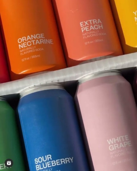
To encapsulate our vision, we decided to strip our brand and packaging system down to the essentials: shape, type, color. We started with an iconic soda element as our canvas—the classic 12oz can silhouette. No skinny cans or new-age glass bottles here. We needed to ground ourselves in a visual cue that said “We are proud to be a SODA”. We modulated this shape with two key layers: 1. A minimalist approach to type that spoke to the accessibility of our brand, and 2. a dynamic full-spectrum palette of 12 brand colors to convey variety. The result is a brand system that celebrates the iconic in the modern, the premium in the generic, and the freedom in choice.
We created worlds for each of flavors, personalities that lived and breathed through color, music, and written word. From there, we could share each story as brand-centric content.
List the results
The United Sodas team spent over 18 months translating our vision for the future of soda into this sensory experience that has already excited the hearts, minds, eyes and taste buds of our fans and customers. We've seen the brand being featured in Oprah Magazine, The Today Show, Forbes, Fortune, Fast Company, Adweek and countless social feeds around the world. We secured over 150 press mentions with a potential reeach of 1.5 Billion impressions.
United Sodas quickly sold out of the signature variety pack, significantly outpacing the original sales projects for the brand launch five times over. While the brand initially planned to remain in the Direct-to-Consumer space in 2020, retail was launched less than 2 months after the brand launch to over 100 retail locations by the end of the year.
More Entries from Drinks in Design
24 items
More Entries from CENTER
4 items