Design > Brand-building
IMAX: BLUE FRAME DESIGN SYSTEM
TBWA\CHIAT\DAY LOS ANGELES / IMAX / 2019

Overview
Credits
Overview
Background
IMAX has a 50-years heritage of partnering with legendary filmmakers and developing ground-breaking entertainment technology, from proprietary in-theatre technology to post-production tools and camera innovations.
Despite this, customers were losing sight of IMAX’s value. For some, new competitors muddied IMAX’s difference at the theatre. For others, IMAX was stuck in nostalgic perceptions around science centers and documentaries. For still others, IMAX fell far into the background behind the films shown in its format.
IMAX needed to own its leadership position in the premium large format space it pioneered.
Our Brief: A brand design system that quickly and effectively communicates IMAX’s difference and communicates IMAX as the ultimate immersive movie experience.
Objectives:
– Drive box office sales
– Educate consumers on the IMAX difference
– Build value that justifies price difference
Budget: $2M
Scale: Global – 76 countries around the world, including in over 1,300 theatres
Describe the creative idea
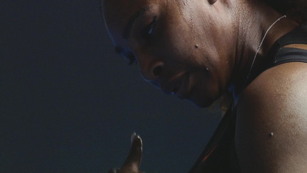
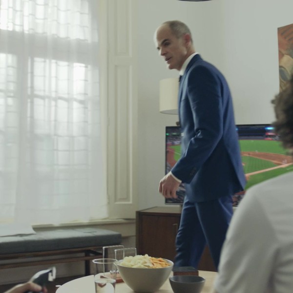
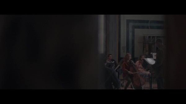
The “IMAX Blue Frame,” a design system that represents the conceptual boundary between IMAX and other movie-going experiences. Everything within the frame symbolizes the standard movie-going experience, whereas everything outside the frame symbolizes the immersive experience you can only get with IMAX.
The frame allowed the IMAX brand to have a consistent voice. Uniting all of their communications across 39 languages, 79 countries, on IMAX-owned branded content, studio IP content, in-theatre displays, online web banners, OOH and AV content. In each execution, the IMAX brand and name was brought front and center, and for the first time ever, became the hero on assets previously dominated by movie visuals.
With this, IMAX communicates clearly to its target of premium moviegoers, a large but discerning group of global film fans who desire premium features and are willing to pay more for the best experience when they go to the theatre.
Describe the execution
The design elements are simple:
– A blue frame incorporated over imagery that allows visual elements to push beyond it.
– The IMAX logo expands beyond the frame, symbolizing the immersive nature of the viewing experience.
– The tagline ‘Films to the Fullest’ lives within the frame while all other supporting messages live beyond the frame, signifying you only get them in IMAX.
The design system needed to be simple and elegant so that global markets and studio partners could easily implement it. It also had to be flexible enough to live across a myriad of formats and visuals without compromising its integrity. From 30 meter tall movie screens down to 2 inch square Instagram posts.
List the results
The results of the new brand design system were impressive and continue to be so. Over the course of only 7 months, ‘The IMAX Frame’ has become synonymous with the IMAX brand. The IMAX Social channels now have an established look and feel and, most importantly, consistency that is built upon the IMAX brand’s voice rather than the film’s voice.
On Instagram, followers have increased by 45% (and growing) since the launch of the design system. We’ve received 80MM+ total impressions across our AV Content, over 1MM visits per month to the official IMAX website, and a 42% increase in Post-Campaign Share of our social content on DNA titles. We’ve also successfully leveraged the campaign to launch 149 new theatres globally in 2018.
While there is still much to do, the IMAX brand design system has made big strides in clearly differentiating IMAX from its competitors.
More Entries from Rebrand / Refresh of an Existing Brand in Design
24 items

More Entries from TBWA\CHIAT\DAY LOS ANGELES
24 items