Design > Brand-building
LA PHIL REBRAND
TBWA\CHIAT\DAY LOS ANGELES / LOS ANGELES PHILHARMONIC ASSOCIATION / 2018

Overview
Credits
Overview
CampaignDescription
In order to look forward while remaining true to a rich legacy, we took the shapes of the two primary venues associated with the LA Phil—the Walt Disney Concert Hall and the Hollywood Bowl—and incorporated their features along with those of the Los Angeles skyline into the anatomy of the logotype.
Execution
The primary logo is a high-contrast sans serif wordmark that feels at once modern and classical, much like the organization itself. The new identity honors its primary venues but elevates the organization above them, allowing the organization’s name to take center stage and better reflect the breadth of its responsibilities and initiatives. It has an inherent musicality, and evokes upward movement even in its static form.
Outcome
The redesign has brought new pride and enthusiasm to every corner of the organization, instantly transforming its hundreds of pieces of printed and digital materials. It has given them a modern, fresh look on par with its creative output and generated tremendous excitement for the future.
Synopsis
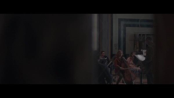
Established in 1919, the Los Angeles Philharmonic (LA Phil) is an orchestra and music organization based in Los Angeles, widely recognized as one of the most contemporary, groundbreaking, and innovative in the world. Their identity needed to reflect the LA Phil’s role in progressive culture.
More Entries from Rebrand / Refresh of an Existing Brand in Design
24 items
More Entries from TBWA\CHIAT\DAY LOS ANGELES
24 items