Cannes Lions
BRANDING
COLEY PORTER BELL, London / PERNOD RICARD / 2011

Overview
Entries
Credits
OVERVIEW
Description
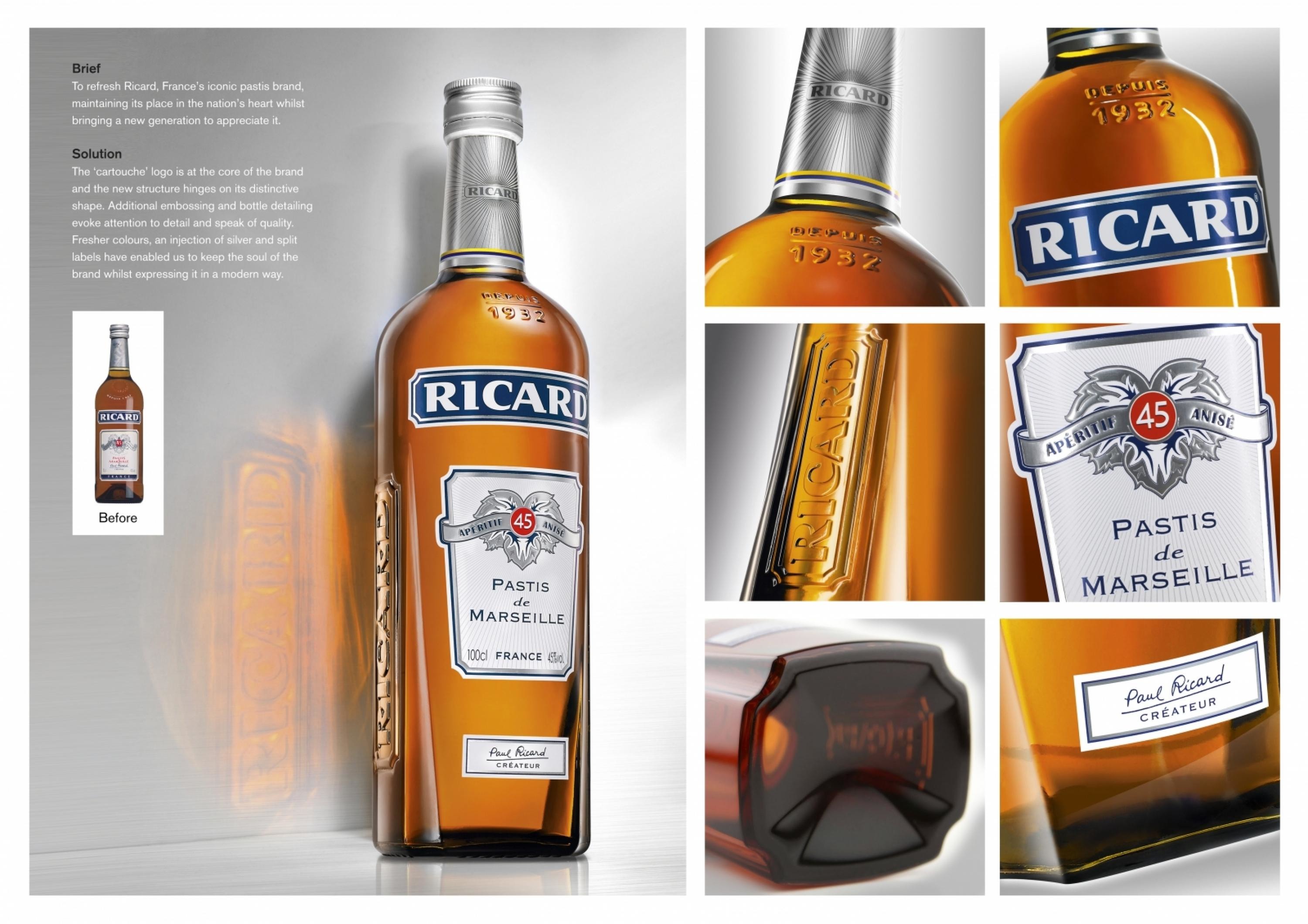
Ricard, the iconic French pastis, lacked distinction and was looking tired.
In its native France, where 3/4 of volumes are drunk, it is perceived as an ‘eternal’ brand – always there, an intrinsic part of people’s lives, a dependable friend.
The brief was to re-design Ricard to; - create an iconic bottle that could differentiate it from other spirits, and critically, other pastis brands- modernise the brand (demonstrating it can move with the times/be relevant to a new, younger generation of drinkers)- help reassert Ricard’s status as a major international drinks brand
Execution
Research revealed that the ‘cartouche’ logo is at the core of the Ricard brand. The new structure therefore hinges on it's distinctive shape.The bevelled edges rising from the base further contribute to the ownable bottle shape. The shoulders provide masculinity and stature and are recognisably Ricard. Additional embossing and bottle detailing evoke attention to detail and speak of quality.Fresher colours, an injection of silver and split labels have enabled us to keep the soul of the brand whilst expressing it in a modern way.
Outcome
Early indications are very promising....
Extensive press coverage of this high profile launch in national, international, mainstream and trade press suggest that the new bottle is really big news and has been incredibly well received.
Research also supports this with consumers describing the new bottle as "Original", "Modern", "Sophisticated", "A bottle I would be proud to show" and "A major change but it remains very Ricard" (see AV) and therefore delivering strongly against the project objectives.The bottle first entered the market four weeks ago and official sales figures are eagerly awaited.
Similar Campaigns
12 items


