Cannes Lions
DIET COKE VISUAL IDENTITY SYSTEM
WIEDEN+KENNEDY AMSTERDAM, Amsterdam / COCA-COLA / 2014
Overview
Entries
Credits
Overview
Description
The core challenge was to create a new VIS and packaging tool-kit that would work consistently across and resonate in over 180 markets. A system that could connect and standardize the fractured brands - Diet Coke and Coca-Cola Light - and work across the caffeine-free and flavored product extensions. While also meeting the key objectives of bringing more energy to the products and globally reinvigorating the iconic brand and packaging.
Execution
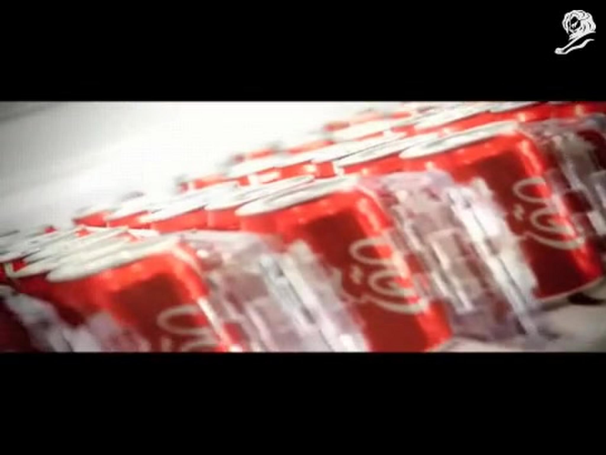
After dozens of tests and prototyping, the final design reinvented the brand’s use of silver with the unique approach of utilizing moiré patterning. This technique involves the layering of lines to create a visual illusion, injecting energy and movement into the product with the perception of an ever-changing surface.
This achieved a silver feel without actually using silver substrate and also worked to create a fabric-like appearance, reinforcing the brand’s continued association with fashion.
Five key moirés and five more specifically designed for cans were ultimately created to work across all packaging, including all bottles, cans, cardboard and plastic.
Outcome
The packaging has only just launched, so we're afraid we don't have any results yet. But we can confirm that markets in question have enthusiastically embraced the VIS and the new Moiré packaging so far.
Similar Campaigns
12 items