Eurobest
Dystitles
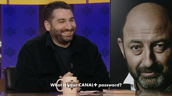
BETC, Paris / CANAL / 2023
Overview
Entries
Credits
Overview
Background
TV shows and series are one of the main sources of entertainment for most people.
They are often the preferred way to escape from reality. With the explosion of the audiovisual industry in every country, it is now very common to have access to content from all over the world. However, to capture all the emotions that this content can provide, the original version is key: preserving expressions, intonations, and therefore acting in general, are more an emotional vector than a post-dubbing.
Brief
how can we make this type of content accessible to as many people as possible so that everyone can enjoy it?
Objective:
By making society adapt to people's needs rather than having people always conform to the most common standards in our society. Therefore, finding suitable tools for each type of person. In this case, dyslexic individuals.
Idea
To make life easier for dyslexic people, we decided to integrate, for the first time, an original typography in the player of a streaming platform that makes reading easier for dyslexic individuals.
Far from addressing only a dyslexic population, this new font is readable by all. Because in a household or family where one person may be dyslexic, others may not be. The content should be understandable and enjoyable for everyone, dyslexic and non-dyslexic alike. Therefore we decided to create this new typography, which is readable by all and easy to integrate into any content, just like any classic subtitle font. And, of course, we partnered with one of the most recognized brands in the French audiovisual sector to promote our message and give more visibility to the project.
Strategy
Dyslexia affects a significant portion of the population worldwide. 12% of the global population has trouble reading most words, including subtitles. In an attempt to solve this problem, experts have been working for many years on tools to make reading more accessible for these people.
That's why we decided to work with a leading expert, a speech therapist and neurologist who has worked on this issue in France. She has been working for over 10 years with a team of researchers concerned with the issue to develop a typography that is immediately readable by dyslexics without requiring any extra concentration, unlike with a standard font.
To highlight the result of these many years of work, we have decided to make it accessible to everyone by adapting it so that non-dyslexics can also read it and offering it as an option on the player of France's largest streaming platform.
Execution
The final typography, designed by the agency in partnership with neurologist Beatrice Sauvageot, president of the association Puissance Dys, was extensively tested during a week-long training with dyslexics and non-dyslexics who all adopted it unanimously. The engineers of the Canal+ platform then validated and certified the feasibility of its implementation on the brand's player.
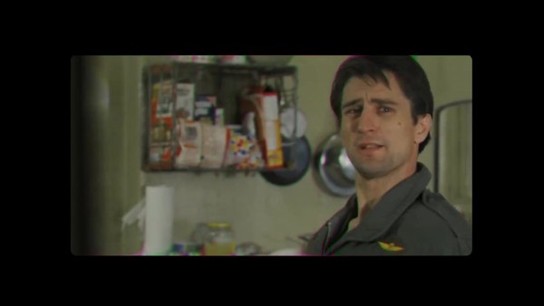
The announcement was then made in a launch tweet by the brand's CEO, sharing a recap video of the testing process. Subsequently, a trailer of the latest hit series produced by Canal+ was subtitled with the new typography and posted on the brand's Youtube channel. The typography will be permanently integrated into the Canal+ player in 2023 and will be finalized on all possible devices by early 2024. This typography will then be made available for other advertisers such as Netflix and Prime Video to follow in the footsteps of Canal+, a pioneer in this field.
Outcome
The first tweet of the launch had a strong reaction, with hundreds of shares and positive comments when the news was announced. The media then immediately picked up on the phenomenon and wrote articles on the subject even before a press release was issued. Subsequently, the announcement of this societal progress was widely reported in all the major French media.
100% of dyslexics who were able to test the new typography approved of its interest and its effectiveness in simplifying their reading of subtitles. We were able to collect numerous testimonials, all of which were broadcast in the launch assets and in dedicated programs on French television and radio.
Similar Campaigns
12 items