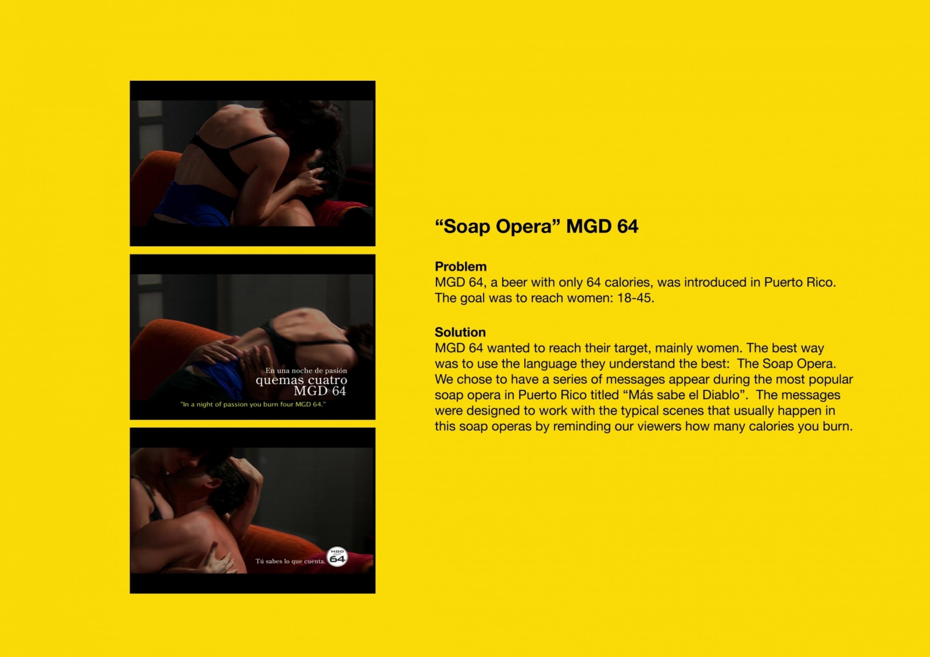
Cannes Lions
Miller Lite
JUNIPER PARK\TBWA, Toronto / MILLER BRANDS / 2017
Overview
Entries
Credits
Overview
Description
Miller Lite is the original light beer and recently released its original white can. Younger drinkers (21yrs+) took notice so we visually condensed the reissued packaging into the Minimalist Can icon. It became the core of the new visual ID.
This new Minimalist Can icon is bold, medium neutral, and constantly evolving. It allows us to say more with less words.
Execution
Design elements and their integration: Minimalist Can is the core of the visual identity and has been constantly morphed and updated into the interests and passions of our drinkers.
Design touch points: online, TV, OOH, print, social, at point of sale, on-premise, at festivals and at stadiums.
Materials, style elements, design choices: Our goal was to create an identity so bold it could not be mistaken, yet malleable enough that it could be kept fresh enough to be noticed in todays always on mediascape. All design choices were made for maximum impact, customizability and use across media and channels.
Design development and process:
Scale: US National
Outcome
The Miller Lite brand has reversed years of negative momentum and is growing again. Since the launch of the new visual identity in early 2016, Miller Lite has been on a streak of back-to-back quarterly share growth against Bud Light, a longtime nemesis and market leader. Support is up with distributors and cultural partners, who have completely embraced this new approach. More importantly, they've seen similar improved penetration with young drinkers and specifically Latino drinkers.
Similar Campaigns
12 items