Cannes Lions
NEON SOUND
KINETIC SINGAPORE, Singapore / NEON SOUND / 2012
1 of 0 items
Overview
Entries
Credits
OVERVIEW
Description
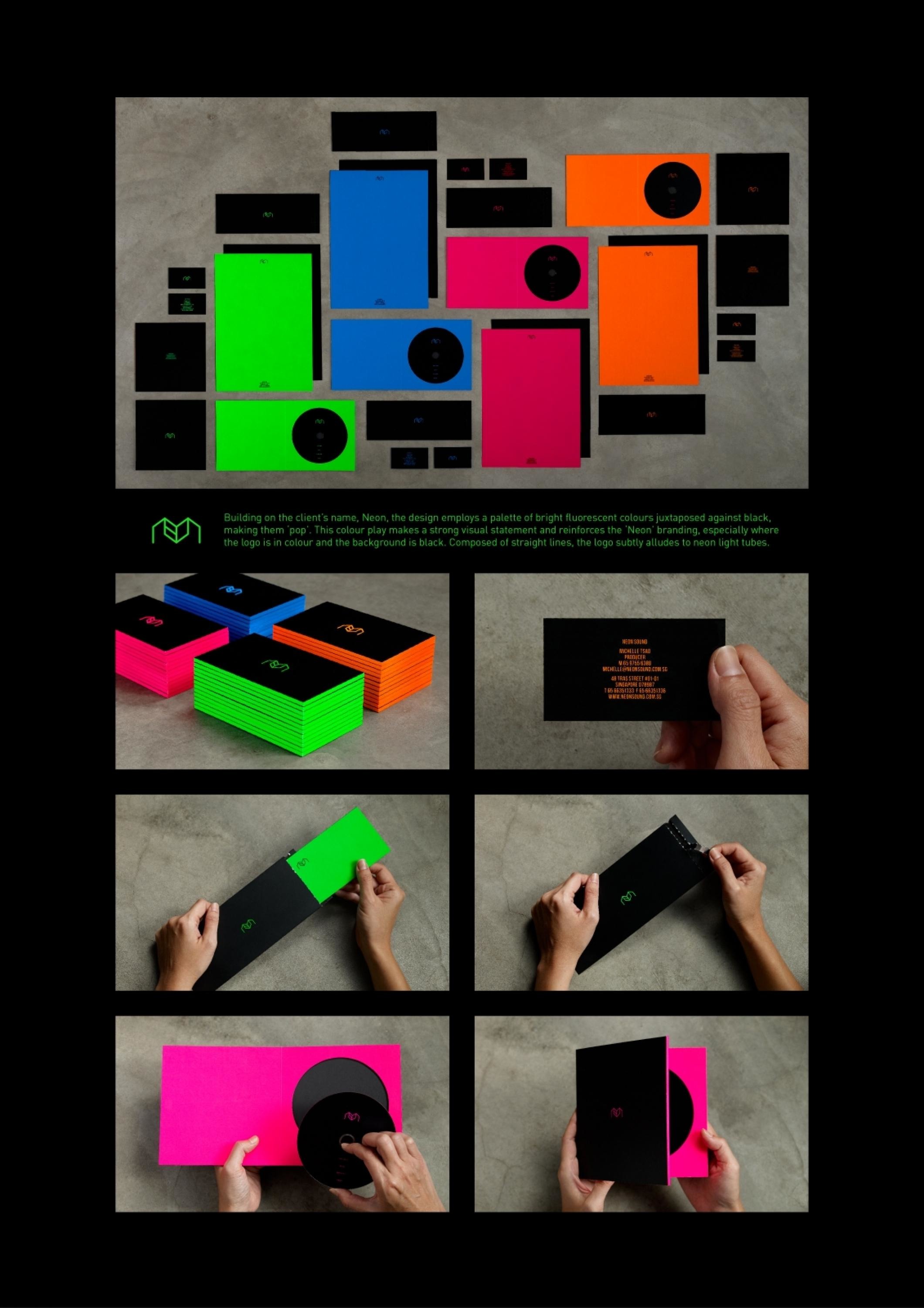
The agency was tasked with the creation of a corporate identity for a newly set up audio house.
Execution
Building on the client's name, Neon, the design employs a palette of bright fluorescent colours juxtaposed against black, making them 'pop'. This colour play makes a strong visual statement and reinforces the 'Neon' branding, especially where the logo is in colour and the background is black. Composed of straight lines, the logo subtly alludes to neon light tubes too.
Outcome
Good design stands out. Clients and potential clients love the entire branding and corporate identity of Neon.
Similar Campaigns
7 items