Cannes Lions
TAKE OUT
CROSS COLOURS , Johannesburg / NANDO'S / 2010
Overview
Entries
Credits
OVERVIEW
Description
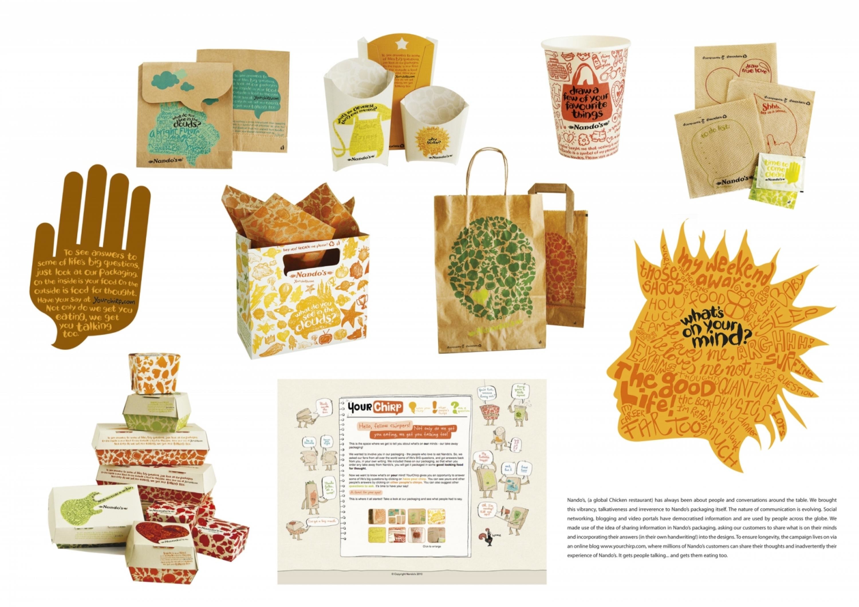
Packaging is one of the key elements in any restaurant take-out experience. Not only does it perform a functional role by protecting, transporting and serving the product but it also needs to serve (excuse the pun) as a brand extension as users take the packaging into the home, work and play environments. Nando’s, an international Chicken restaurant briefed us to create a new range of packaging that reflected the world-class yet irreverent and vibrant personality of their brand. As a global roll-out constituting hundreds of thousands of each unit, the agency was required to remain conscious of cultural diversity and to create a campaign that had universal appeal.
Execution
Nando's, (a global Chicken restaurant) has always been about people and conversations around the table. We brought this vibrancy, talkativeness and irreverence to Nando's packaging itself. The nature of communication is evolving. Social networking, blogging and video portals have democratised information and are used by people across the globe. We made use of the idea of sharing information in Nando's packaging, asking our customers to share what is on their minds and incorporating their answers (in their own handwriting!) into the designs. To ensure longevity, the campaign lives on via an online blog www.yourchirp.com , where millions of Nando’s customers can share their thoughts and inadvertently their experience of Nando’s. It gets people talking... and gets them eating too.Give some indication of how successful the outcome was in the marketA hugely successful global roll out, constituting hundreds of thousands of each packaging unit – all user-generated - appealing to all nations and cultures and the paper packaging is 100% compostable.
Similar Campaigns
12 items
