Design > Brand-building
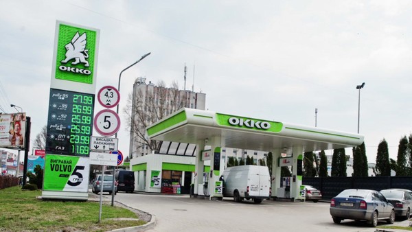
OKKO
BANDA AGENCY, Kiev / OKKO / 2019
Overview
Credits
Overview
Background
OKKO is a major Ukrainian network of 399 petrol stations and more than 1,5 million clients per year. After 20 years in business OKKO gained thousands of loyal clients, but at the same time they felt oldschool to young audience.
The brief was to reposition and as a result to rebrand OKKO. Since OKKO is one of the two largest fuel station networks in Ukraine, the scale of this rebrand is huge.
Describe the creative idea
We believe that great ideas come in motion. When you left home, but didn’t arrived to the destination yet. So OKKO provides petrol to energize cars and tasty food, drinks and refreshing atmosphere to continue moving. That’s why their new brand claim is ‘OKKO. Always a good idea’.
New brand targeted 25-30 year old drivers.
Describe the execution
New brand idea evolved into a visual style. New branding is based on the exclamation ‘O!’ symbolizing a good idea coming to one’s mind.
‘O!’ turned into a radial pattern and OKKO got its unique visual language. It makes the brand dynamic and hypnotic.
Pattern expands outwardly from the centre. It always starts from the product because good ideas are more likely to come after a tasty meal or a bracing coffee.
List the results
In the first 6 months quantity of young drivers who drived to OKKO for the first time increased by 22% (25-30 y.o.) and by 25% (18-24 y.o.).
Some products became instagram superstars thanks to their new design.
More Entries from Rebrand / Refresh of an Existing Brand in Design
24 items

More Entries from BANDA AGENCY
24 items