Cannes Lions
Your Way, Way Better
JONES KNOWLES RITCHIE, New York / BURGER KING / 2021
Awards:


Overview
Entries
Credits
Overview
Background
Burger King has spent years removing preservatives, coloring and flavors from artificial sources out of their food… but you’d never know it. Because before you bite into a Whopper, you see packaging that screams convenience, not craveability.
The brief? Create an attention-grabbing new packaging that would get everyone to take notice. Showcase Burger King’s bold, flavorful, irreverent personality, without sacrificing ‘Have it Your Way.’
Idea
Burger King needed a distinctive set of motion assets in the QSR space. Something that could be used on food-focused communications, visually set them apart from any competitors and live up to their design principles of Mouthwatering, Big & Bold, Playfully Irreverent and Proudly True.
To solve this brief, we designed motion elements that leveraged quality and craveability to stand out in the QSR space —without sacrificing personality.
Strategy
To combat consumer's negative perceptions, we reinforced BK's food story: less synthetic, artificial and cheap; more real, crave-able and tasty. At launch, we flooded the internet with 100+ new assets; the new identity impossible to miss. BK execs introduced the new look from the Miami flagship, and a virtual press conference let reporters from around the world tune in.
CMO Fernando Machado took to LinkedIn and Twitter, sharing behind the scenes content, exclusive sketches and gems left on the cutting room floor. His posts spread to all over the internet, including Reddit, Clubhouse and TikTok.
The work was lauded by BK fans of all ages. Boomer and Gen X journalists cooed over references to their childhood BK; younger generations loved the fresh reinterpretation. Across audiences, our key message remained — this isn’t change for change’s sake, but a visual manifestation of BK’s commitment to quality. It's your way, way better.
Execution
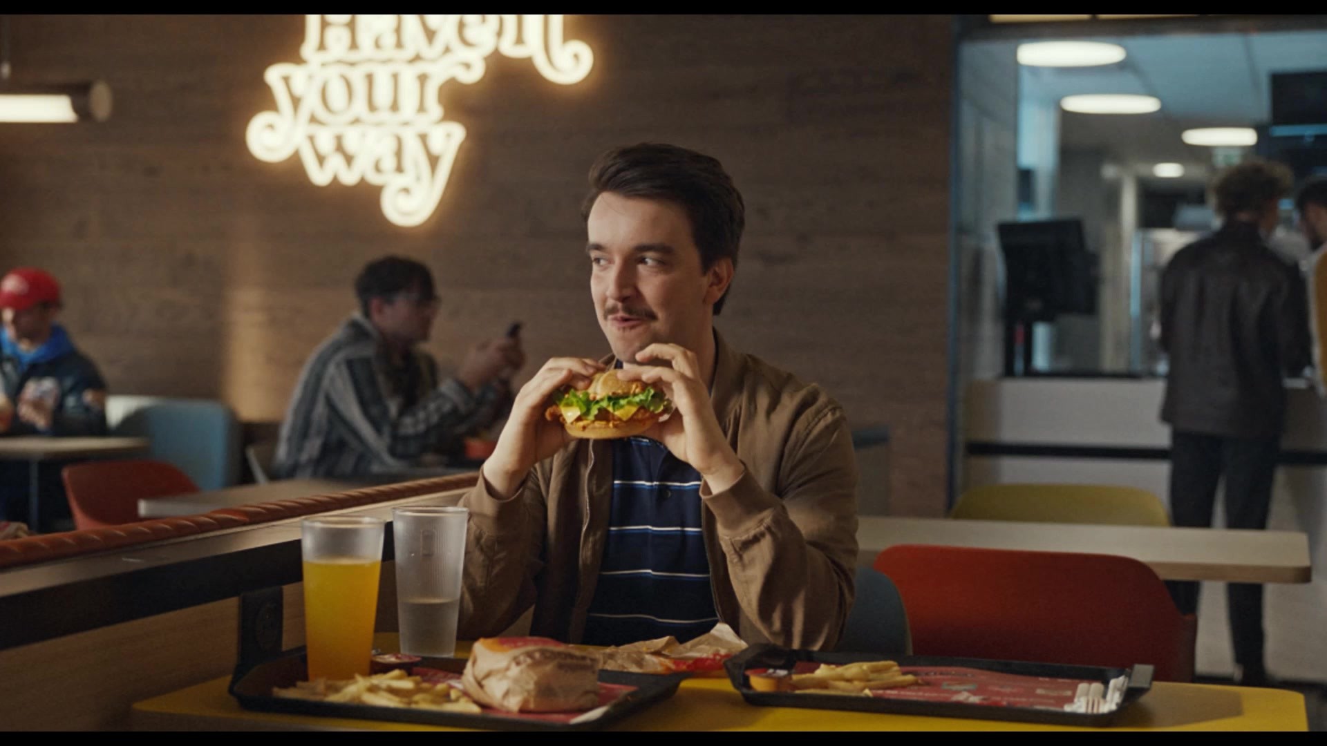
We created hand-drawn illustrations full of color, energy and irreverence to bring our personality to life in a way live action simply cannot replicate. Our colorful, energetic style draws attention to the points that matter — at a speed live action can’t match.
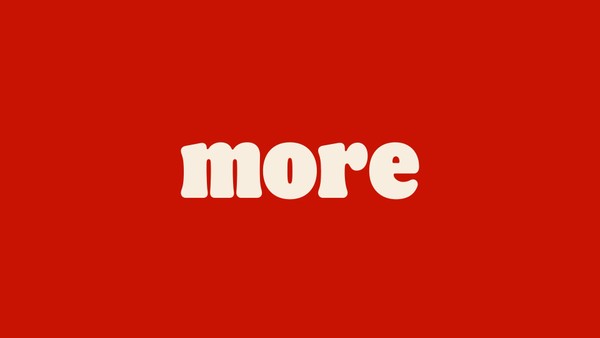
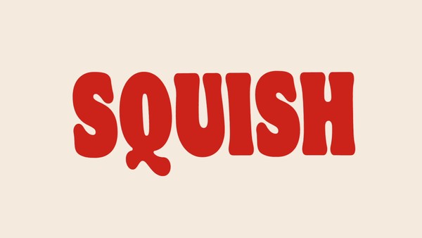
Then we paired our illustrations with a bespoke typeface family, Flame, to bring juiciness to every sentence. By spinning, stretching and layering elements, we create a bold, fun, drool-worthy design suite. Better yet, Flame Bold, is a limited variable font, designed to animate while retaining optimized proportions and allowing for a wider range of widths in a single typeface.
The overall effect screams flavor and craveability, all laddering up to Burger King’s core design principles: Mouthwatering, Big & Bold, Playfully Irreverent and Proudly True.
BK’s new motion assets were first revealed at a conference for internal stakeholders to secure employee and franchisee buy-in for the new identity. Then they brought the campaign to life at launch, appearing across Twitter, Instagram, Youtube, Vimeo, TikTok and in press coverage worldwide.
Outcome
The new identity scored 1.1 billion impressions in the first five days, with headlines in Fast Company, CNN, Forbes, Adweek, Ad Age and more. Stock prices jumped 7.8% (in a pandemic), and the refresh out-performed McDonald’s rebrand with a 66% increase in purchase intent. Visitation intent went up by 39%, and overall sentiment was 98% positive.
The rebrand was also a cultural phenom, trending on US & UK Twitter, landing on the front page of Reddit Design Porn with a 95% upvote rate, and engaging the next generation of branding experts on TikTok.
Similar Campaigns
12 items